Please wait to load all the graphs. This page is not setup to be fast loading. :)
Things you can do on each graph
Hover your mouse over a trend line to find which location it refers to.
Single click on a location in the legend to show and hide that location's trend line.
Double click on a location in the legend to show only that location OR show ALL locations in that graph.
Click and drag on a graph to zoom into a particular area.
Data Sources
Covid-19 cases and deaths data from https://github.com/nytimes/covid-19-data.
Population and Land Area data from random places I found information from the internet. Most was sourced via US Census data and tend to be at least 10 years old.
Death Risks by Age Group
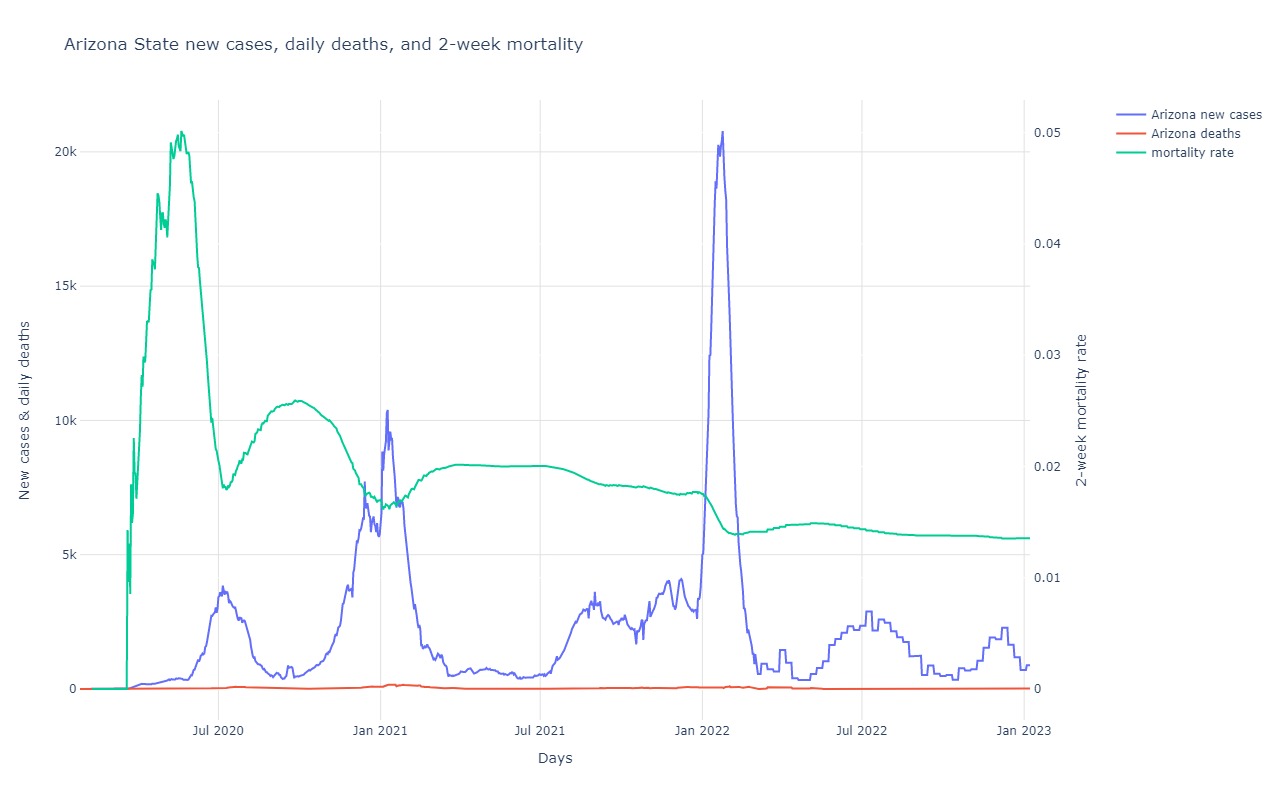
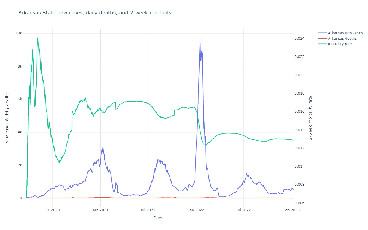
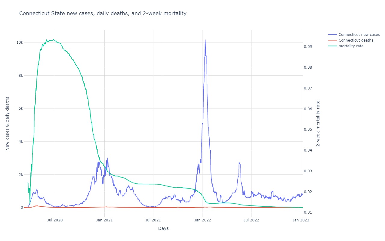
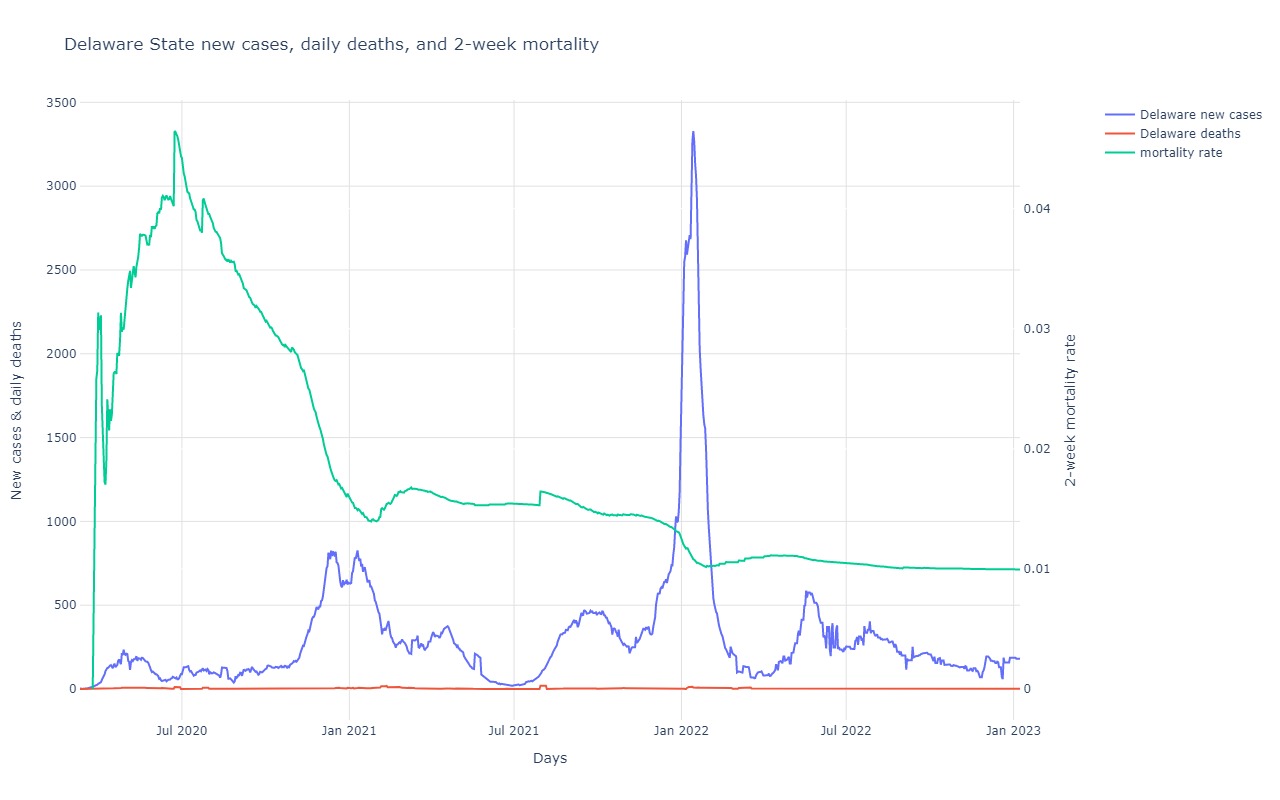
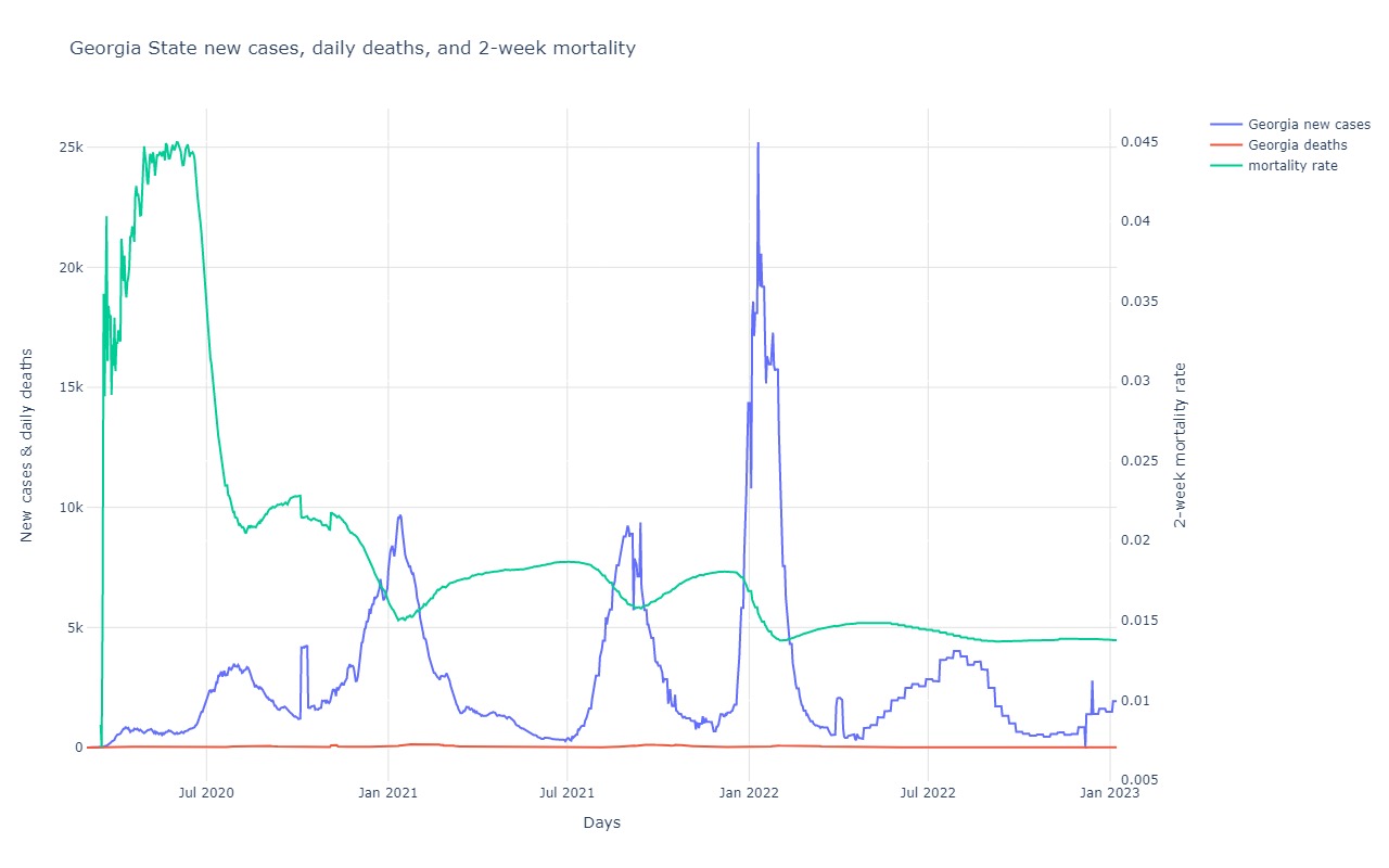
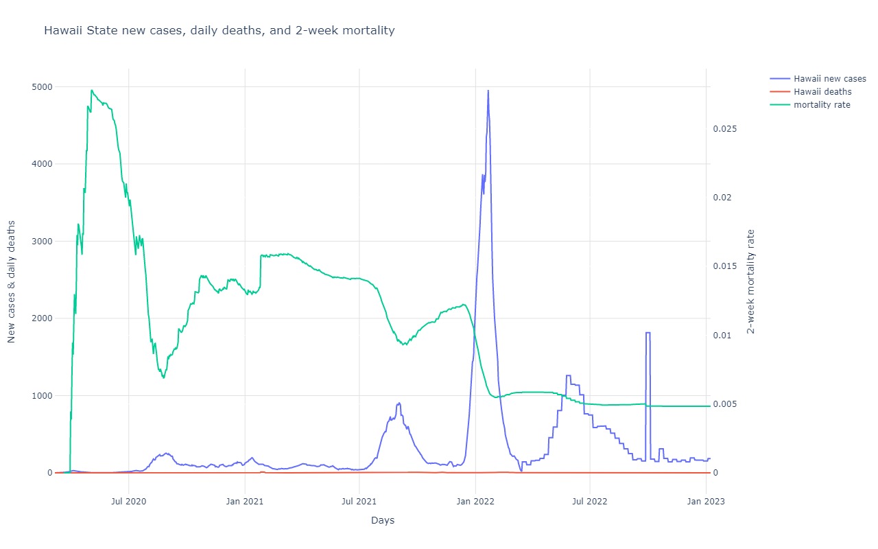
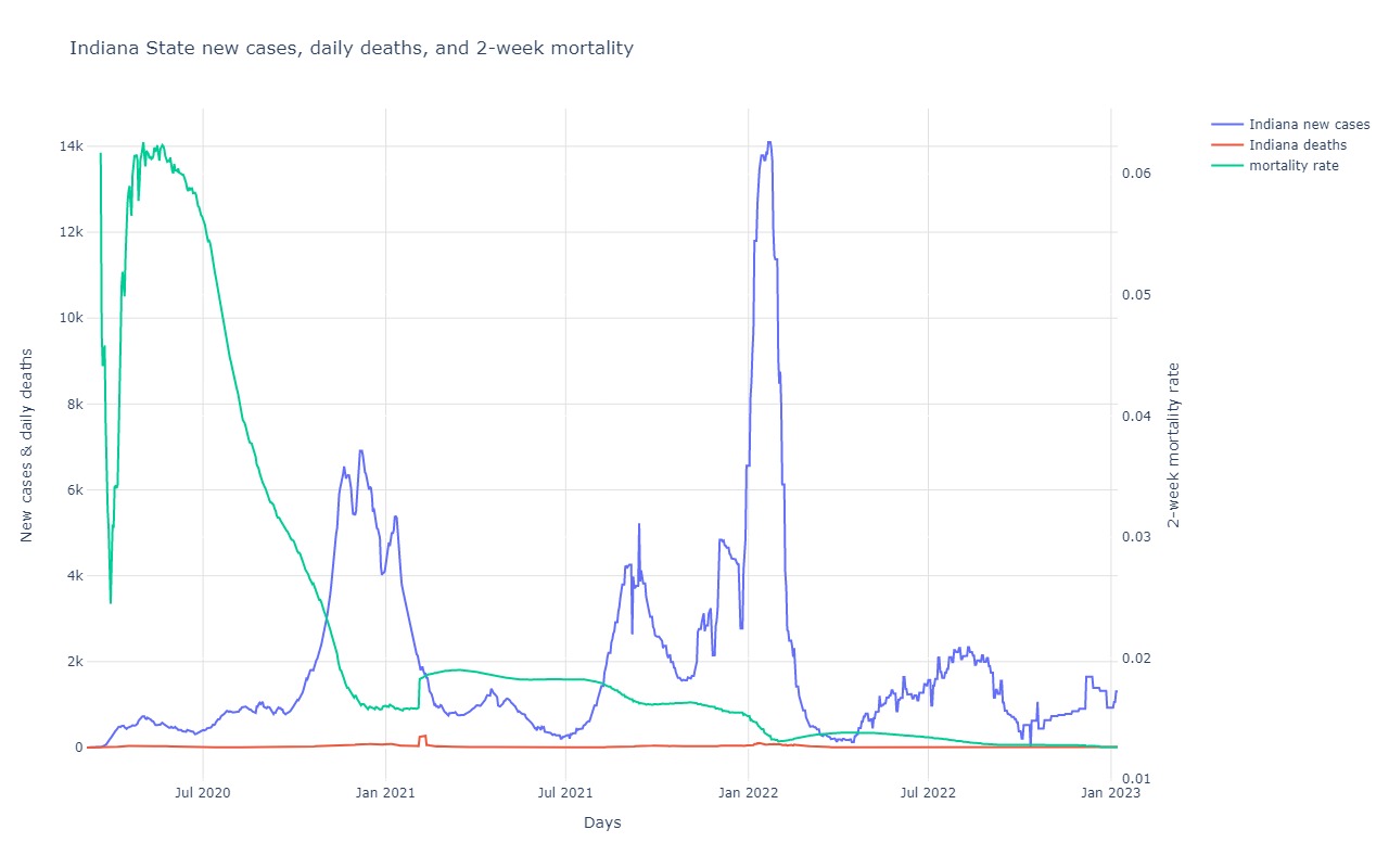
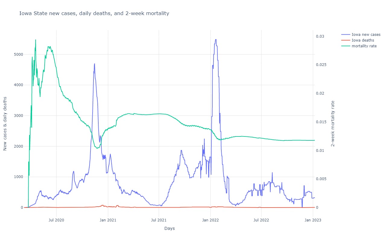
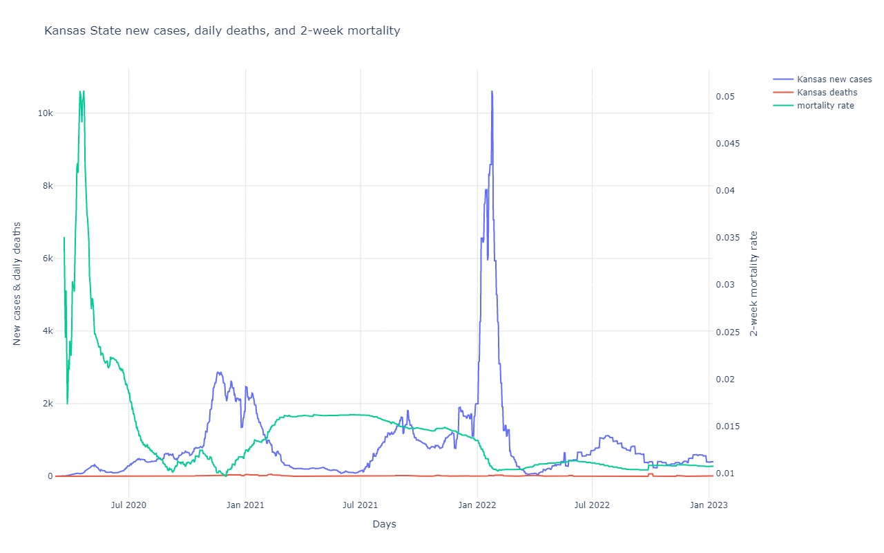
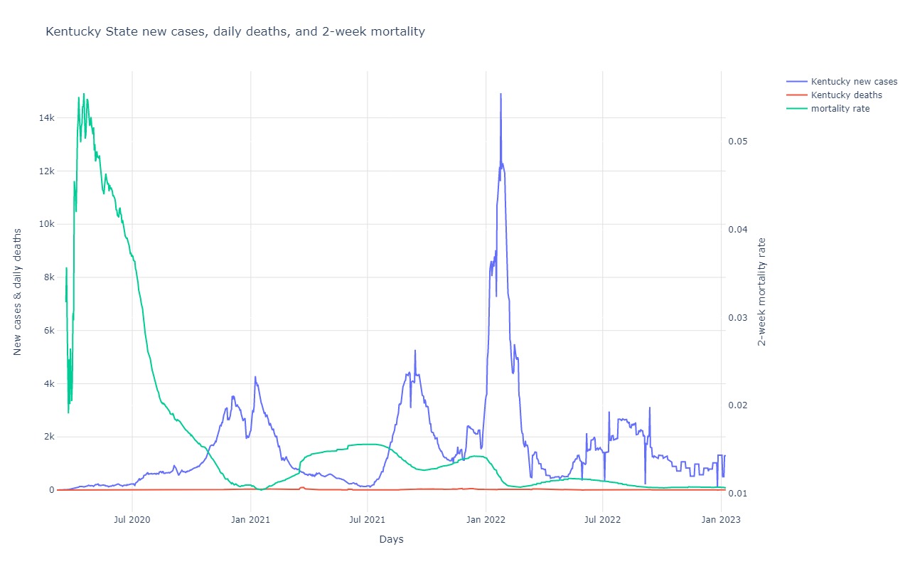
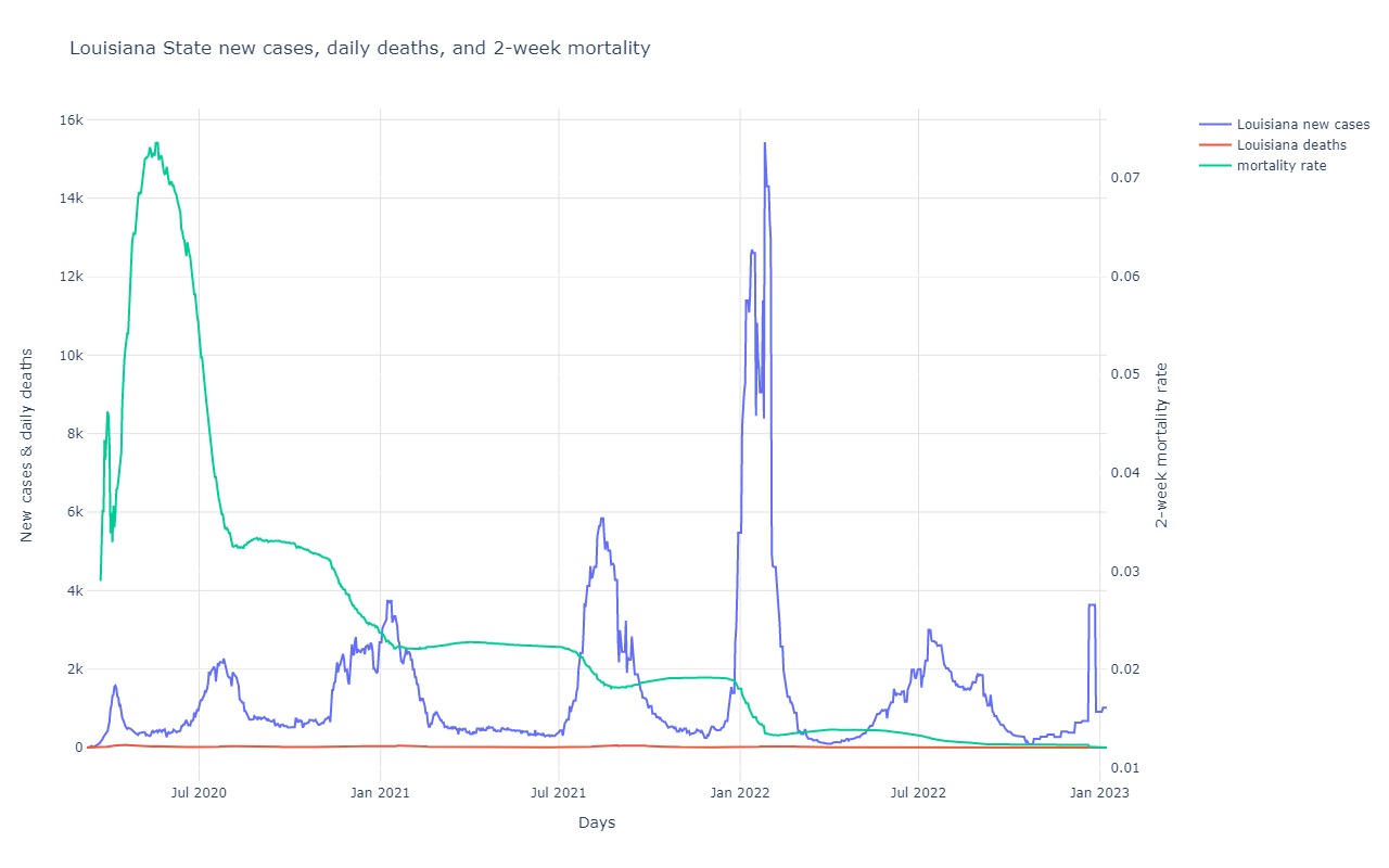
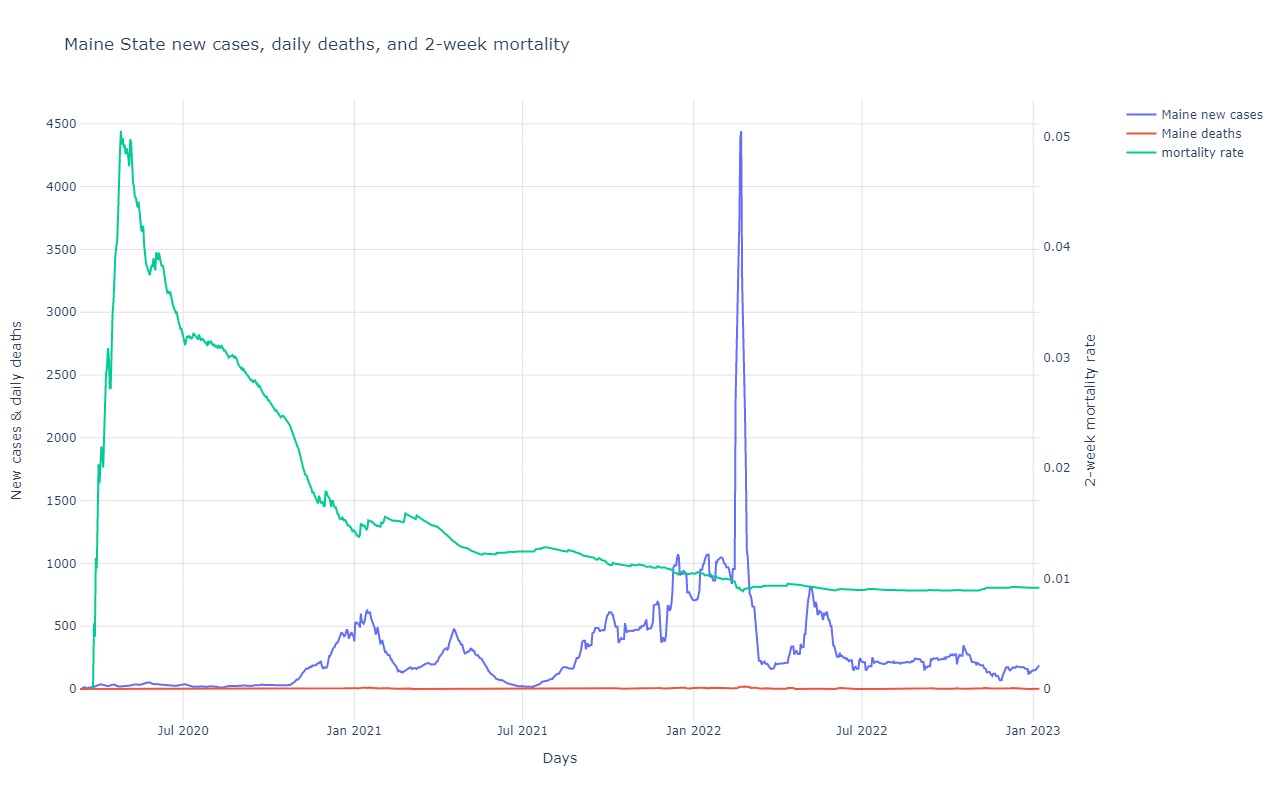
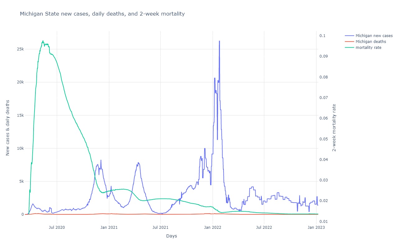
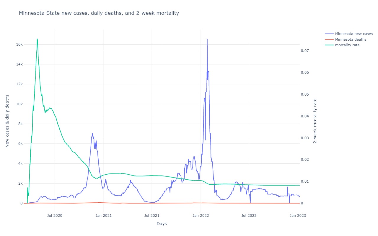
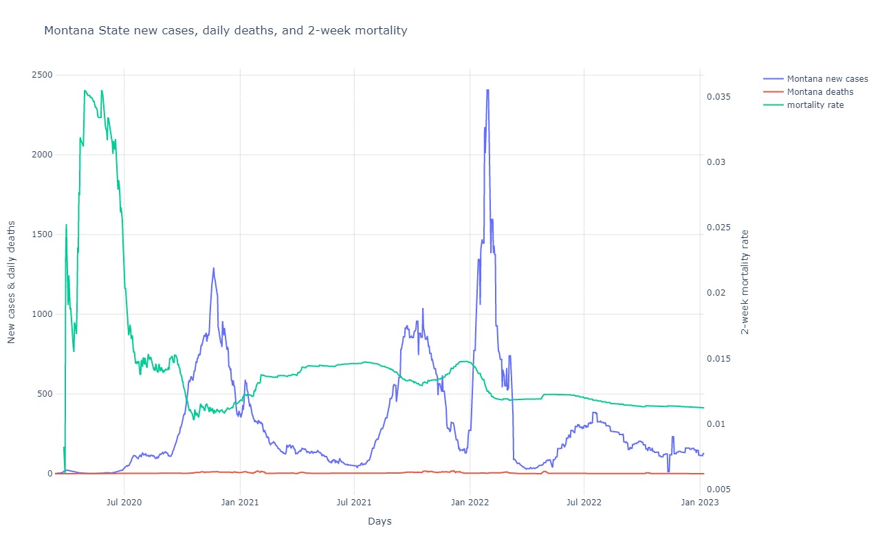
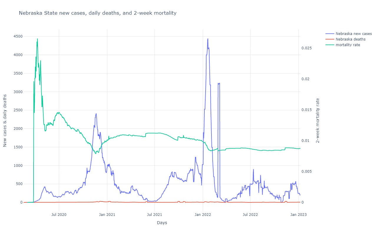
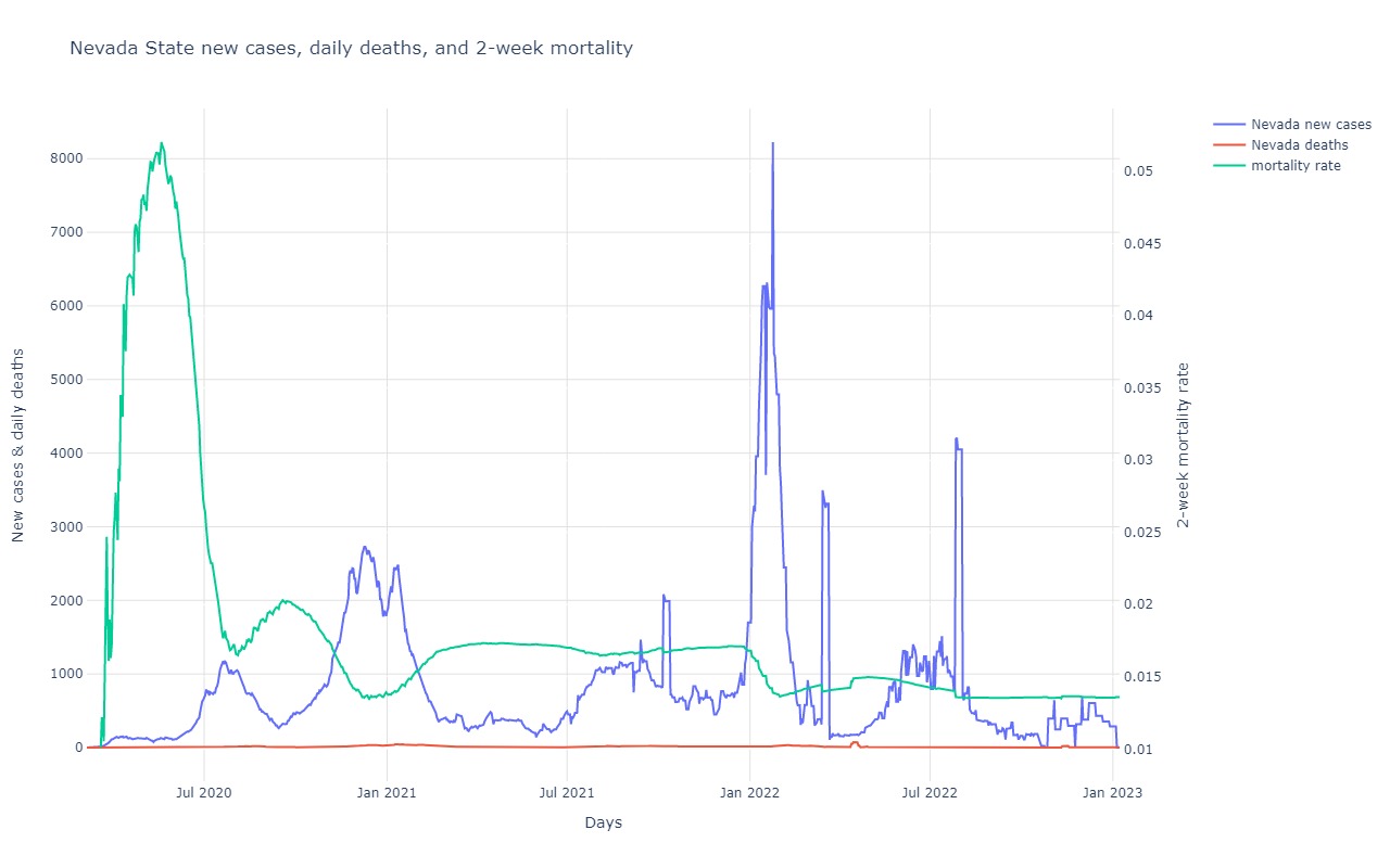
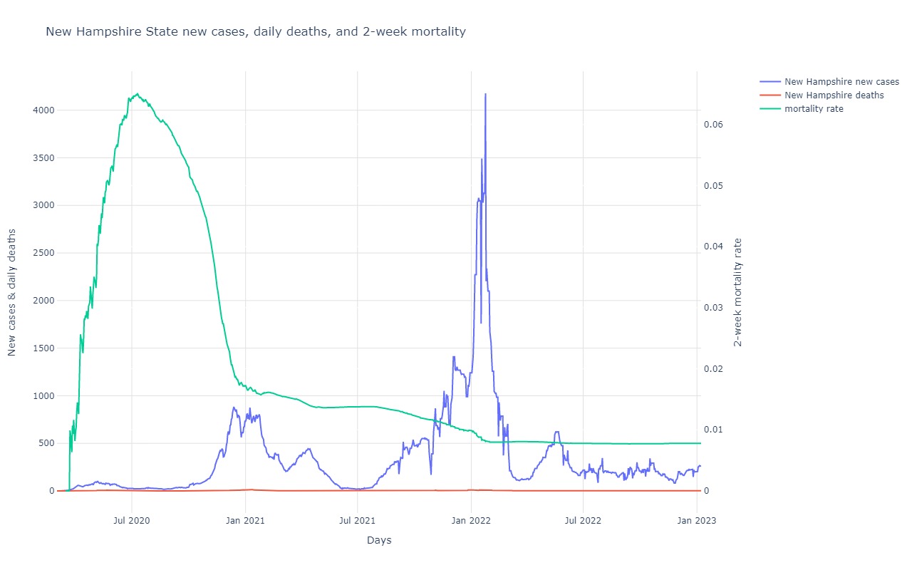
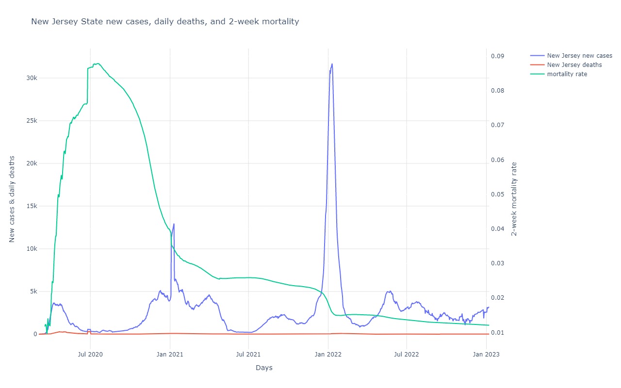
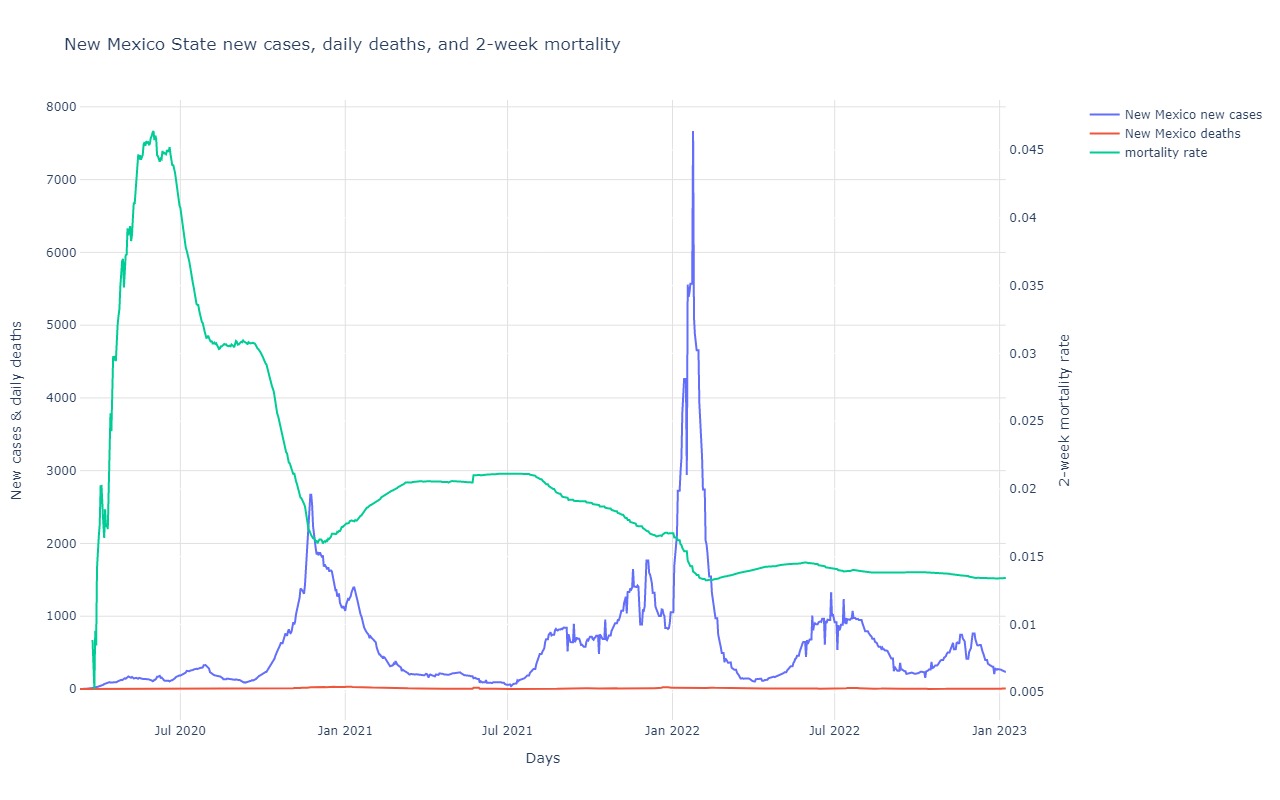
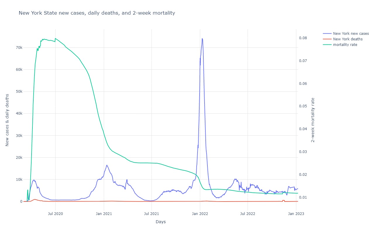
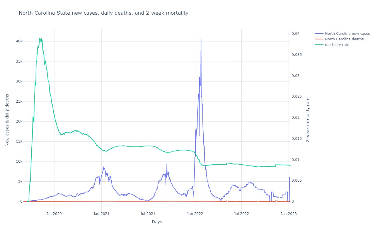
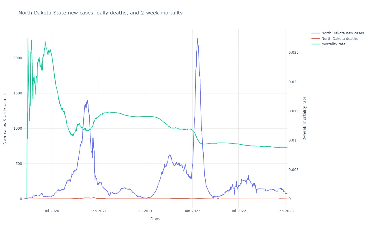
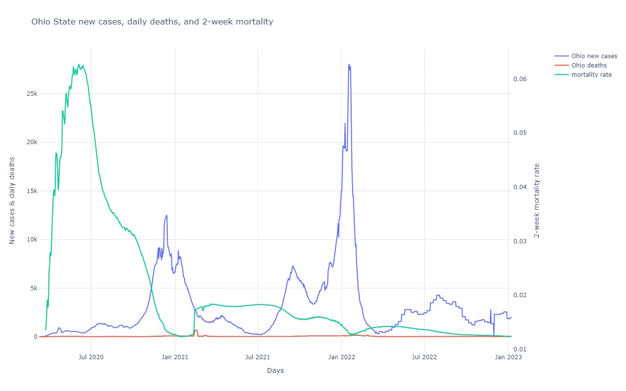
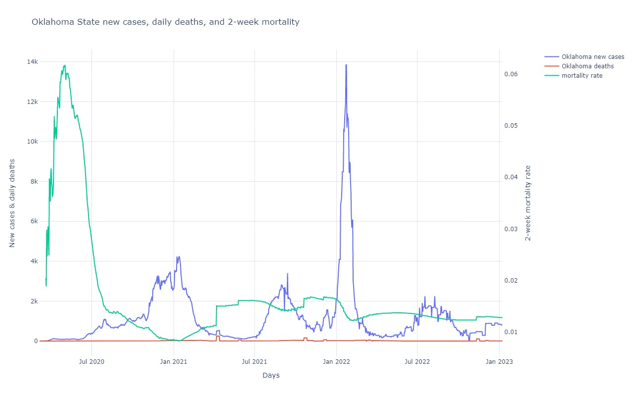
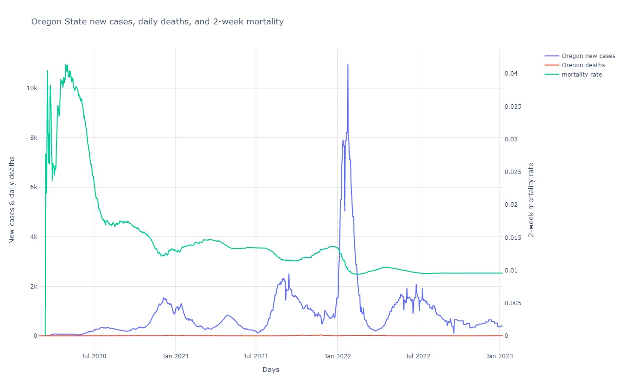
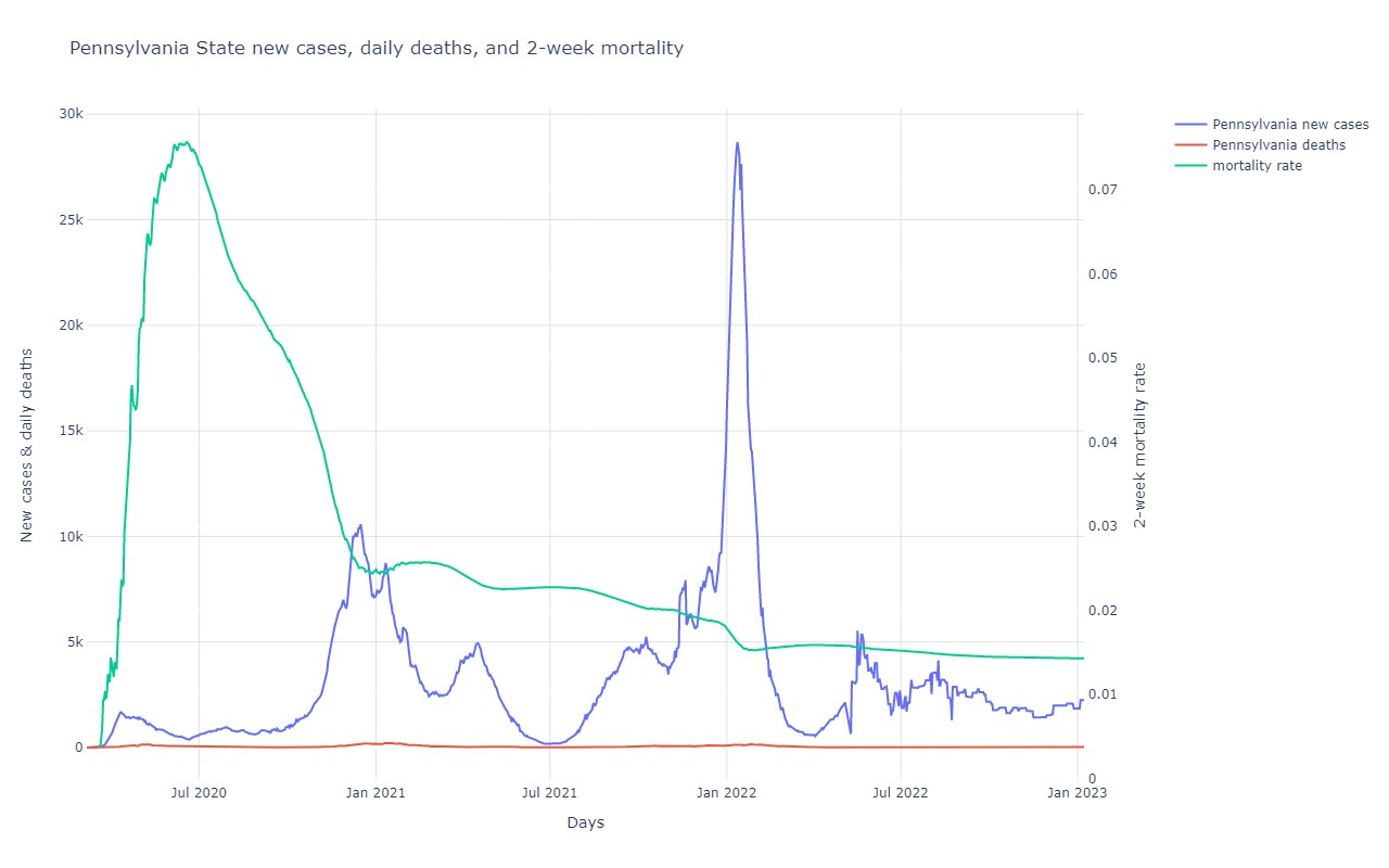
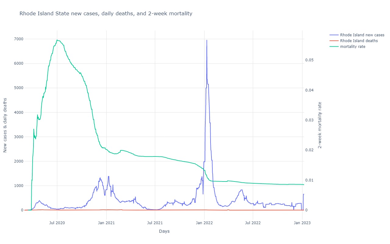
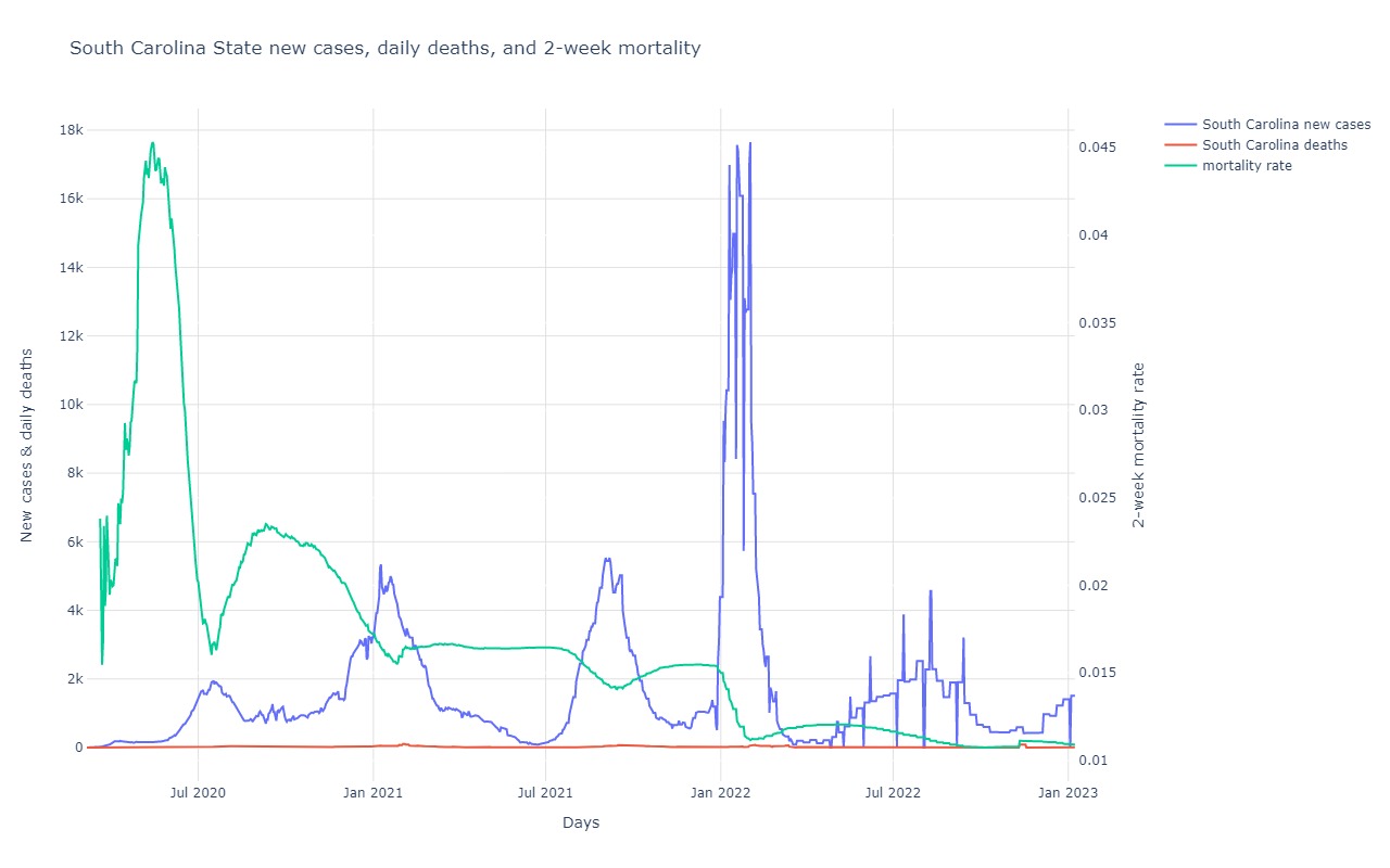
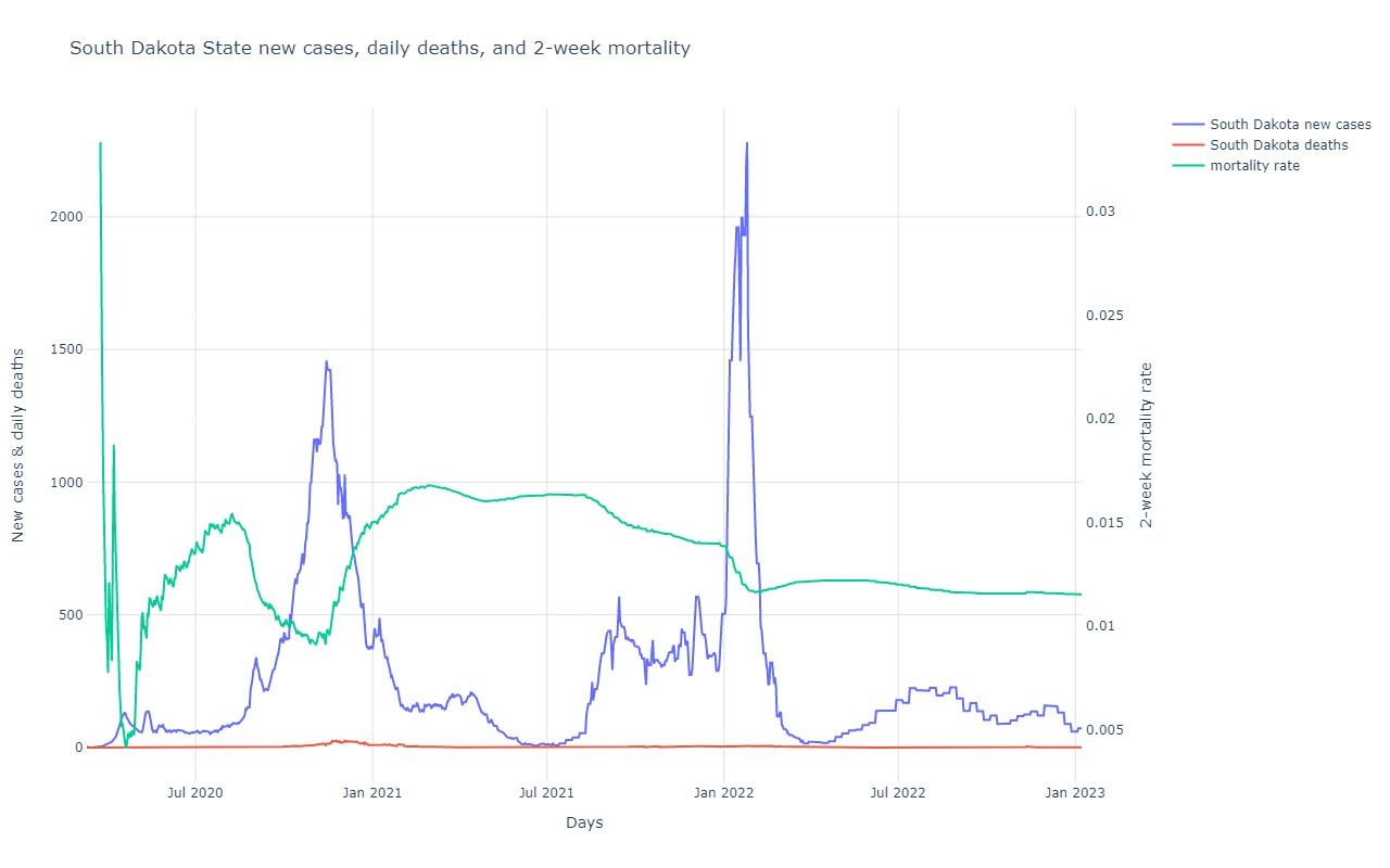
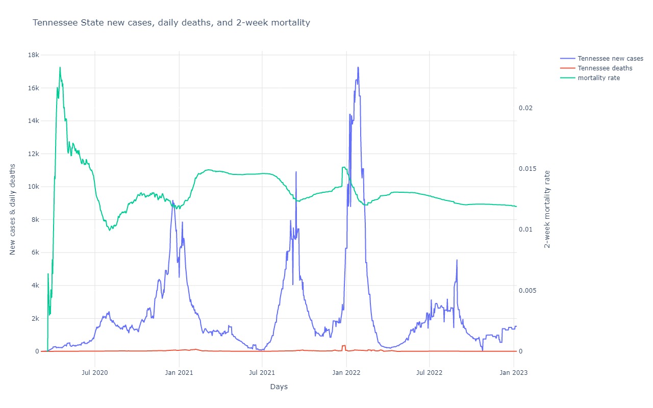
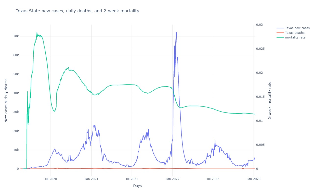
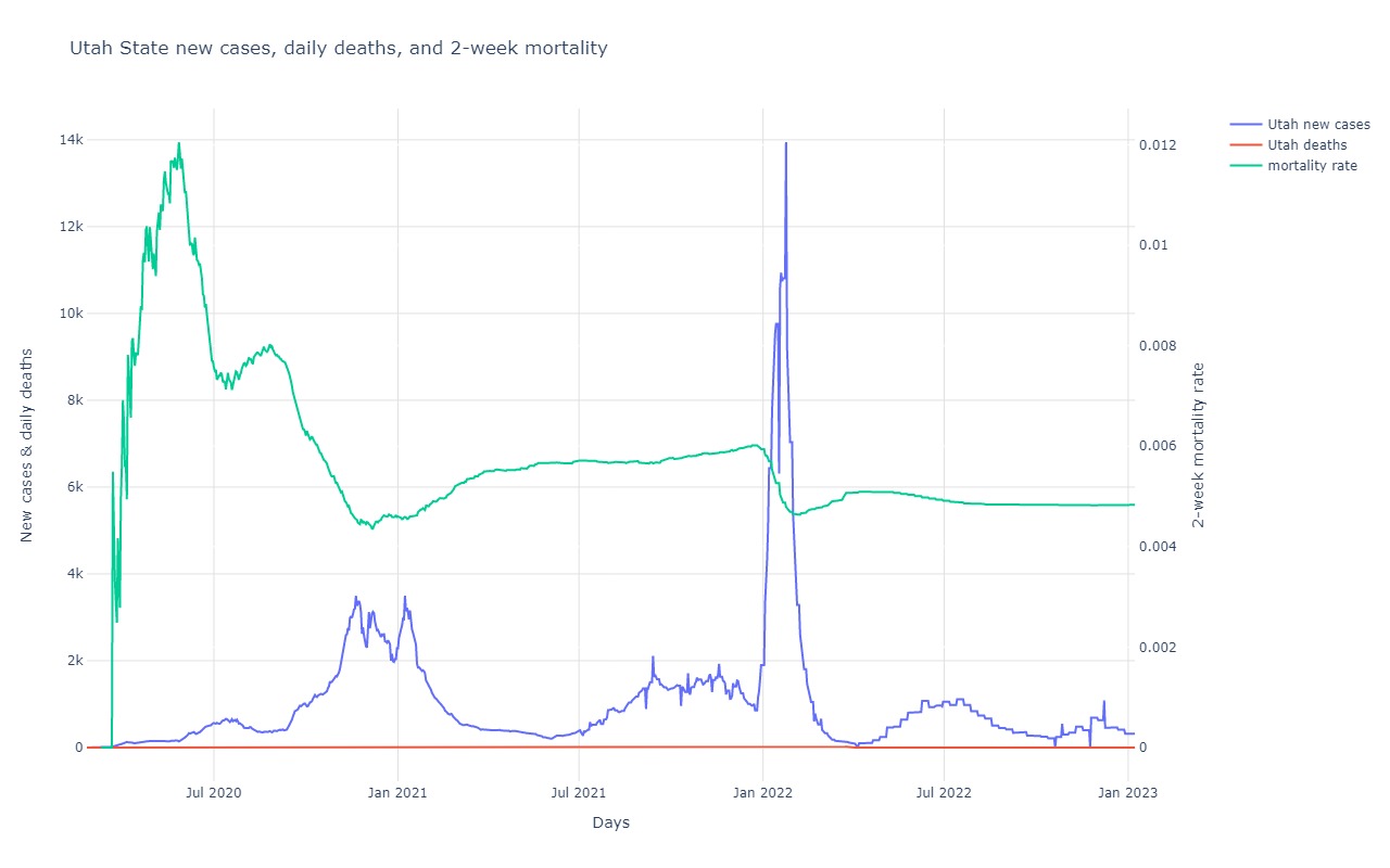
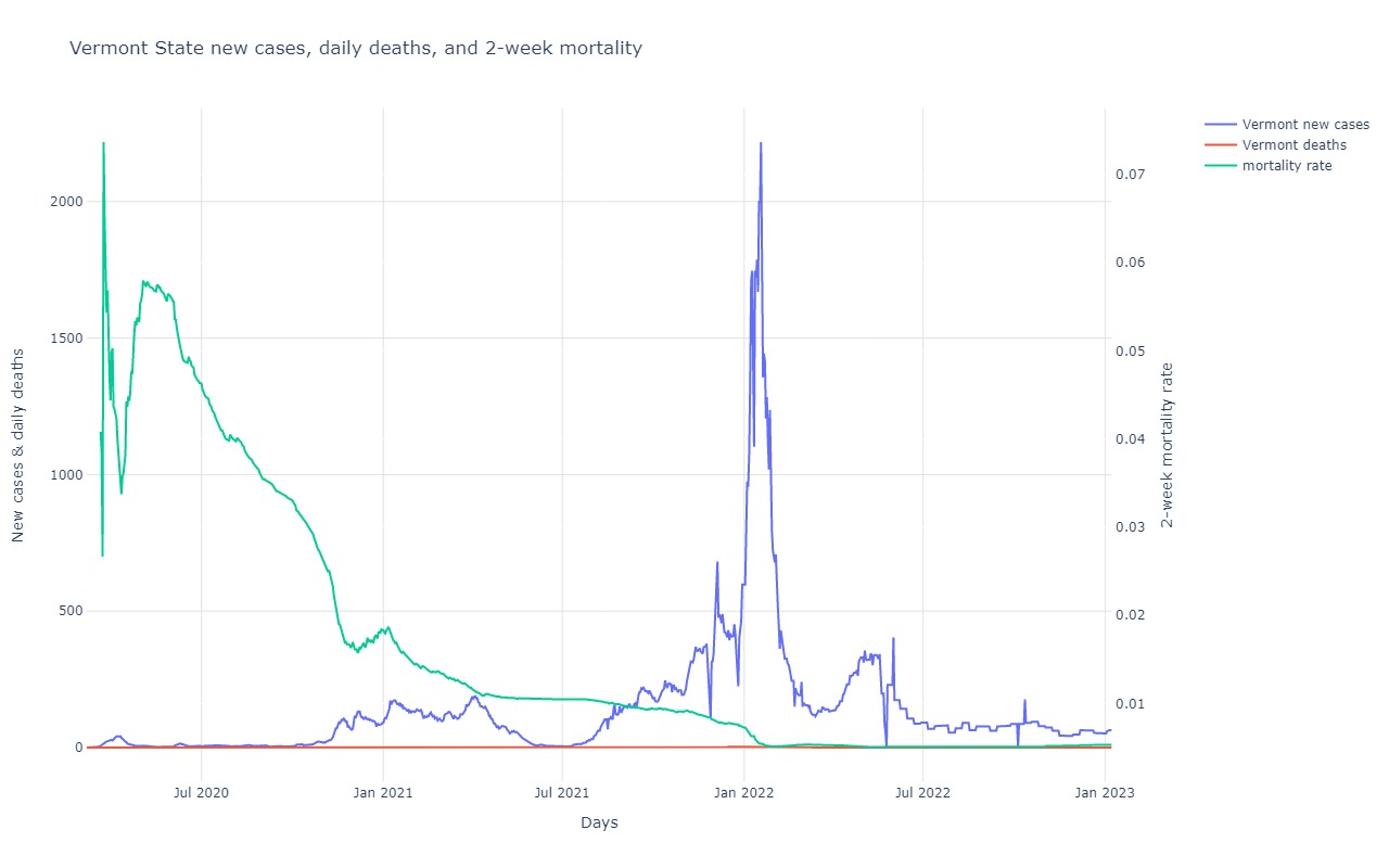
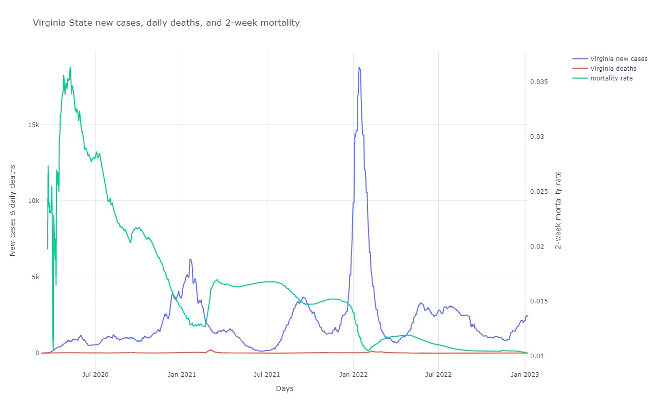
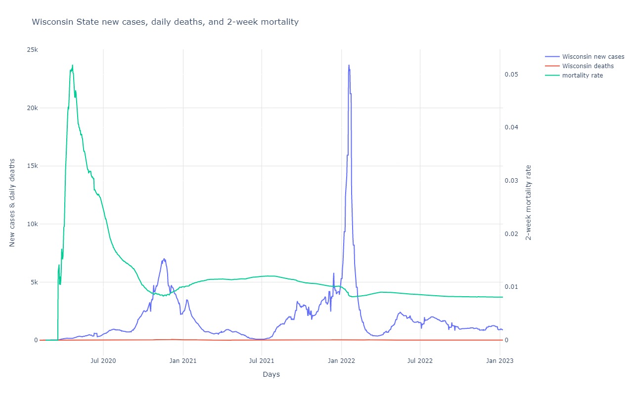
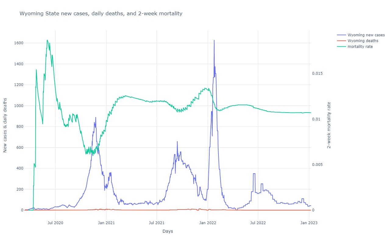
New cases, Daily Deaths and 2-week Mortality for US
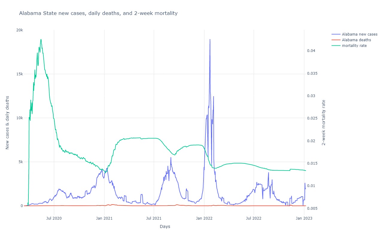
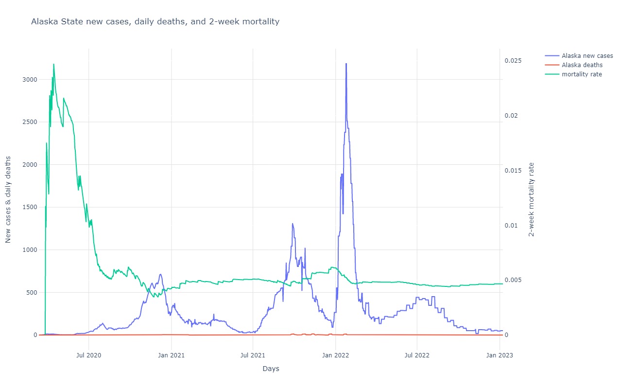
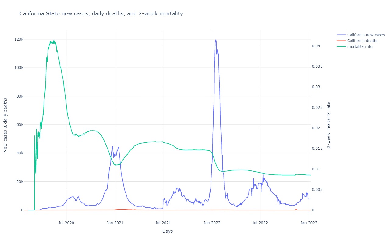
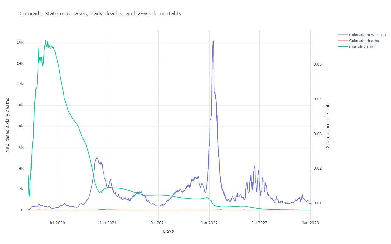
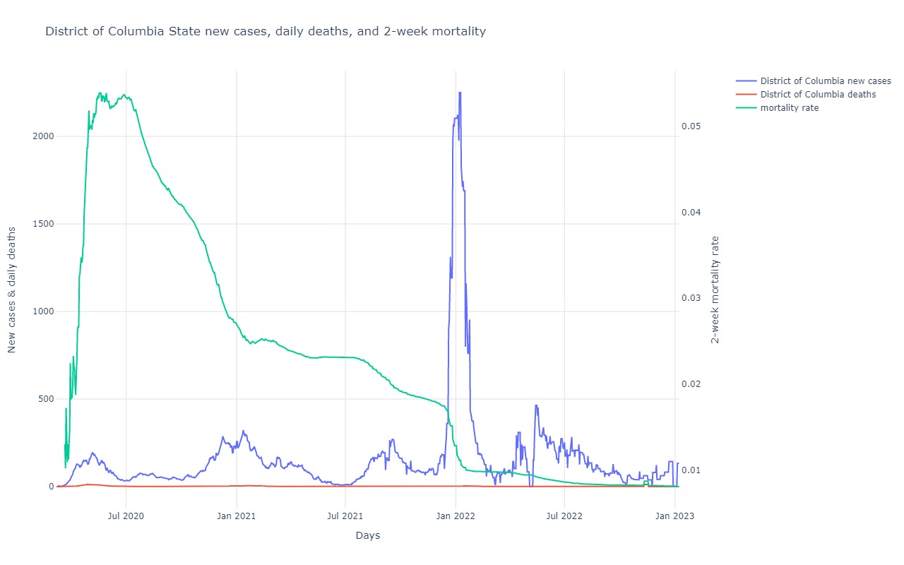
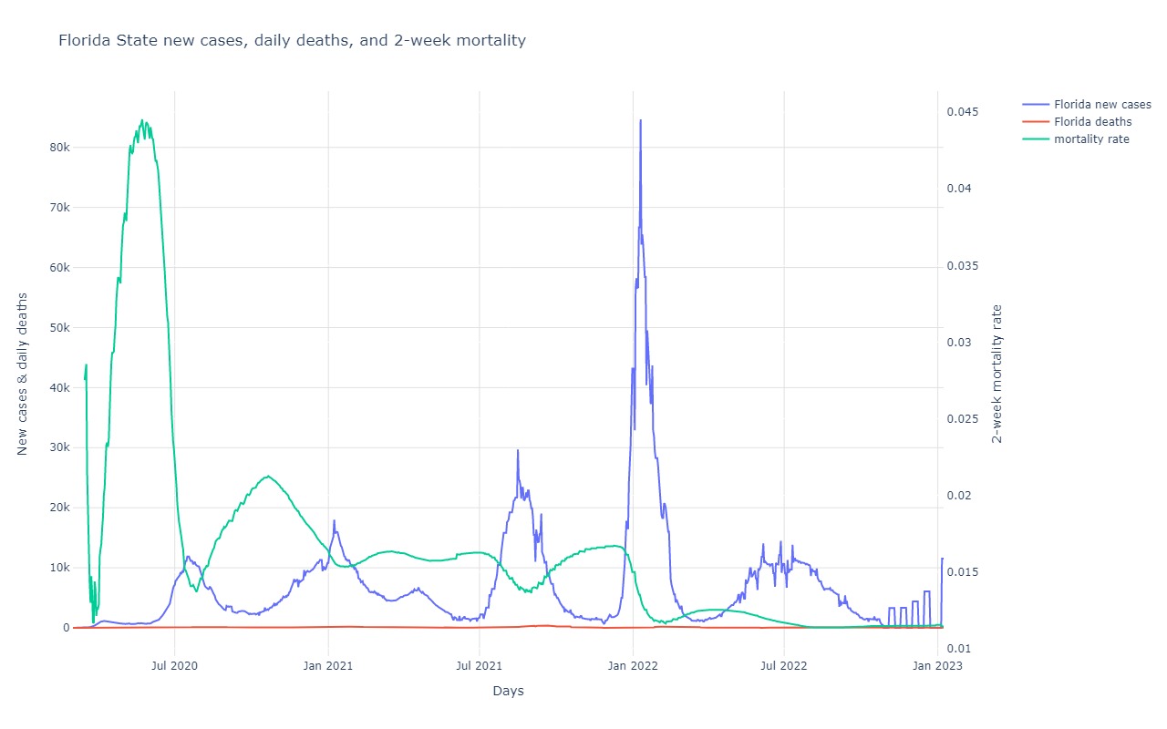
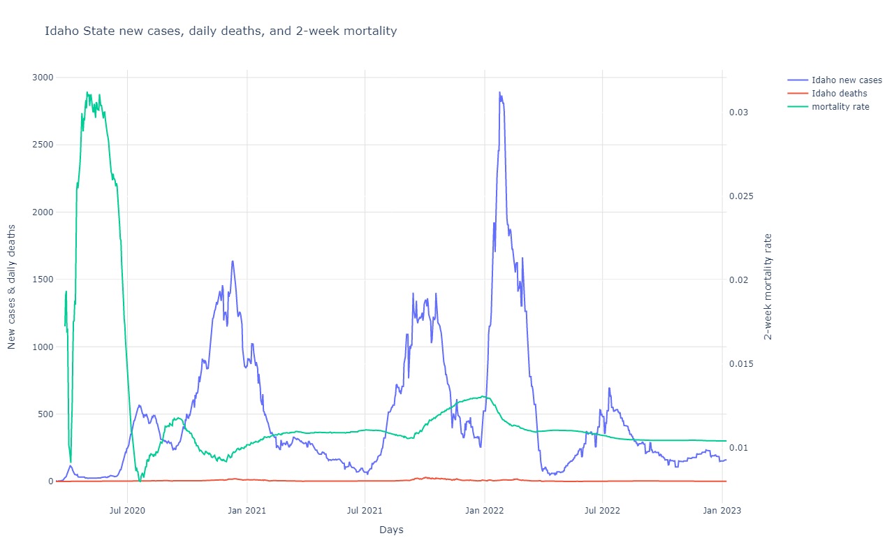
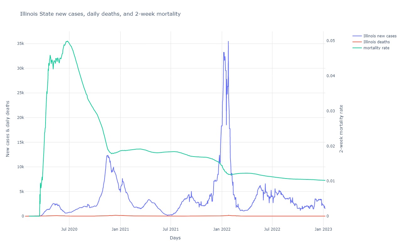
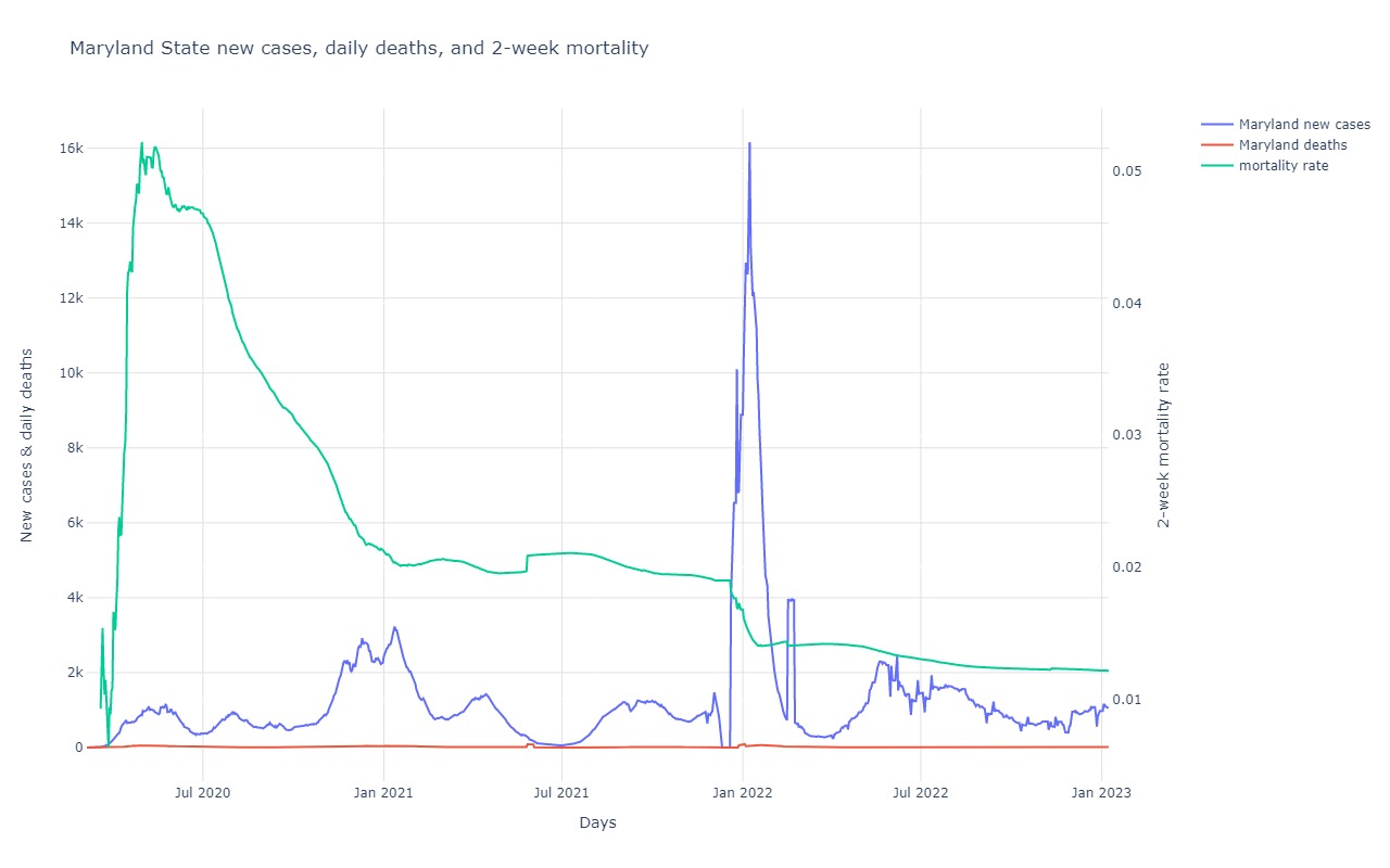
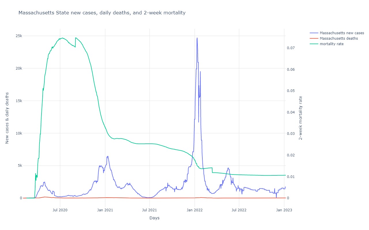
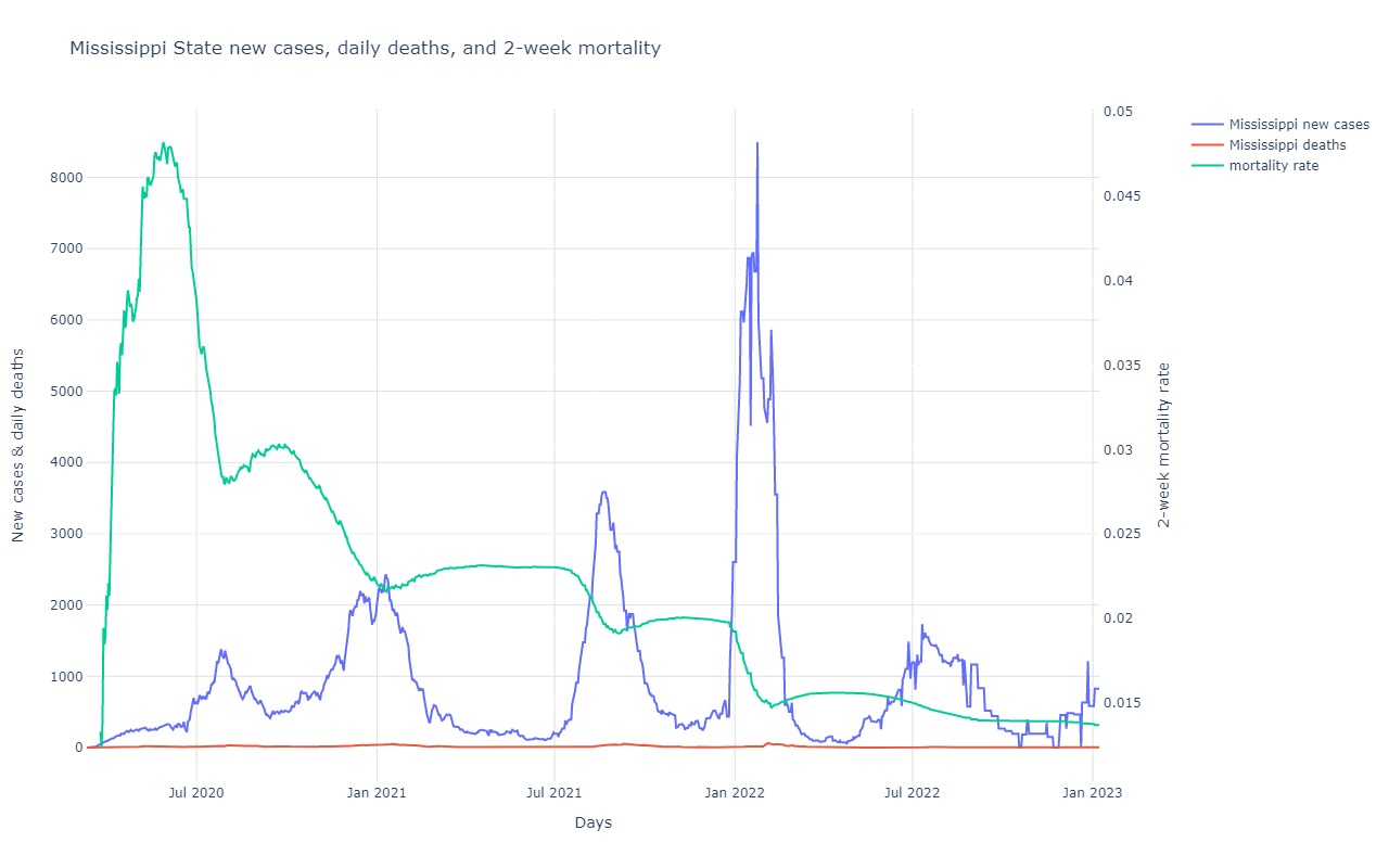
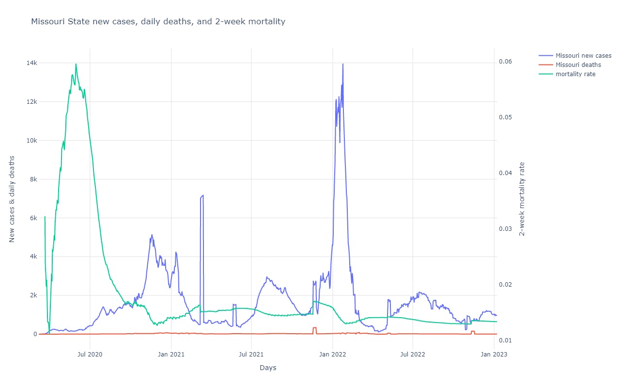
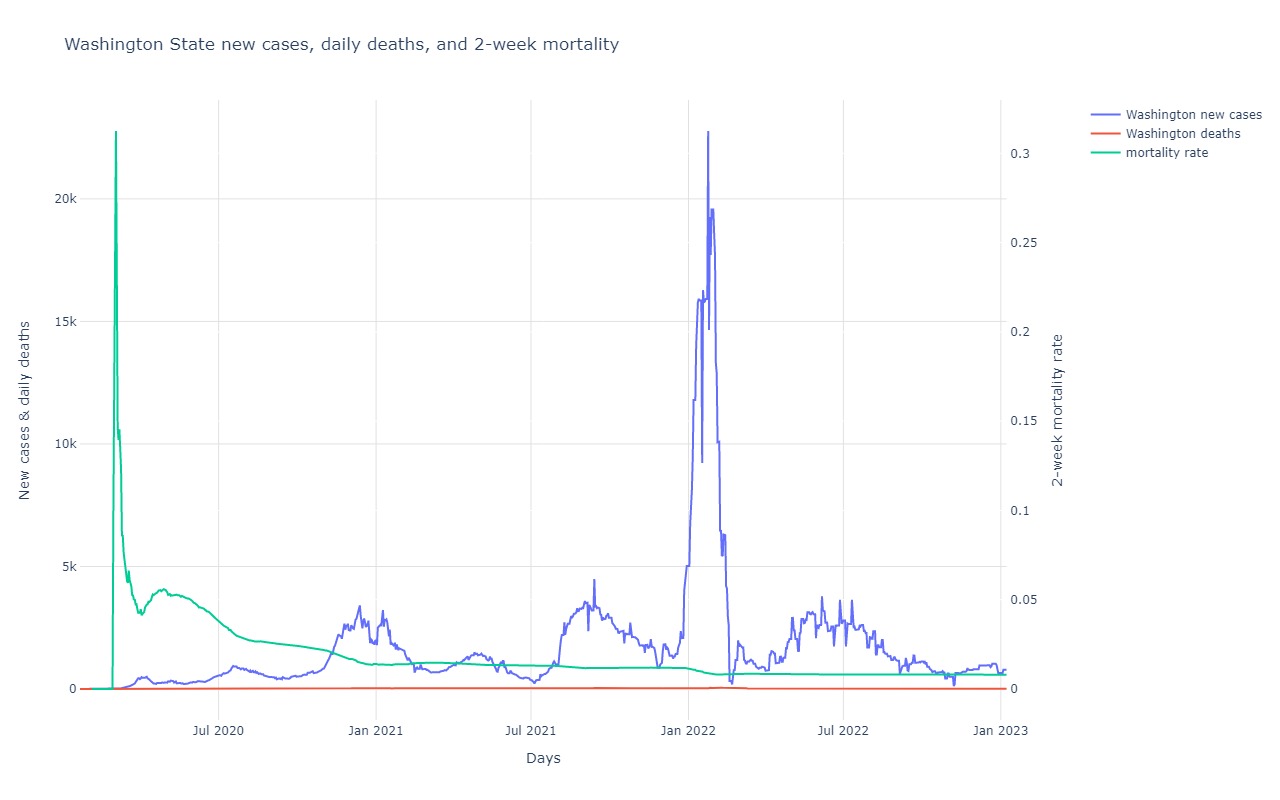
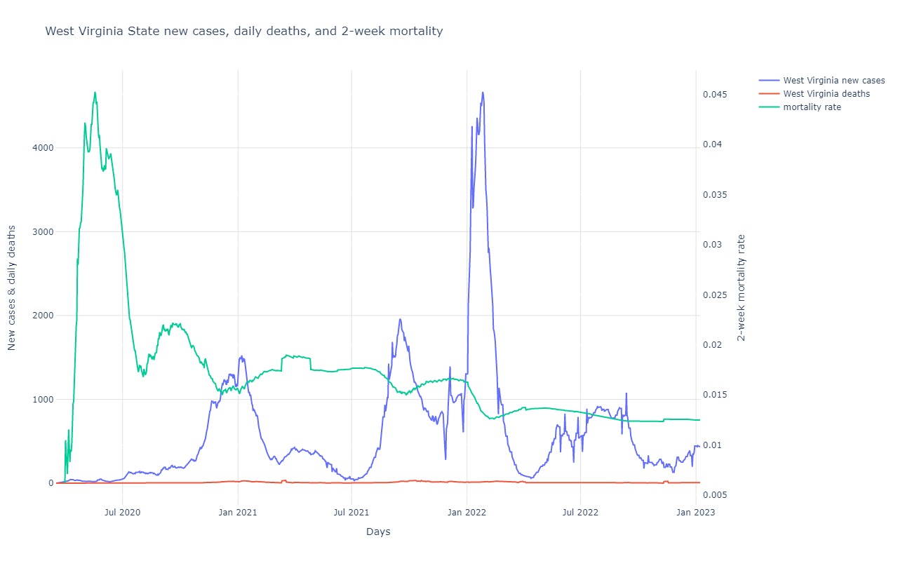
This is a combination plot showing a 7 day moving average of number of new cases per day, number of deaths per day,
and a 2-week mortality rate for the US overall. Note that the scale for the mortality rate appears along the right hand side of the graph,
while the scale for cases and deaths is along the left.
The 2-week mortality rate is calculated by taking the total number of deaths that occurred by each date, and dividing it by the total number of new cases that occurred
2 weeks earlier. Therefore, the desired line should be trending downward indicating that the number of deaths compared against the number of cases found is going down.
This could be due to more people being tested and testing as positive while the absolute mortality of covid-19 stays constant, but it also could be due to better treatment
of those infected. Note that a .03 mortality rate is believed to be about 30x higher than that of influenza. But also remember that disregarding age, a .03 mortality rate
implies that if you are infected, you have a 97% chance of surviving.
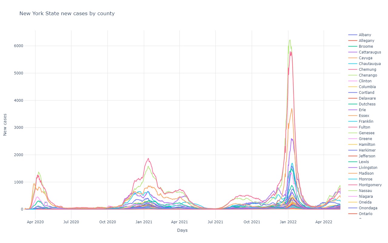
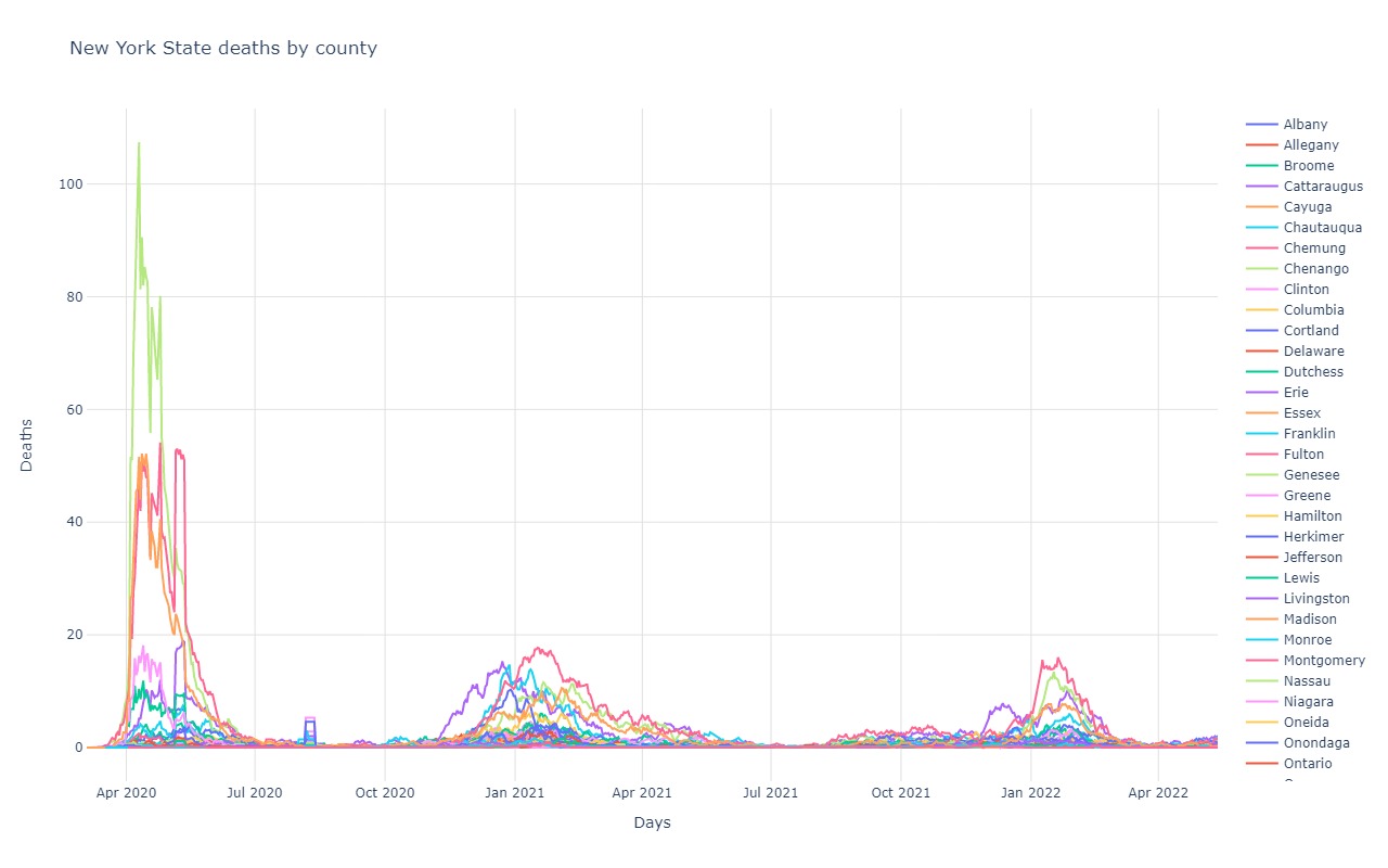
New Cases and Deaths by State
New Cases and Deaths in Locations Interesting to Me
State New Cases and Death Breakdowns
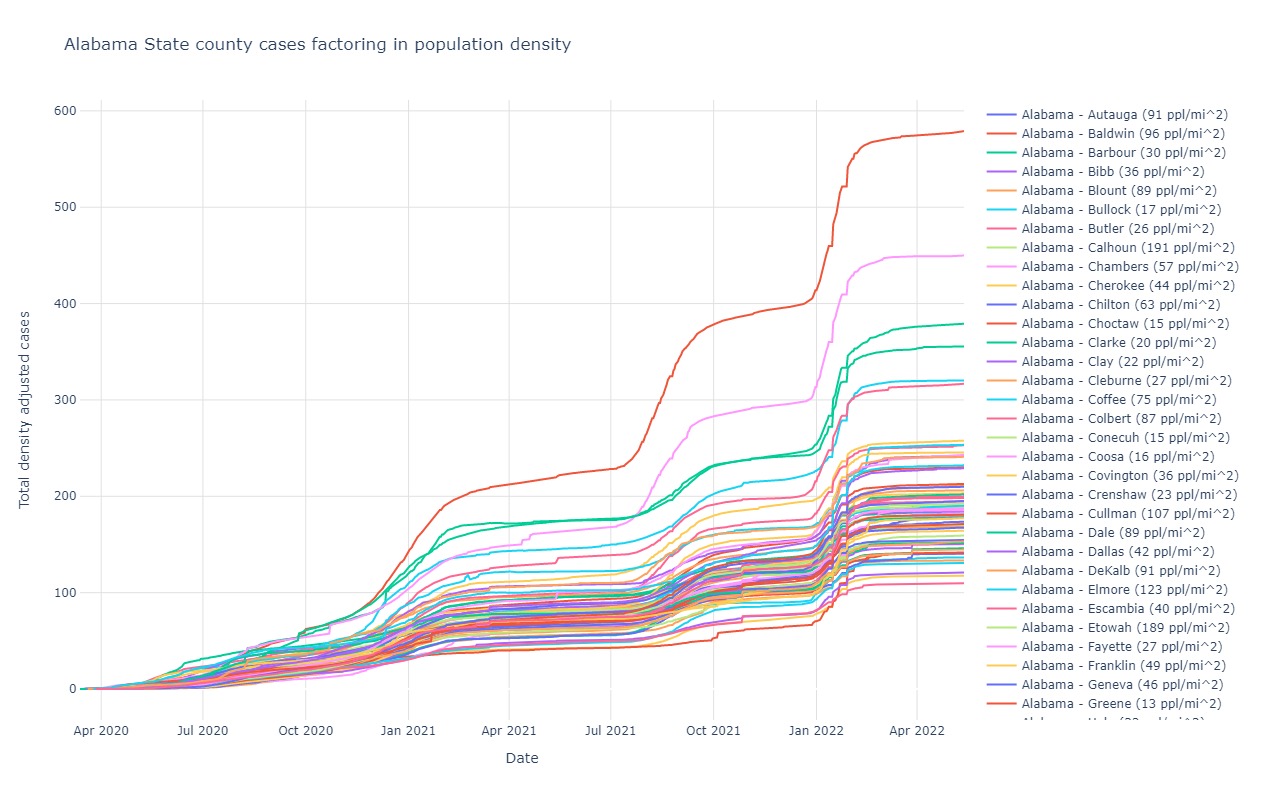
Alabama
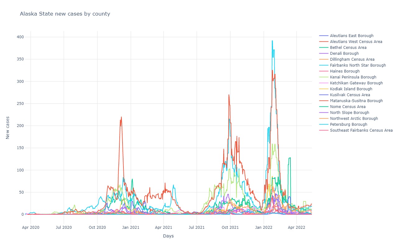
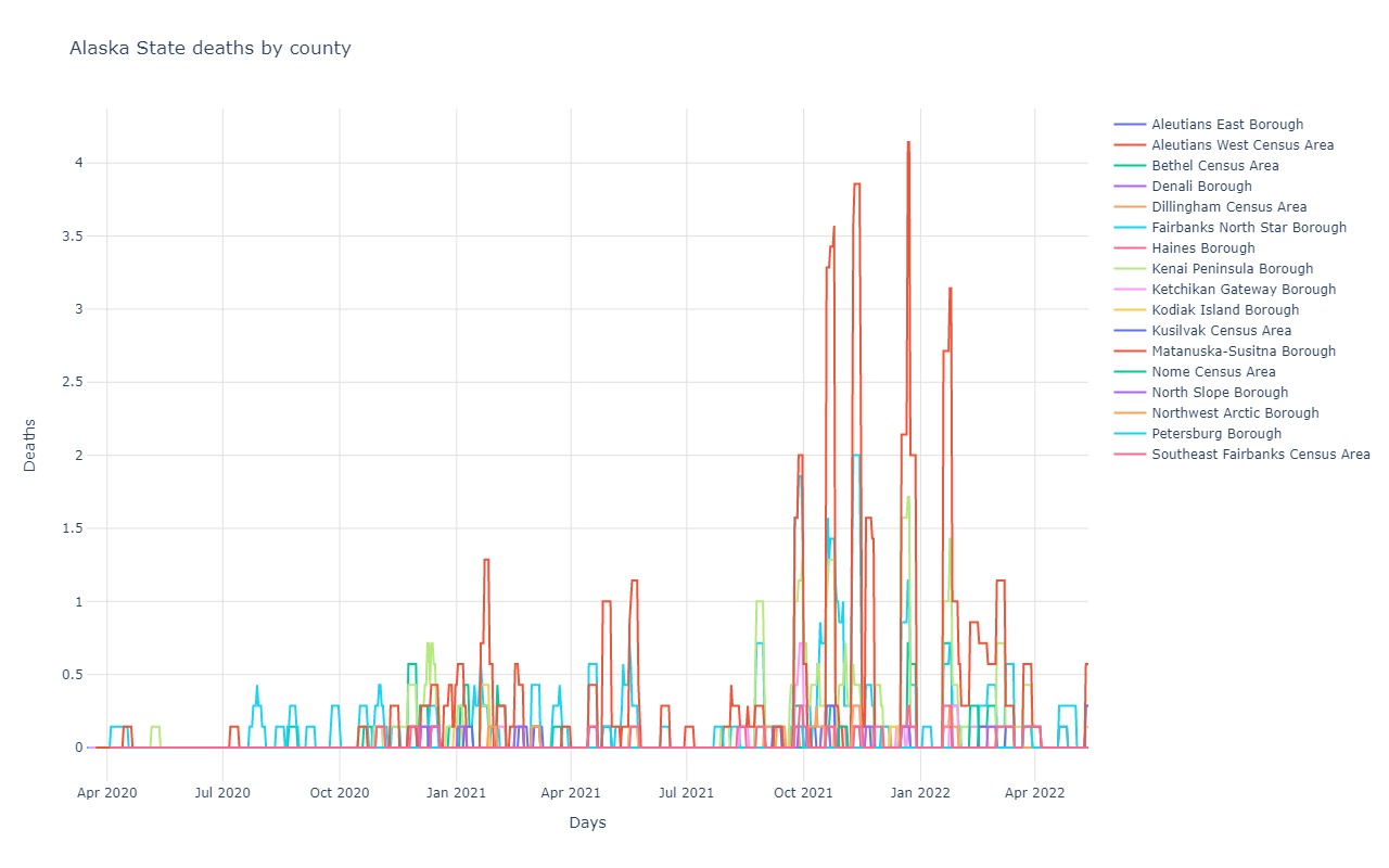
Alaska
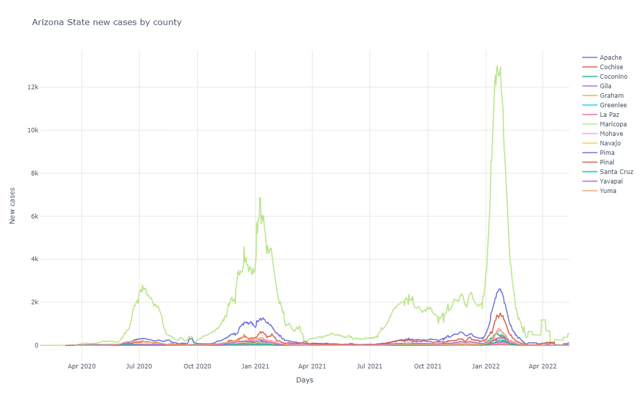
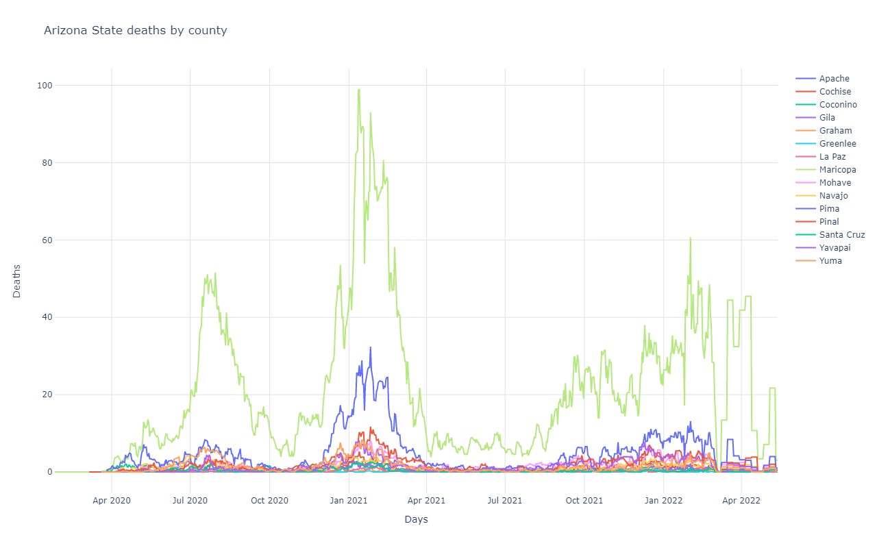
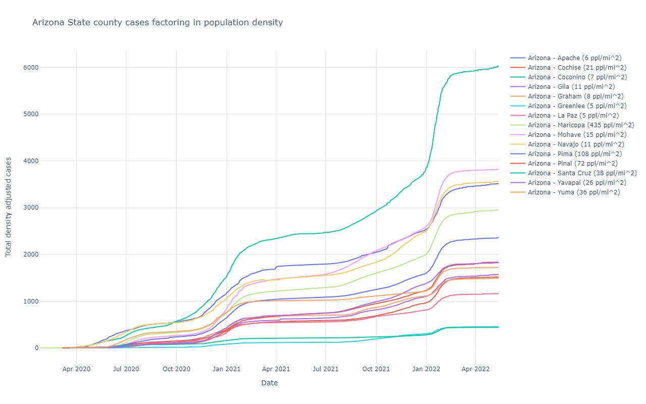
Arizona
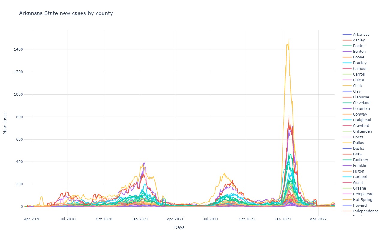
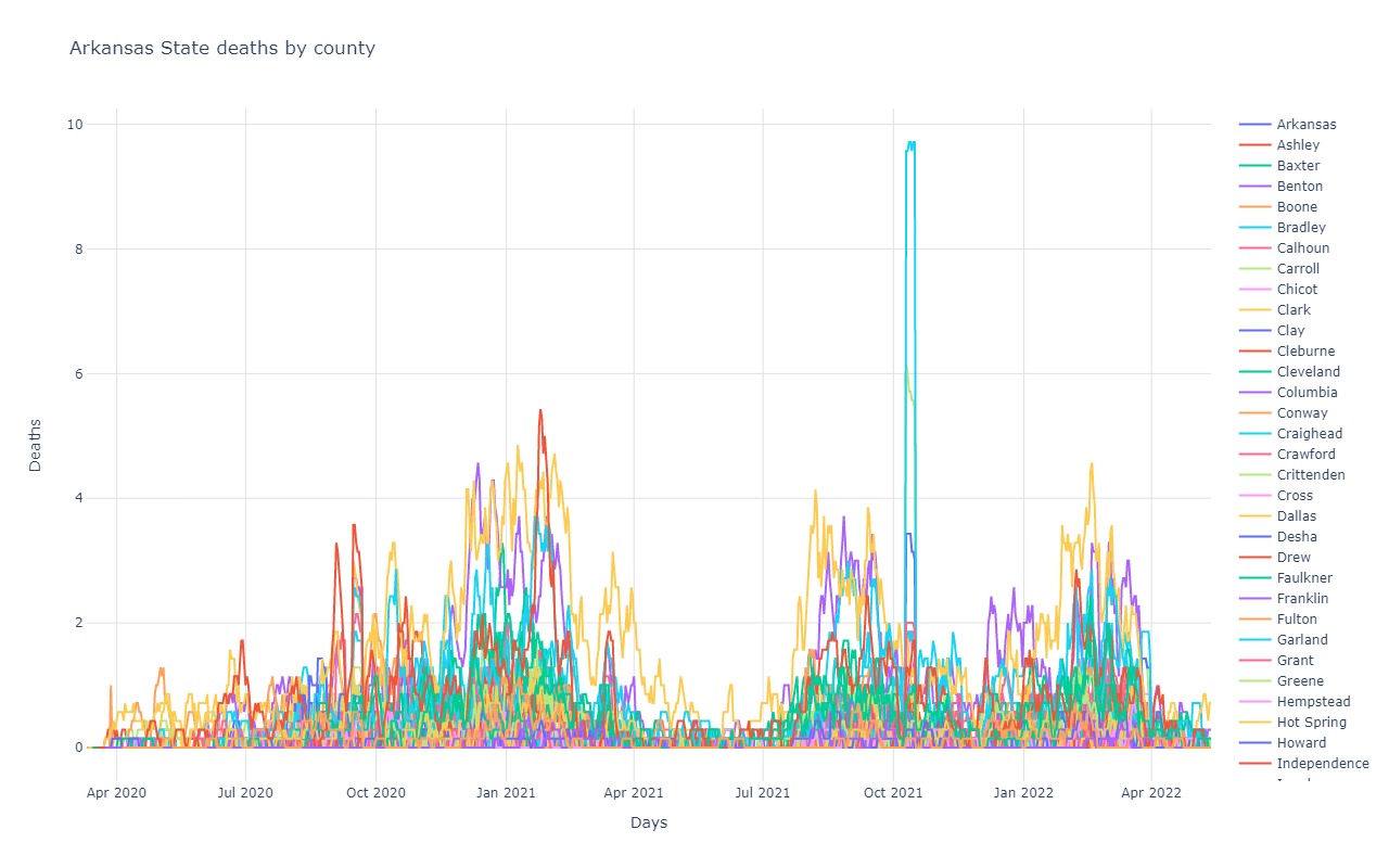
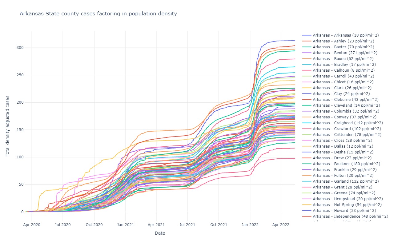
Arkansas
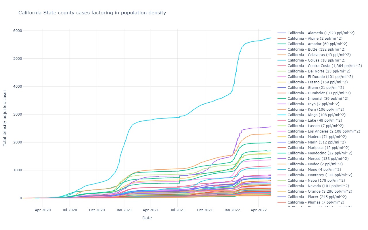
California
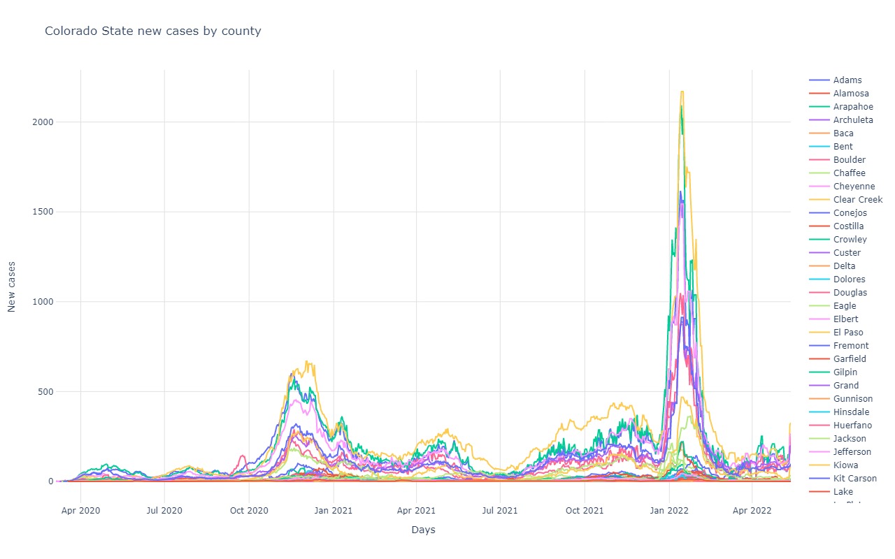
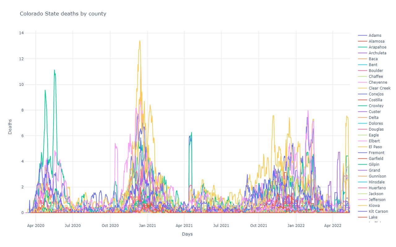
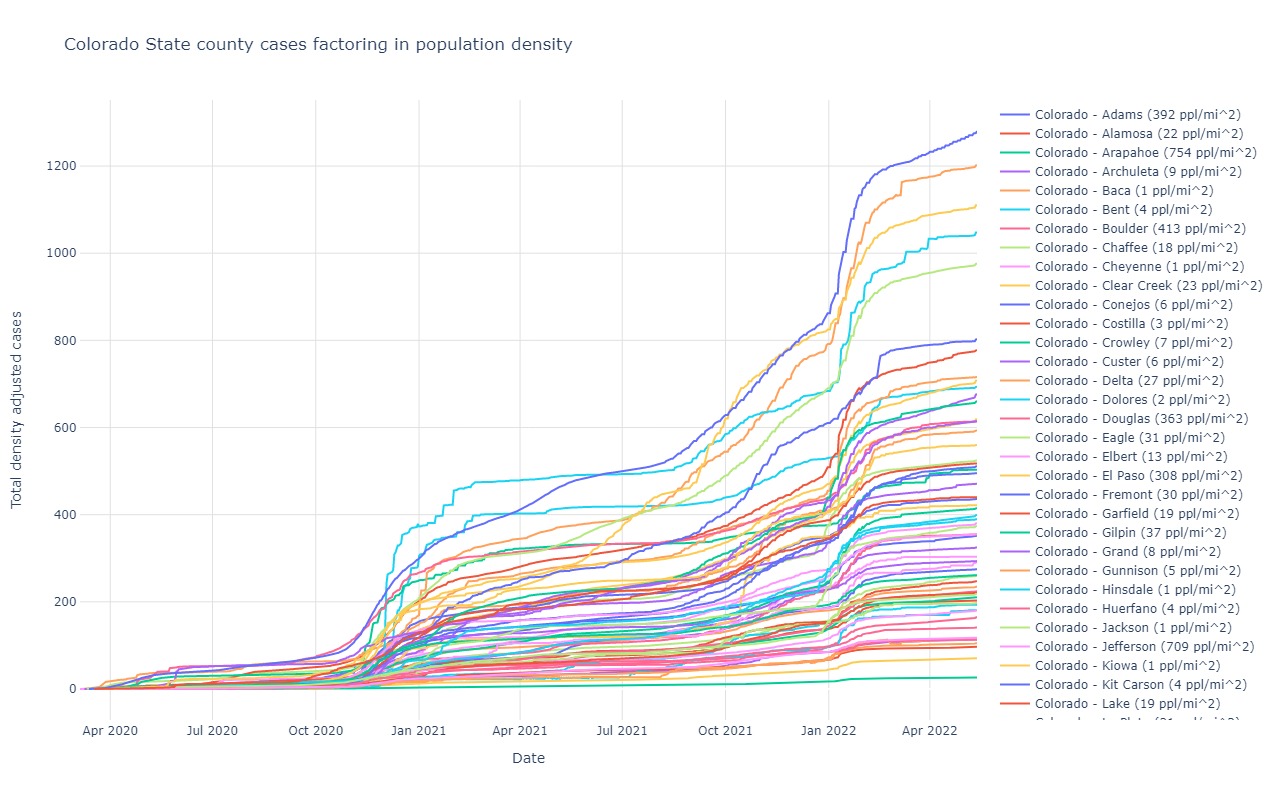
Colorado
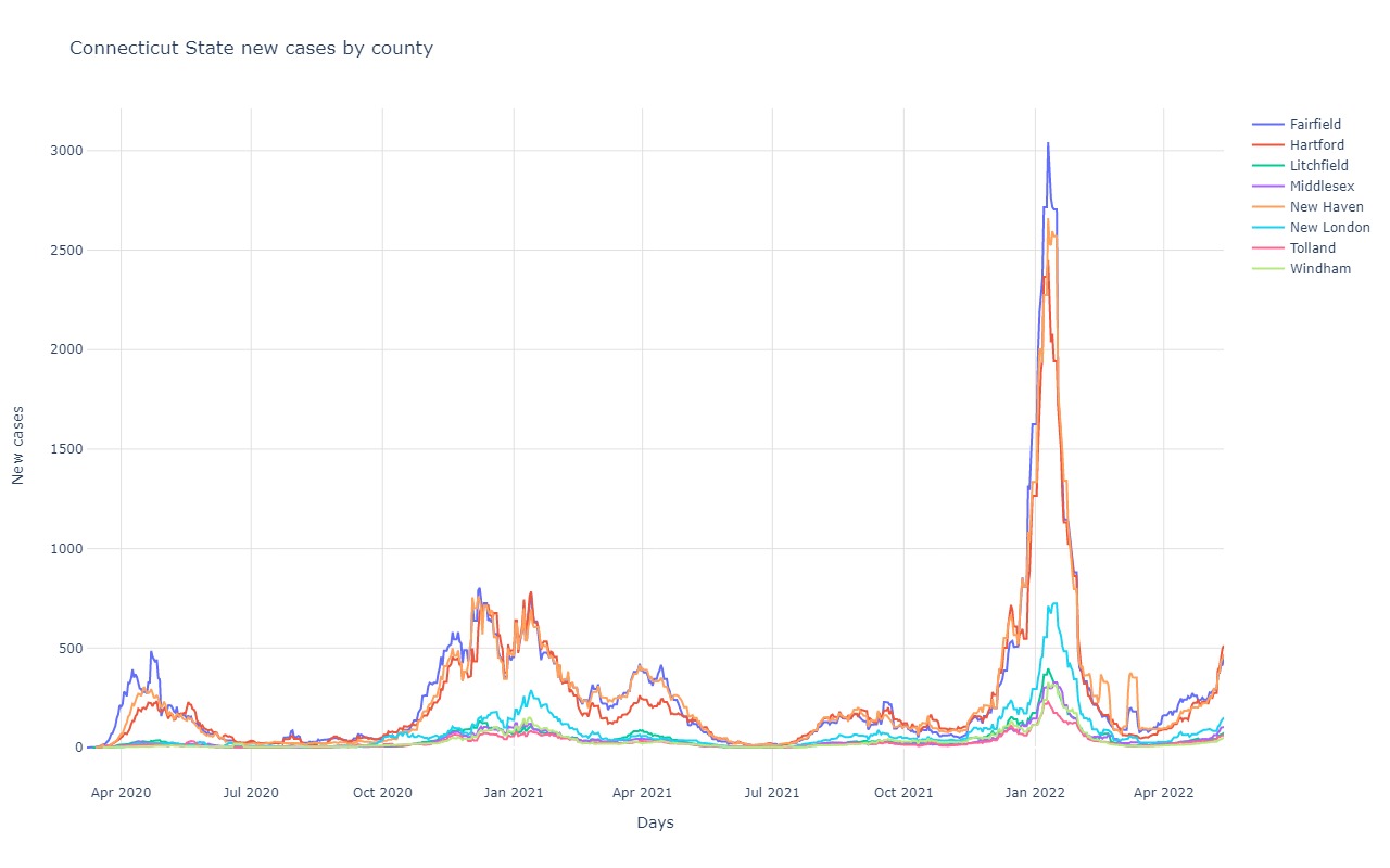
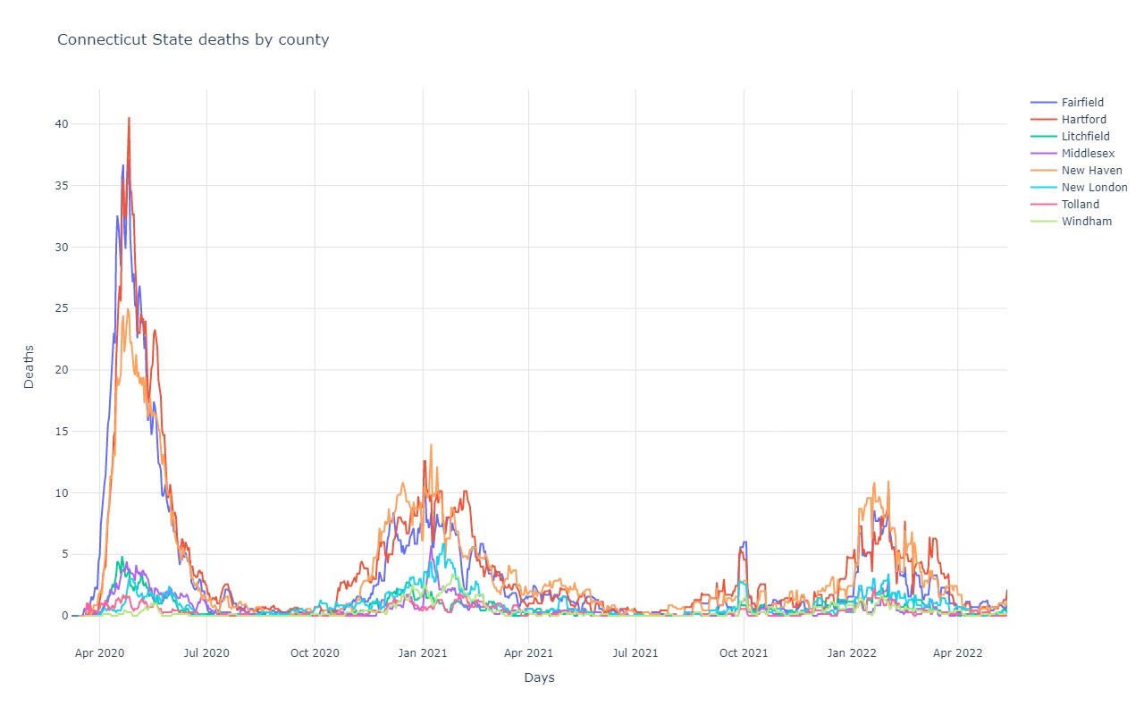
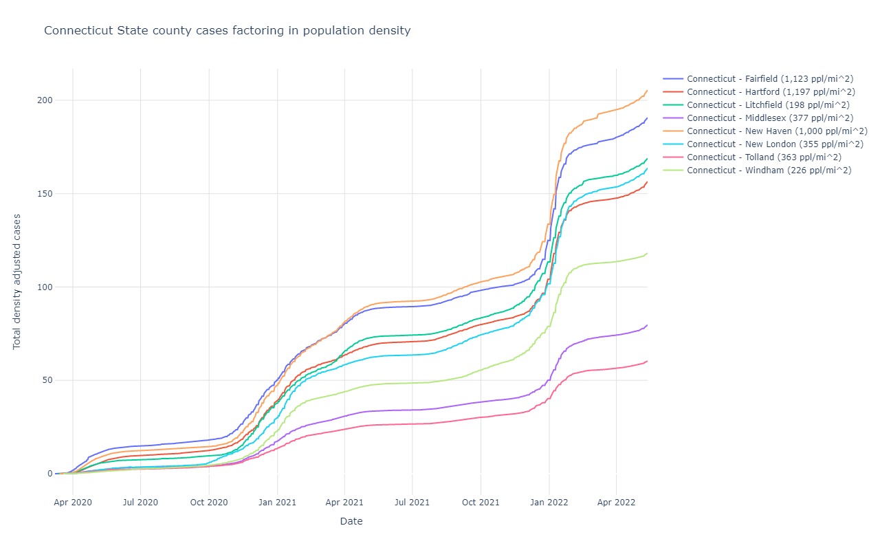
Connecticut
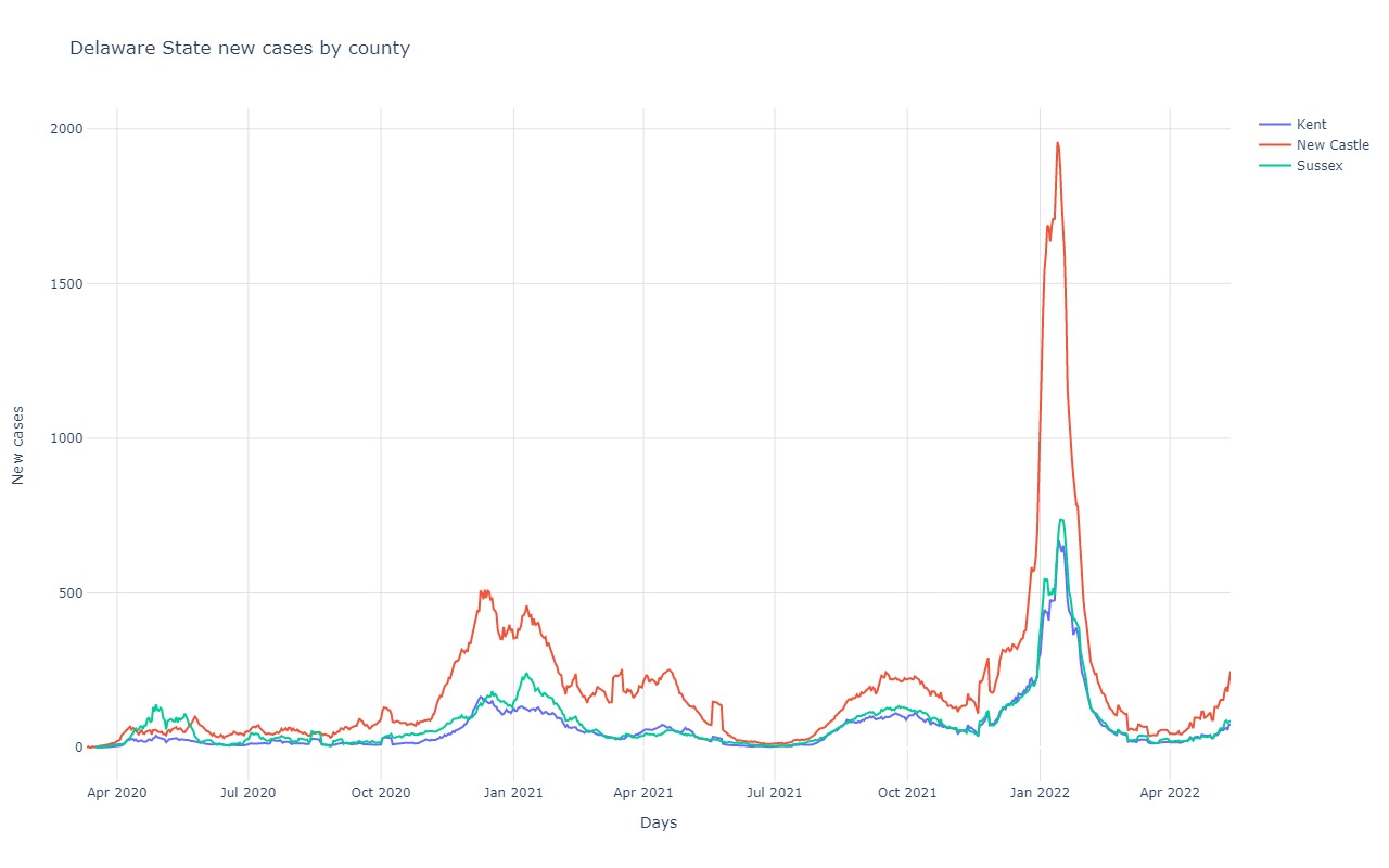
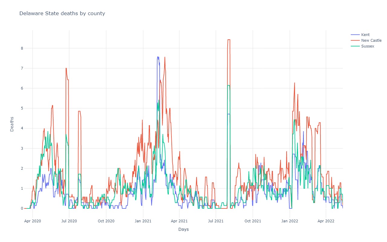
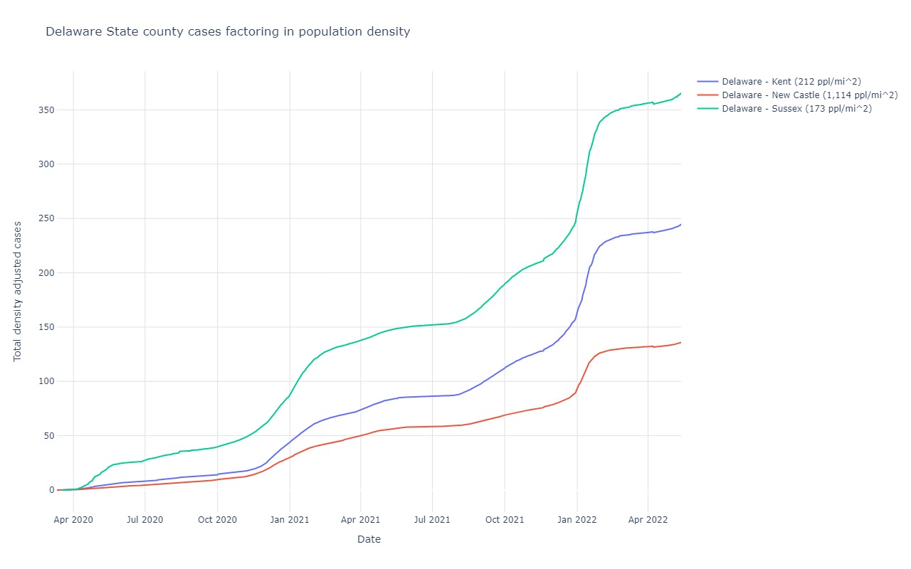
Delaware
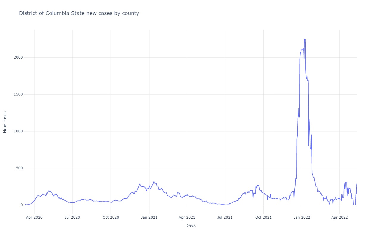
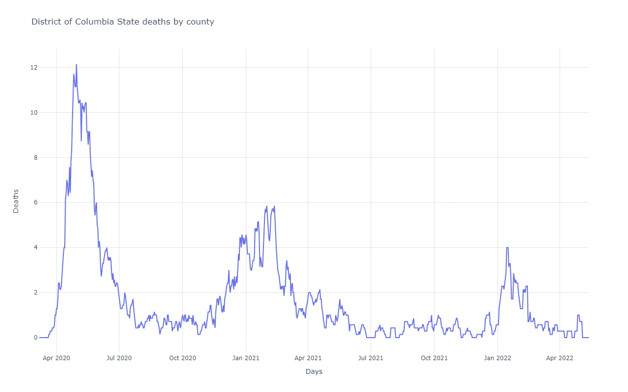
District of Columbia
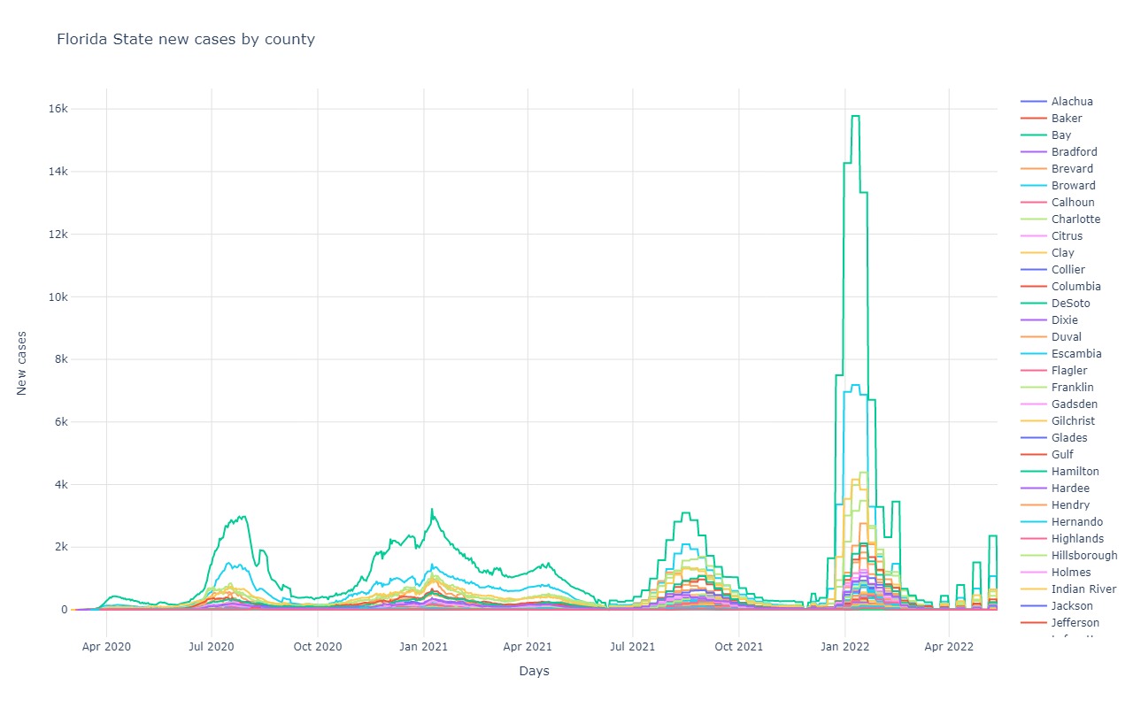
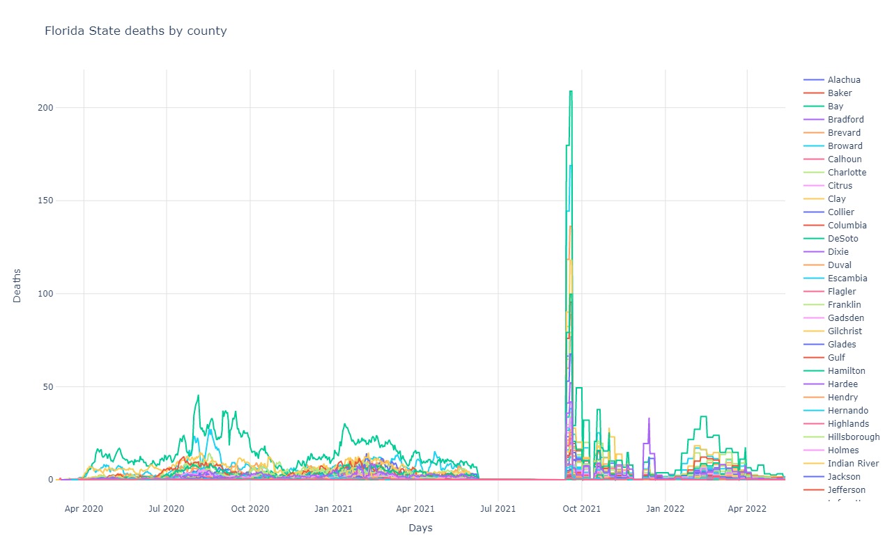
Florida
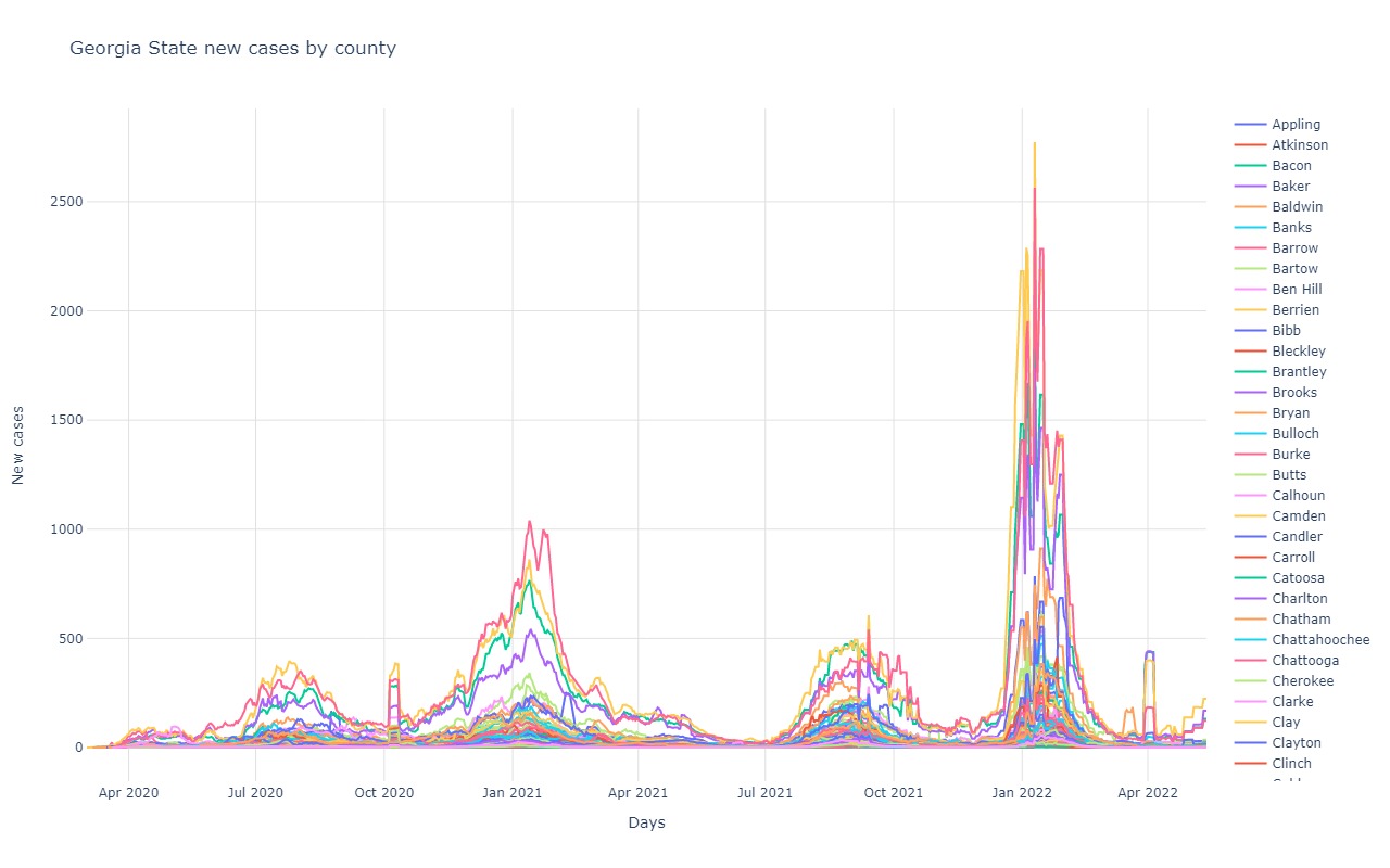
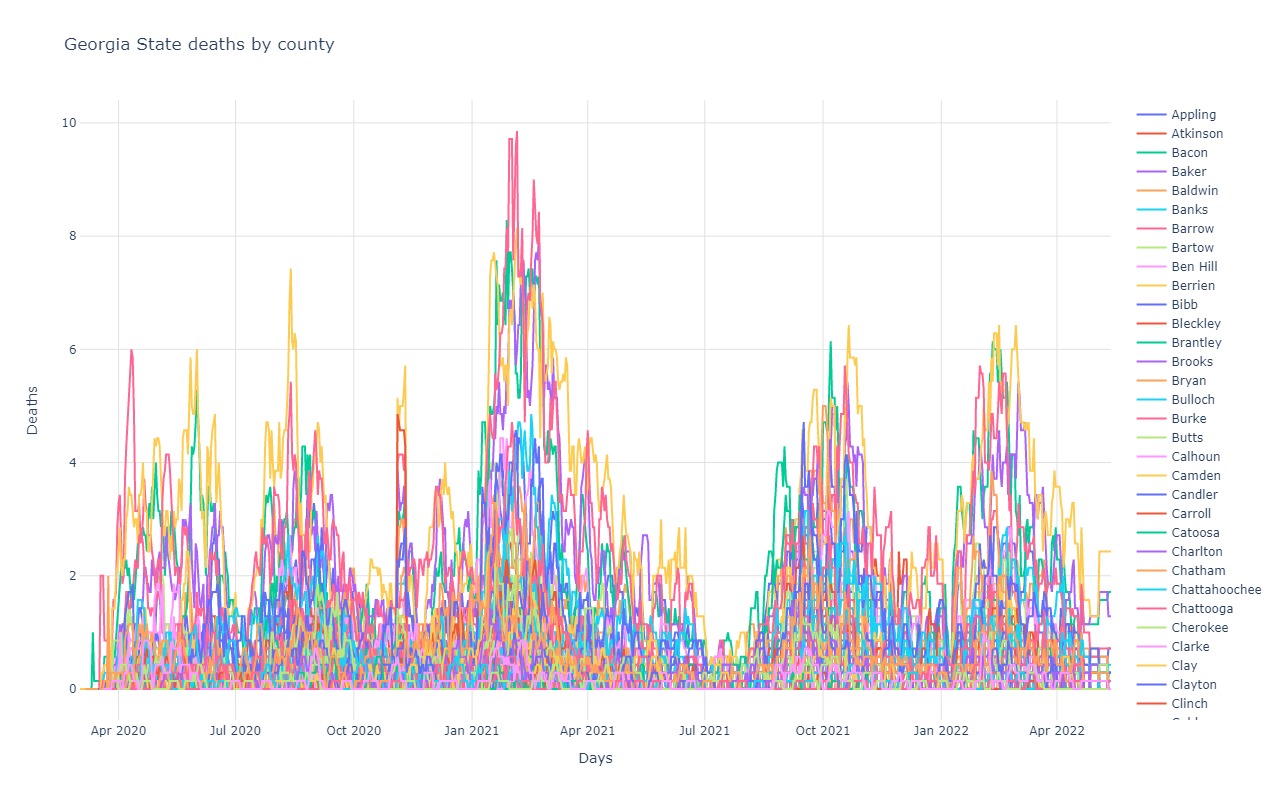
Georgia
Hawaii
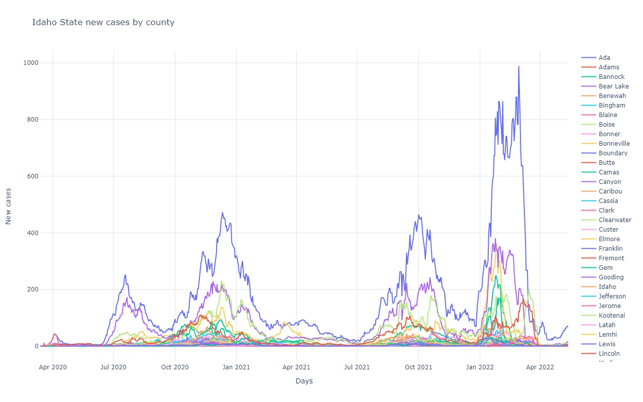
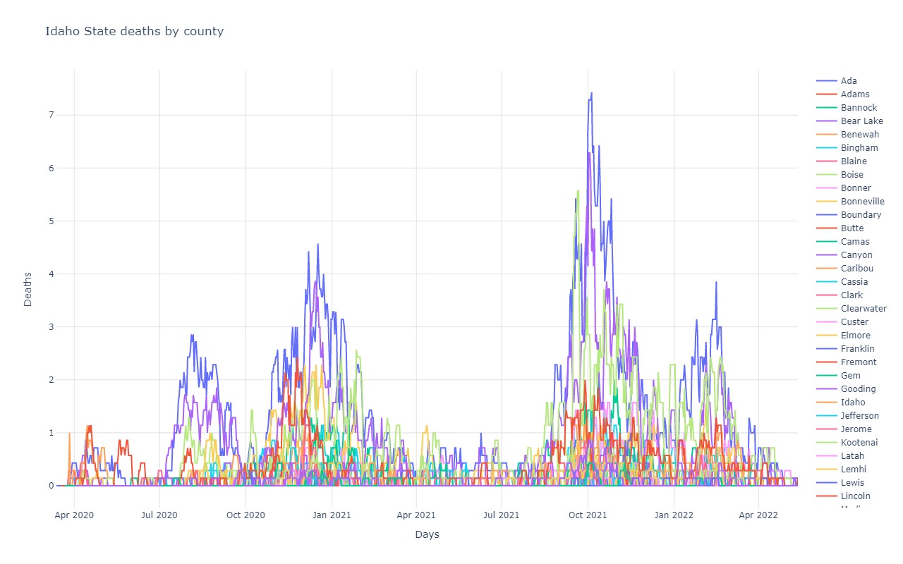
Idaho
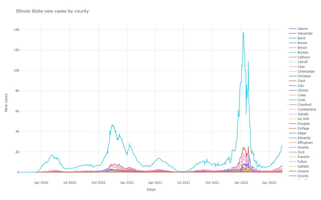
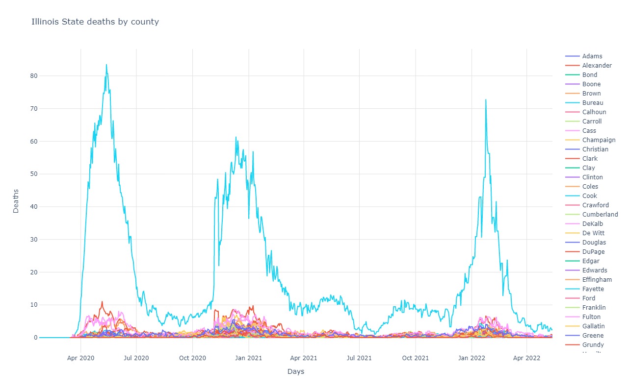
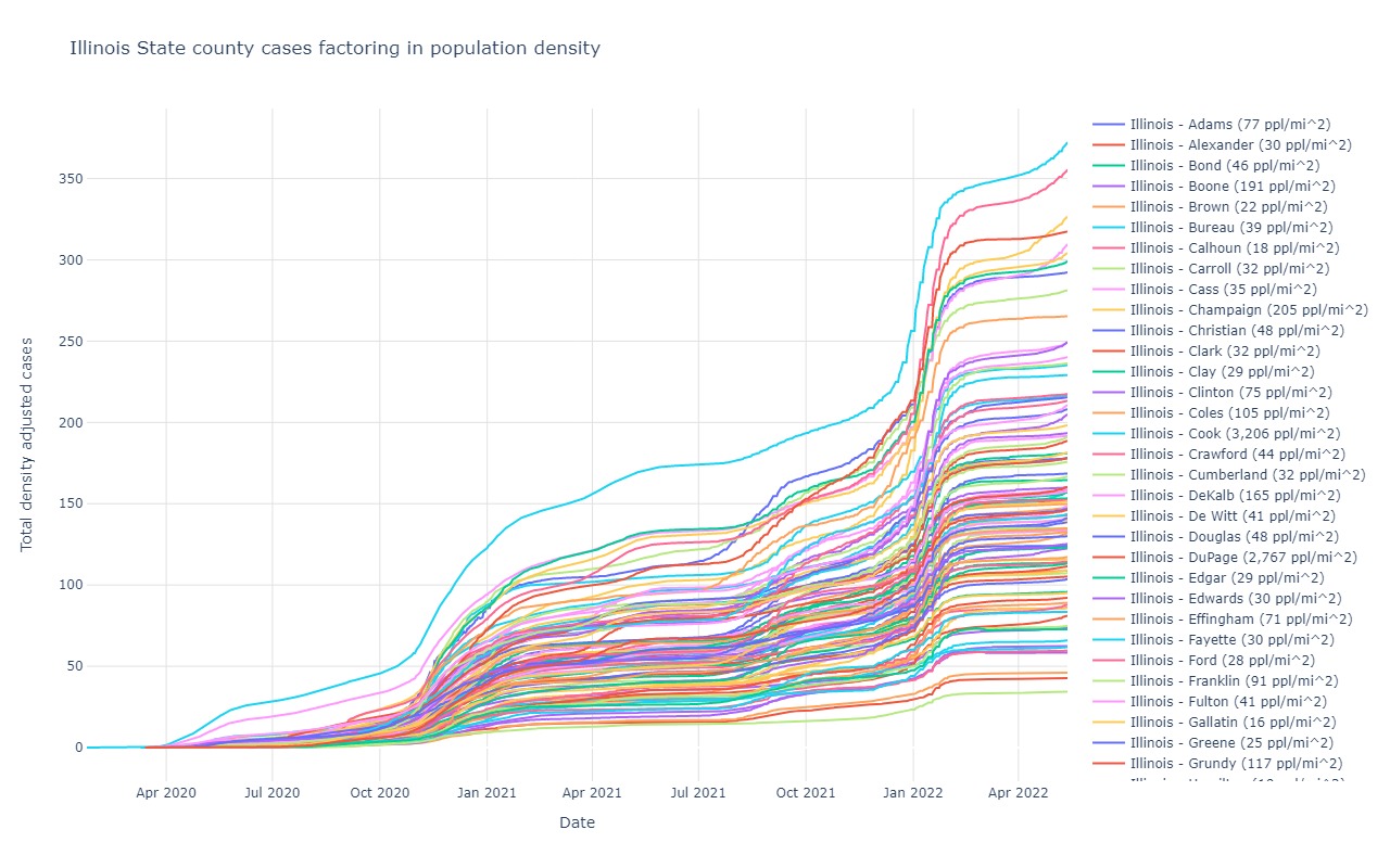
Illinois
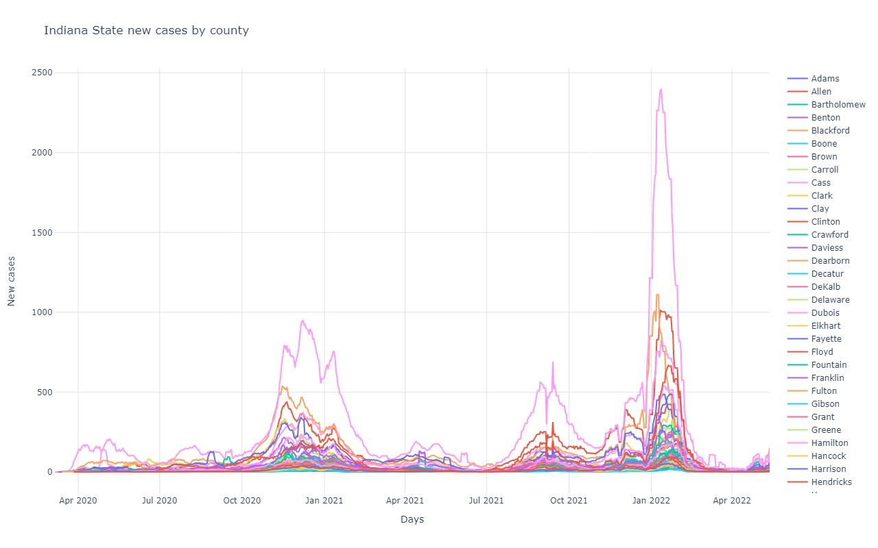
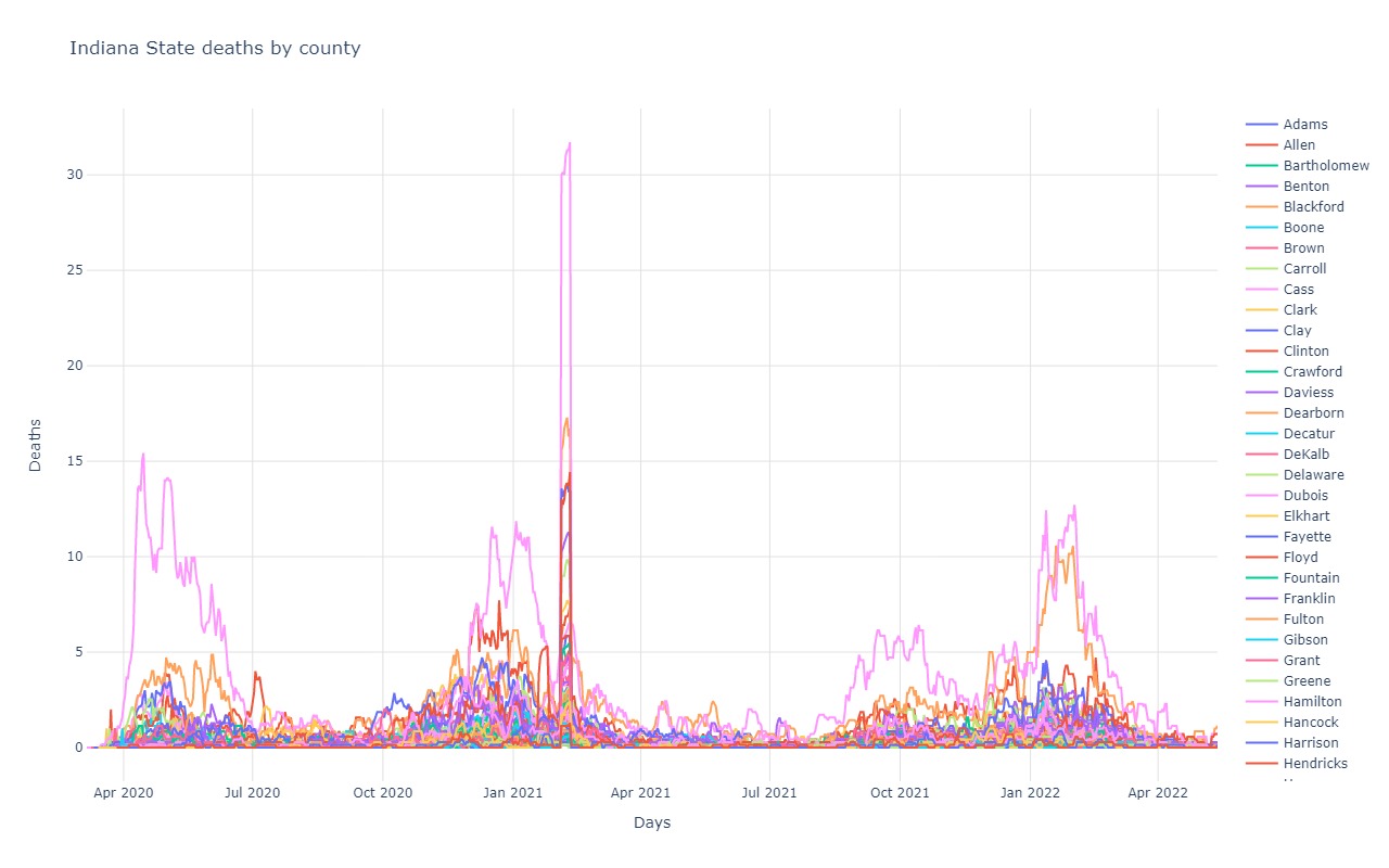
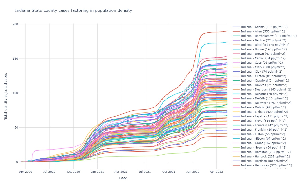
Indiana
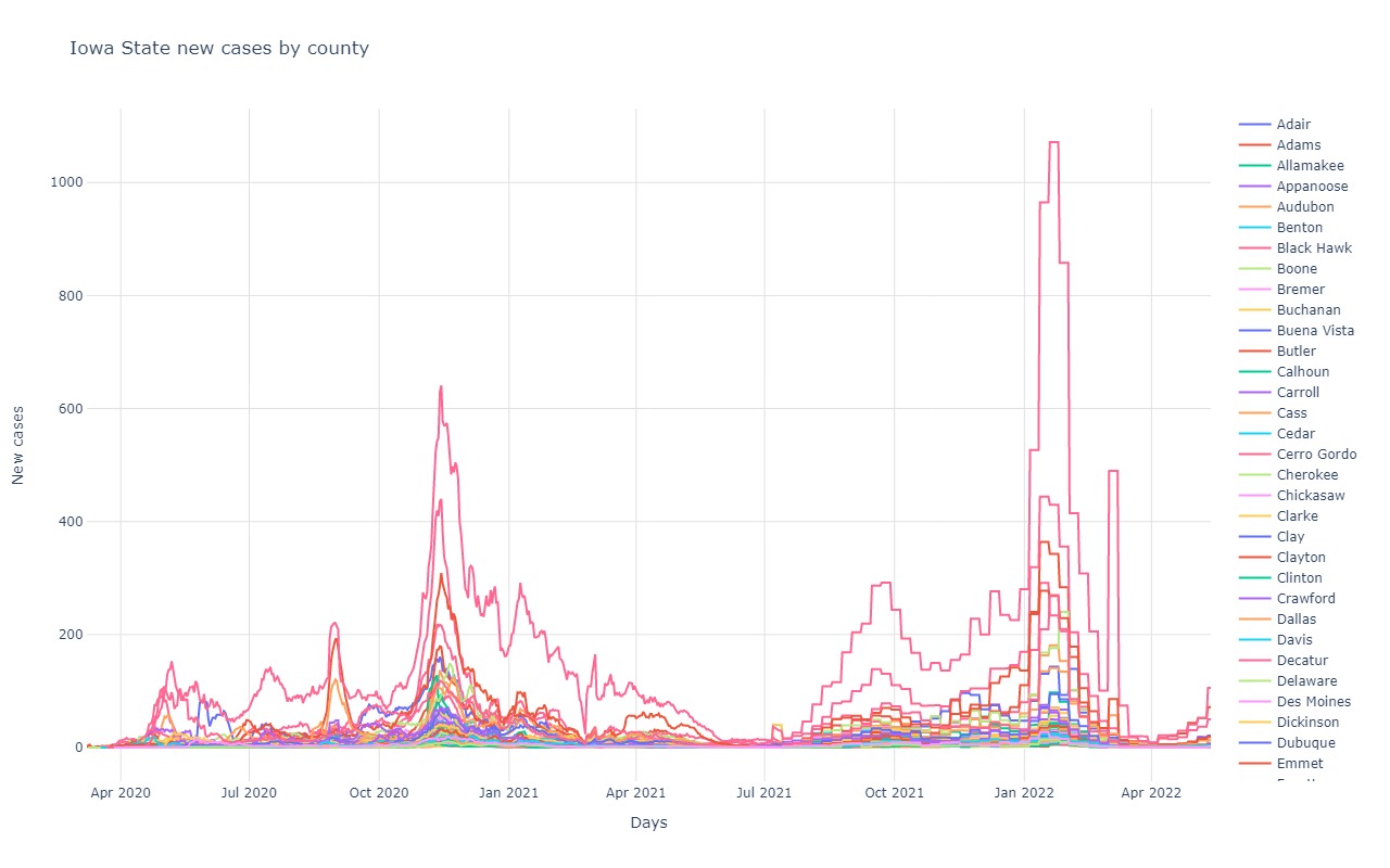
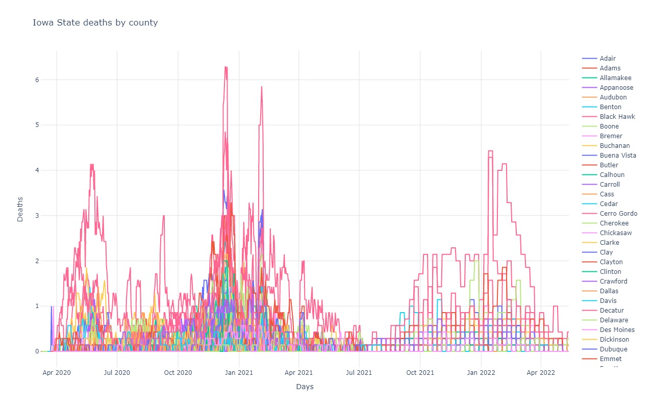
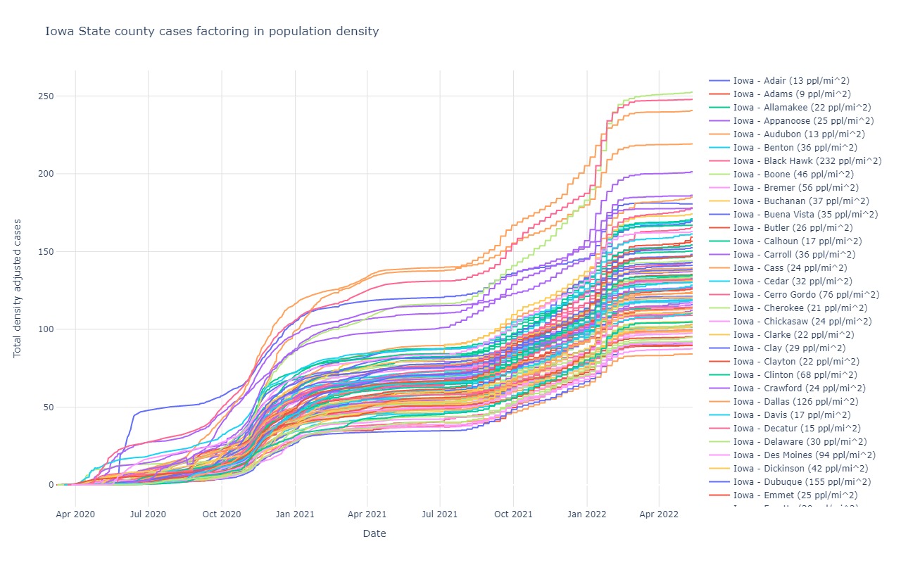
Iowa
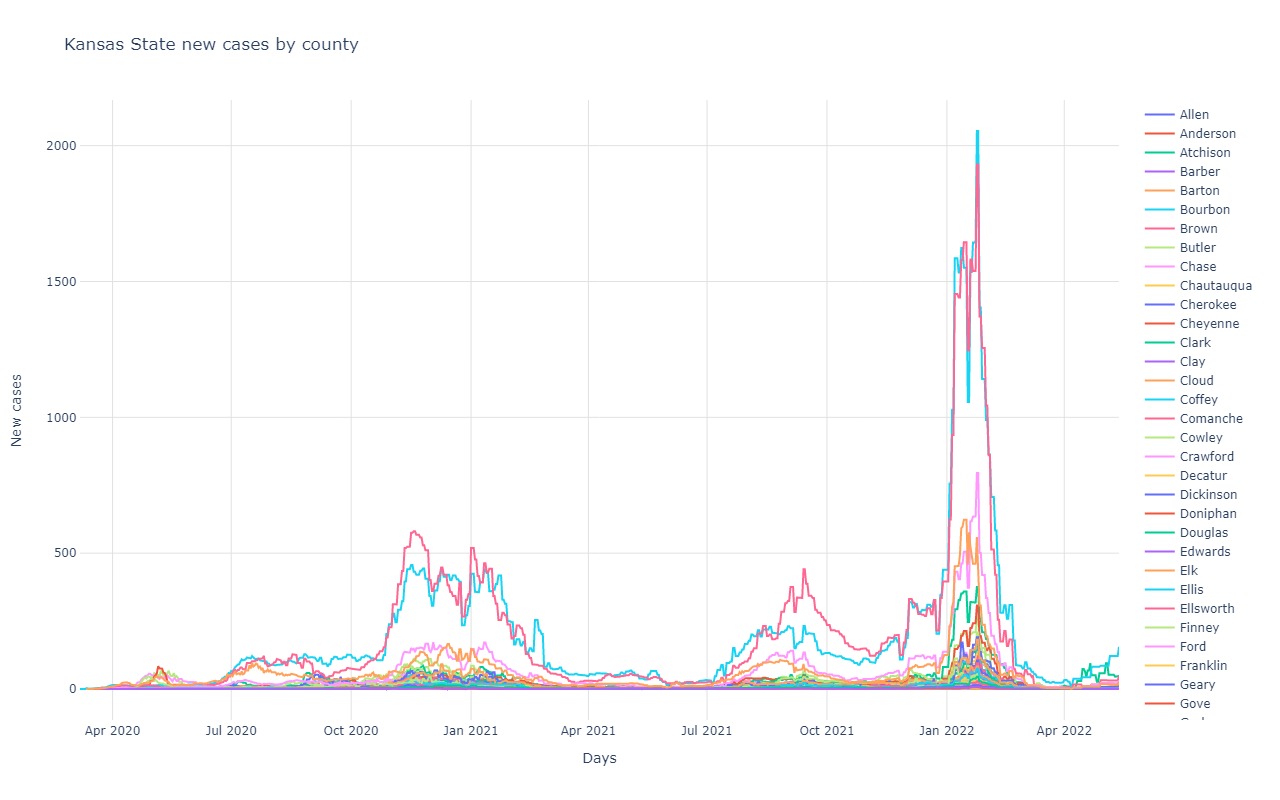
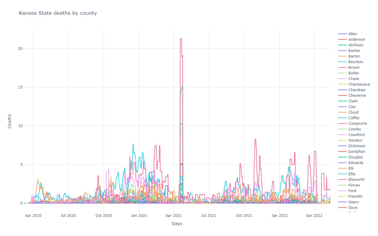
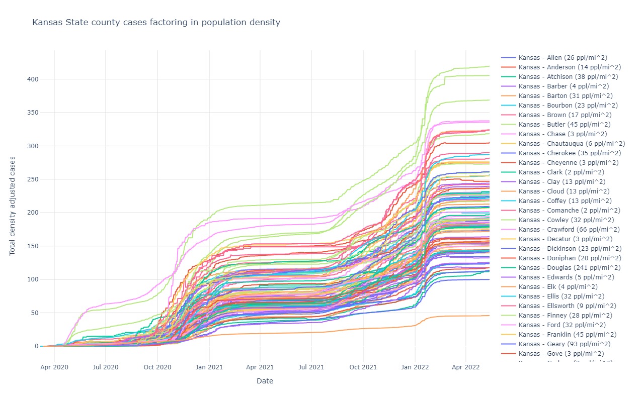
Kansas
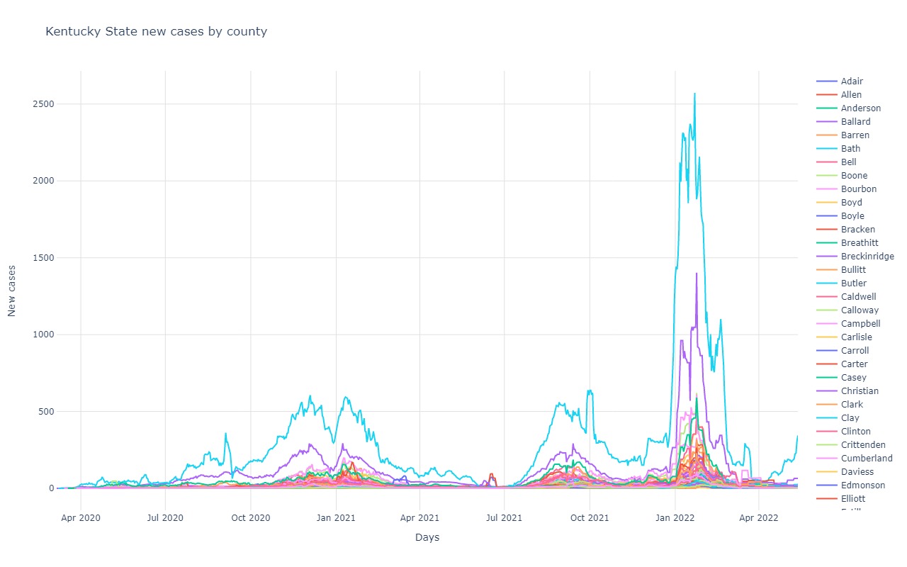
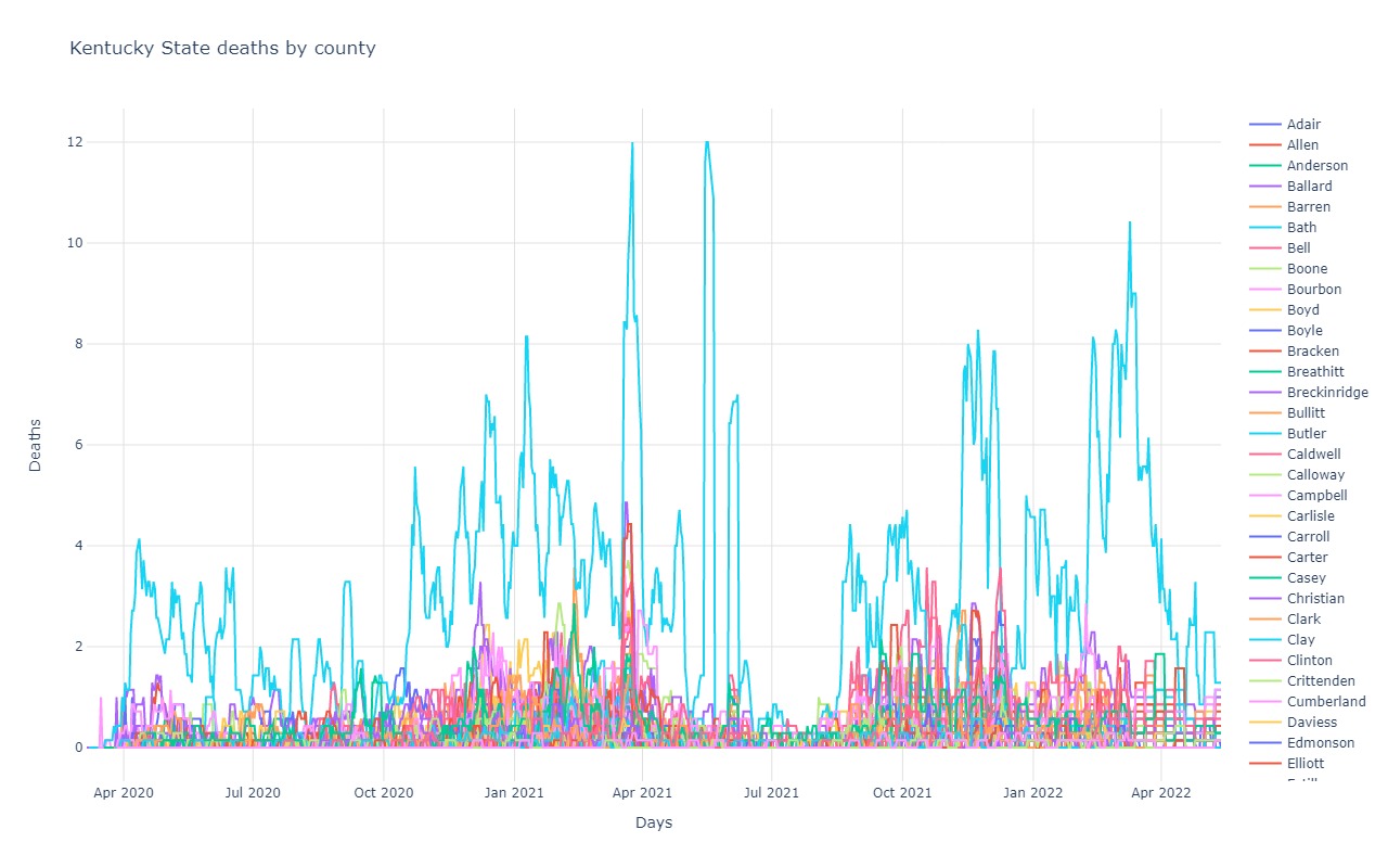
Kentucky
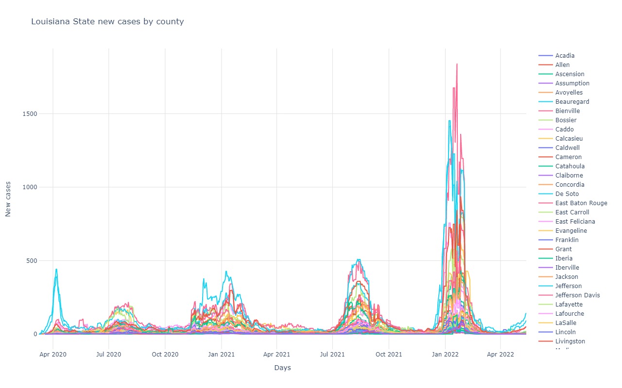
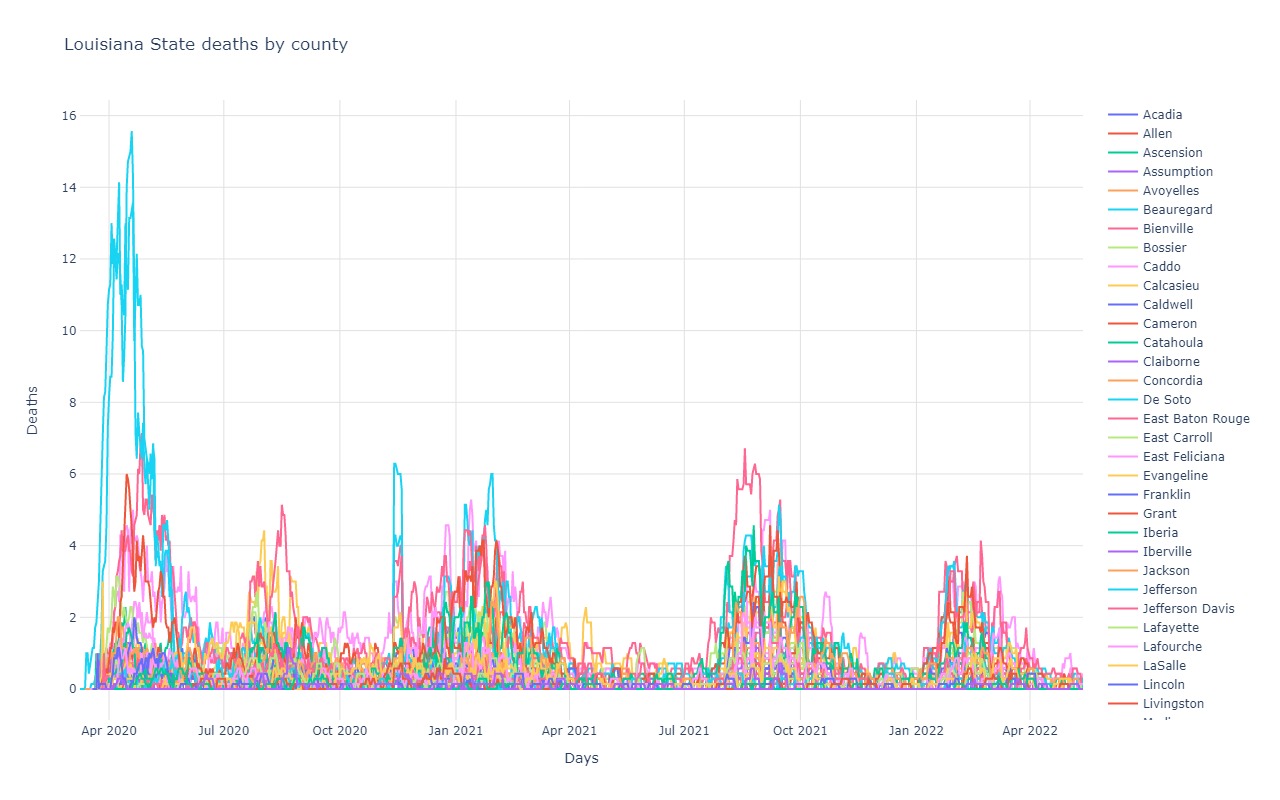
Louisiana
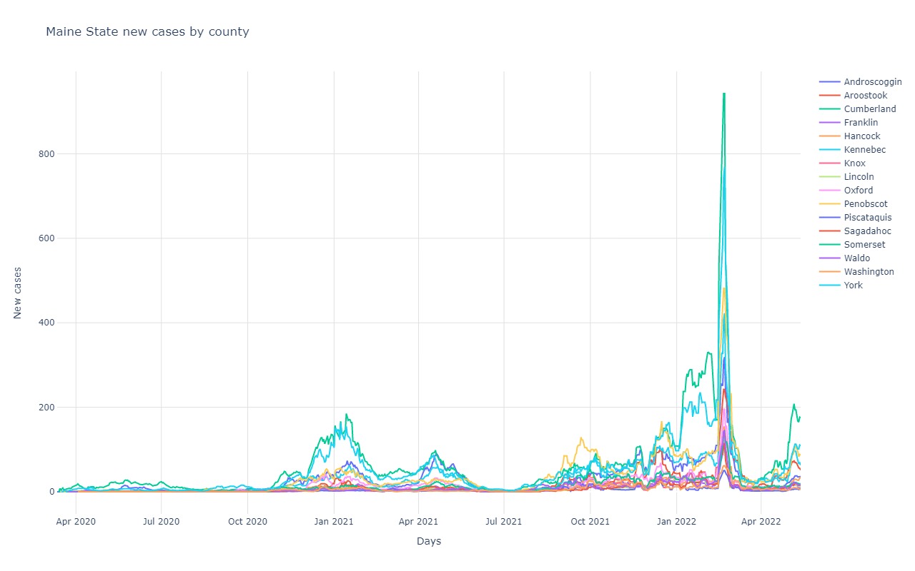
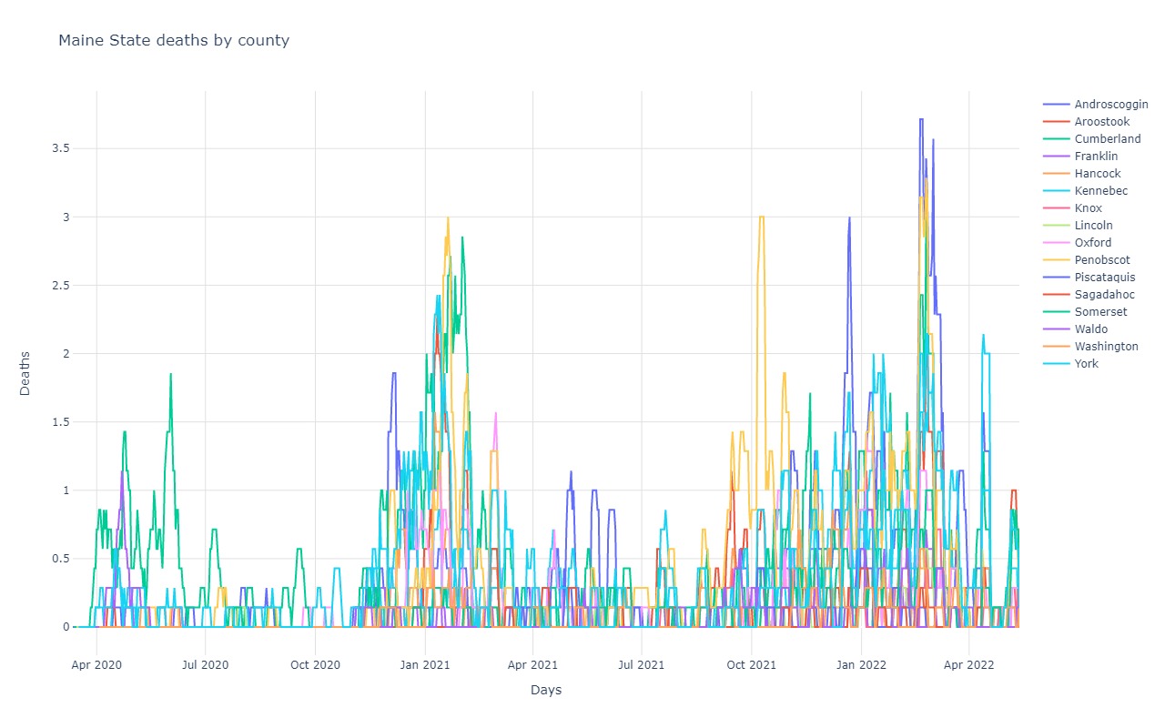
Maine
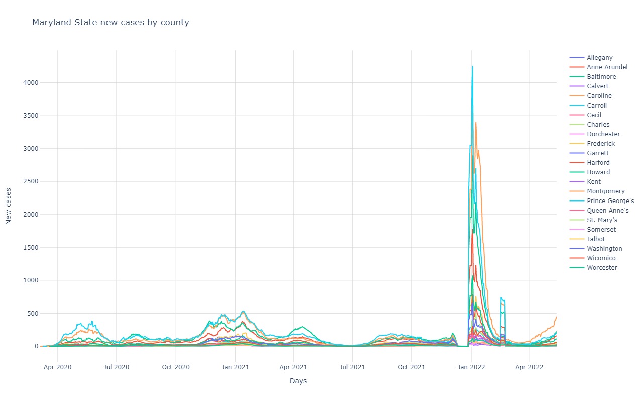
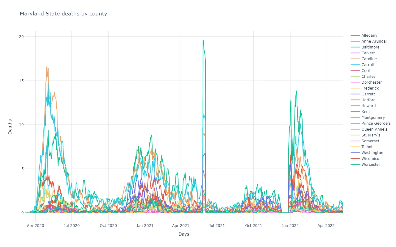
Maryland
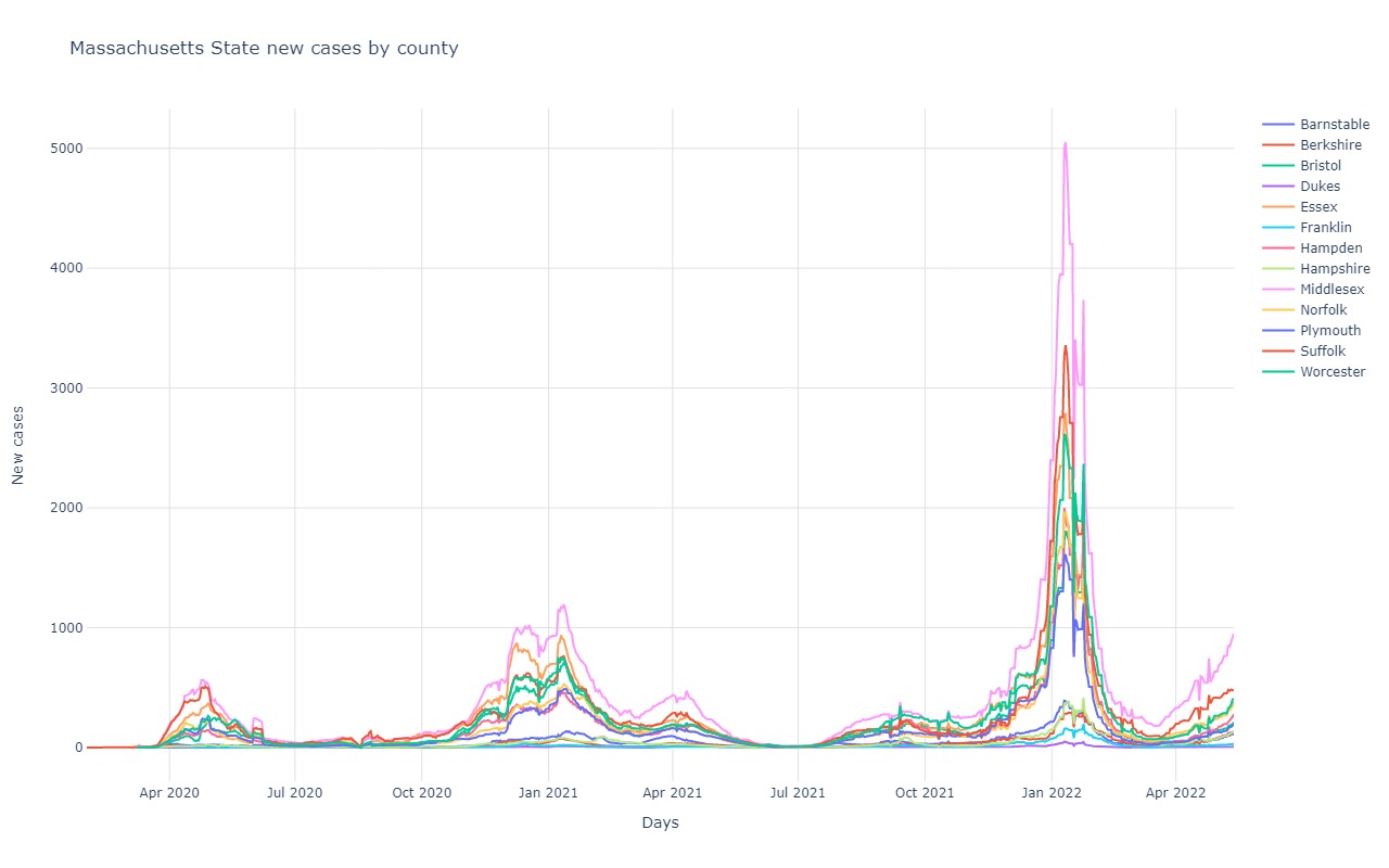
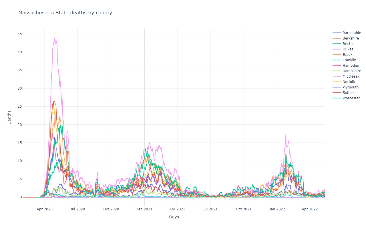
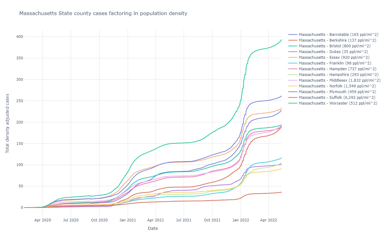
Massachusetts
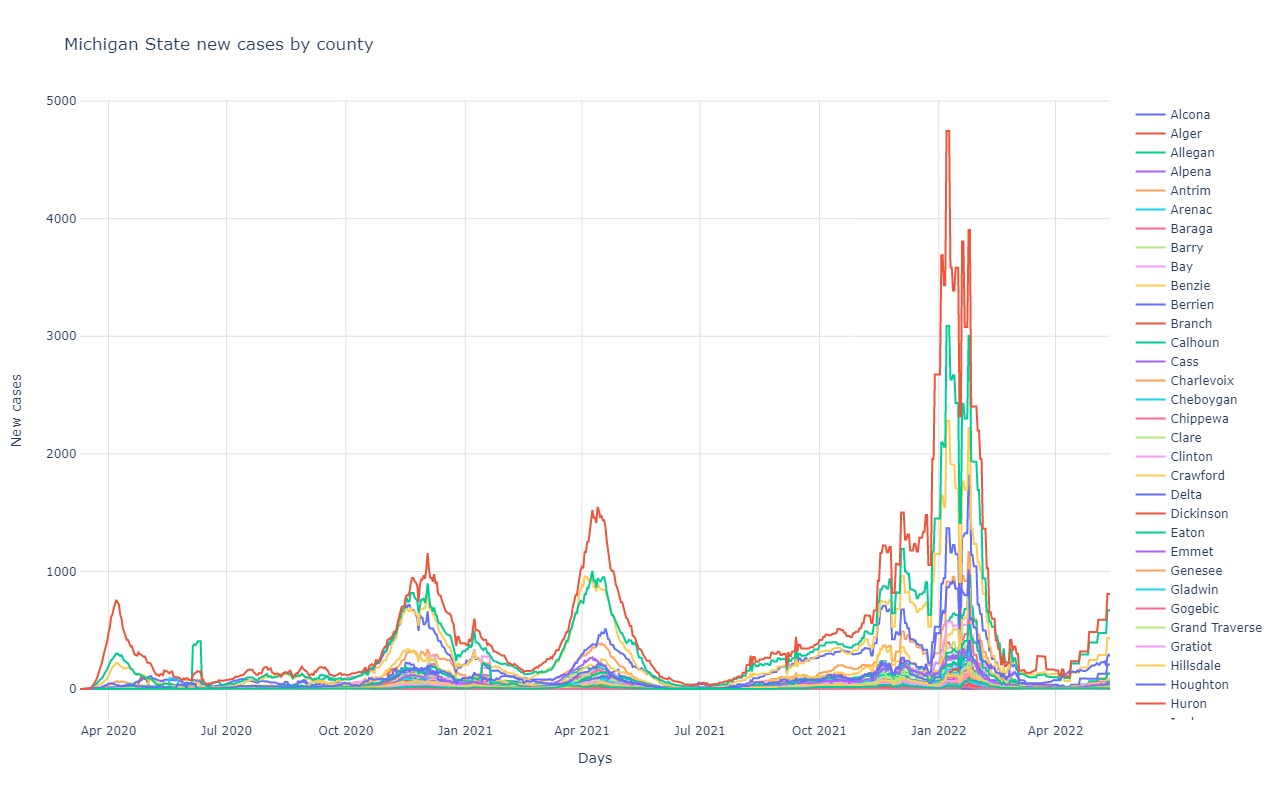
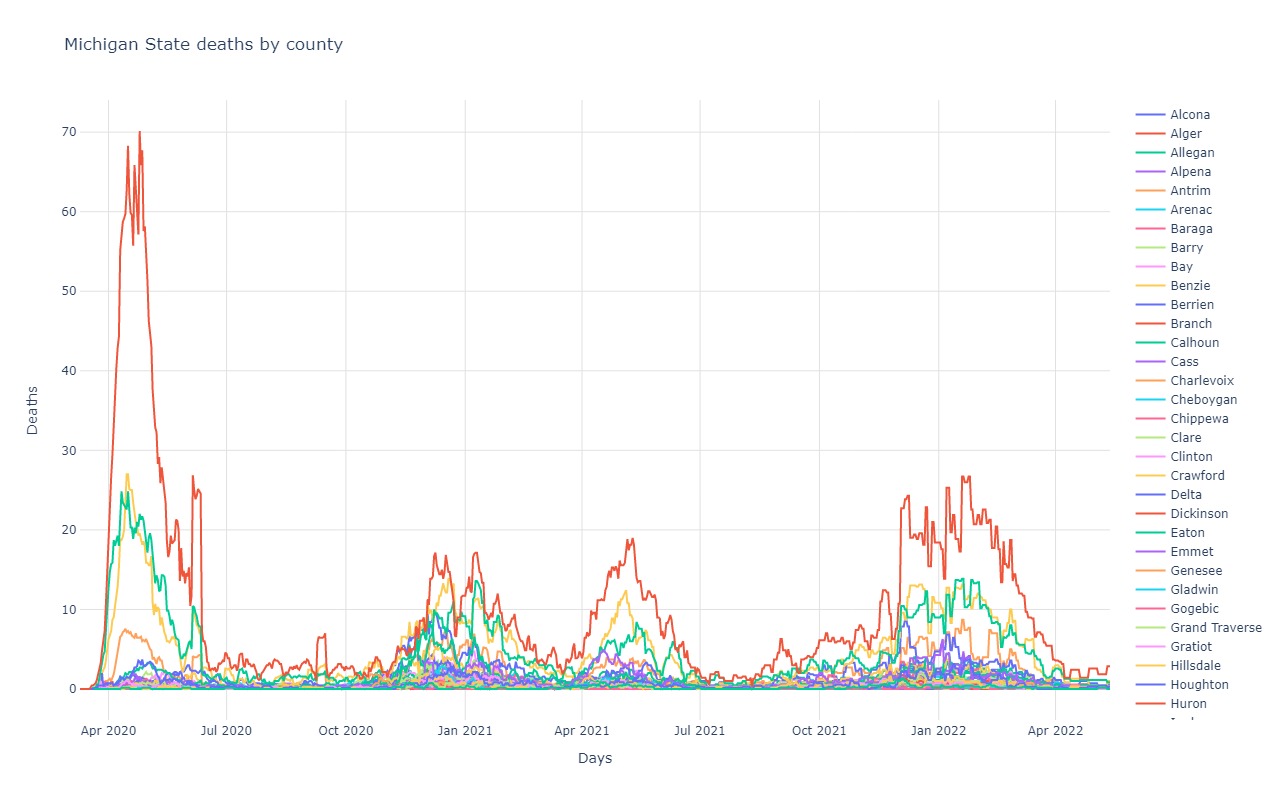
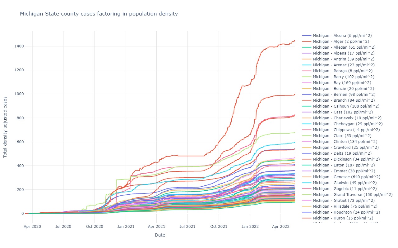
Michigan
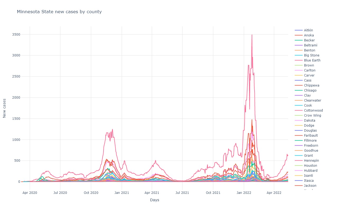
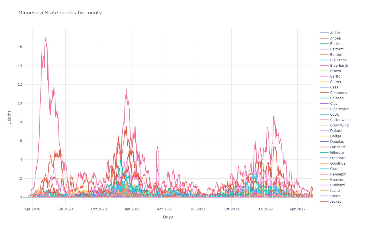
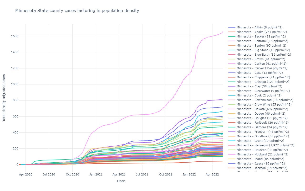
Minnesota
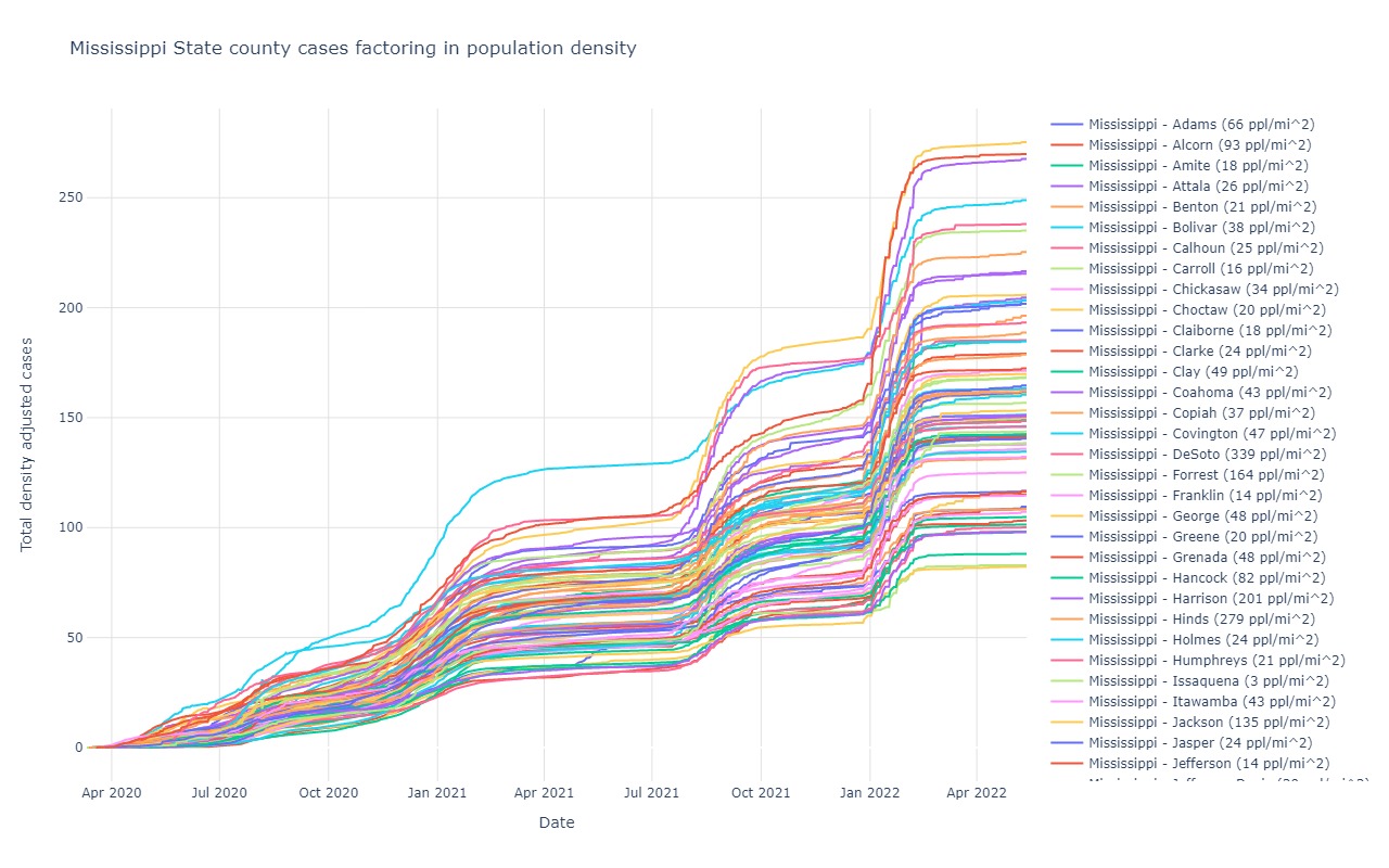
Mississippi
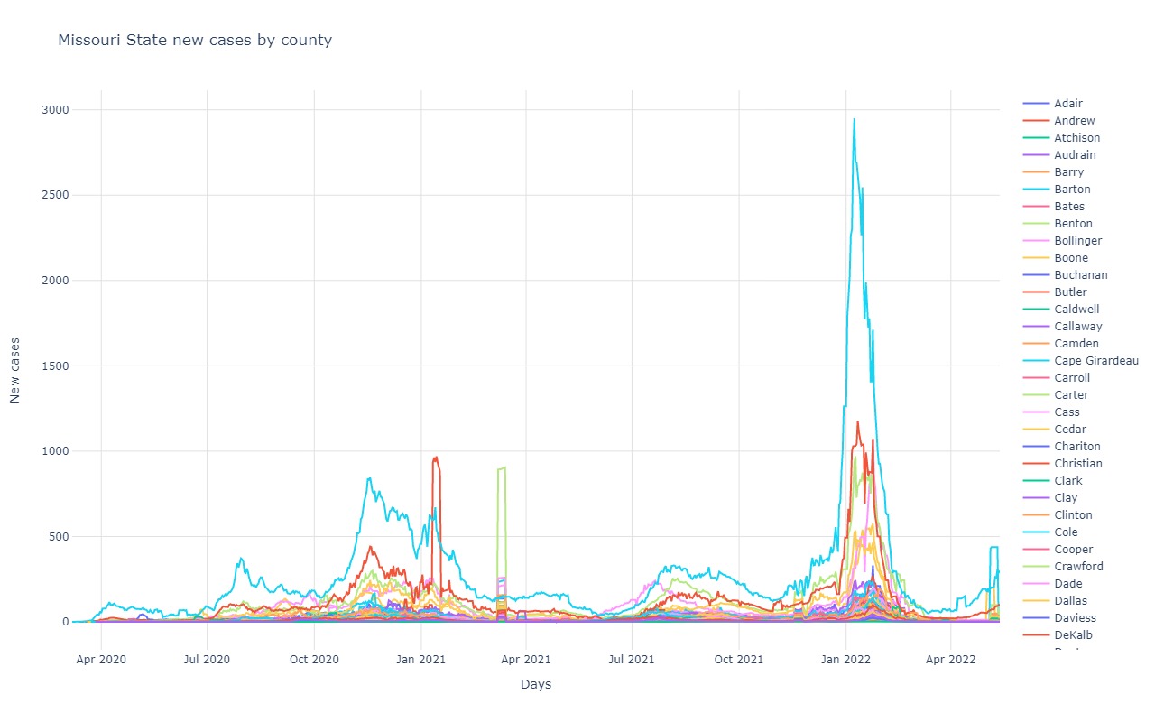
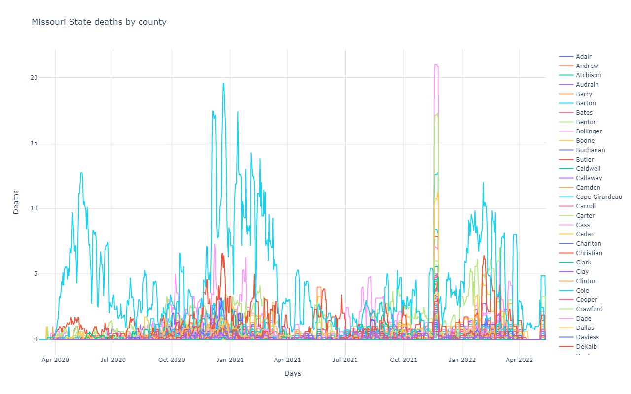
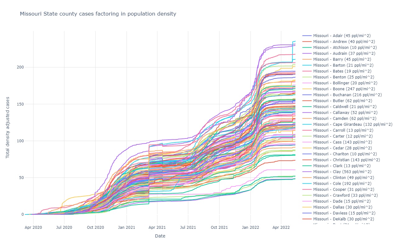
Missouri
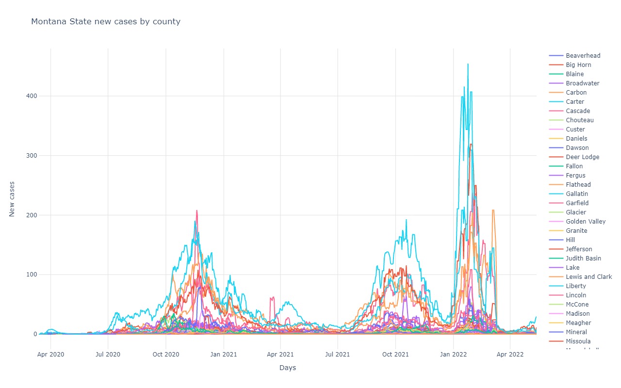
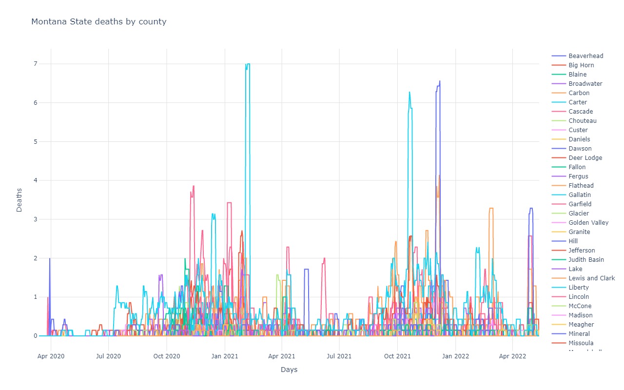
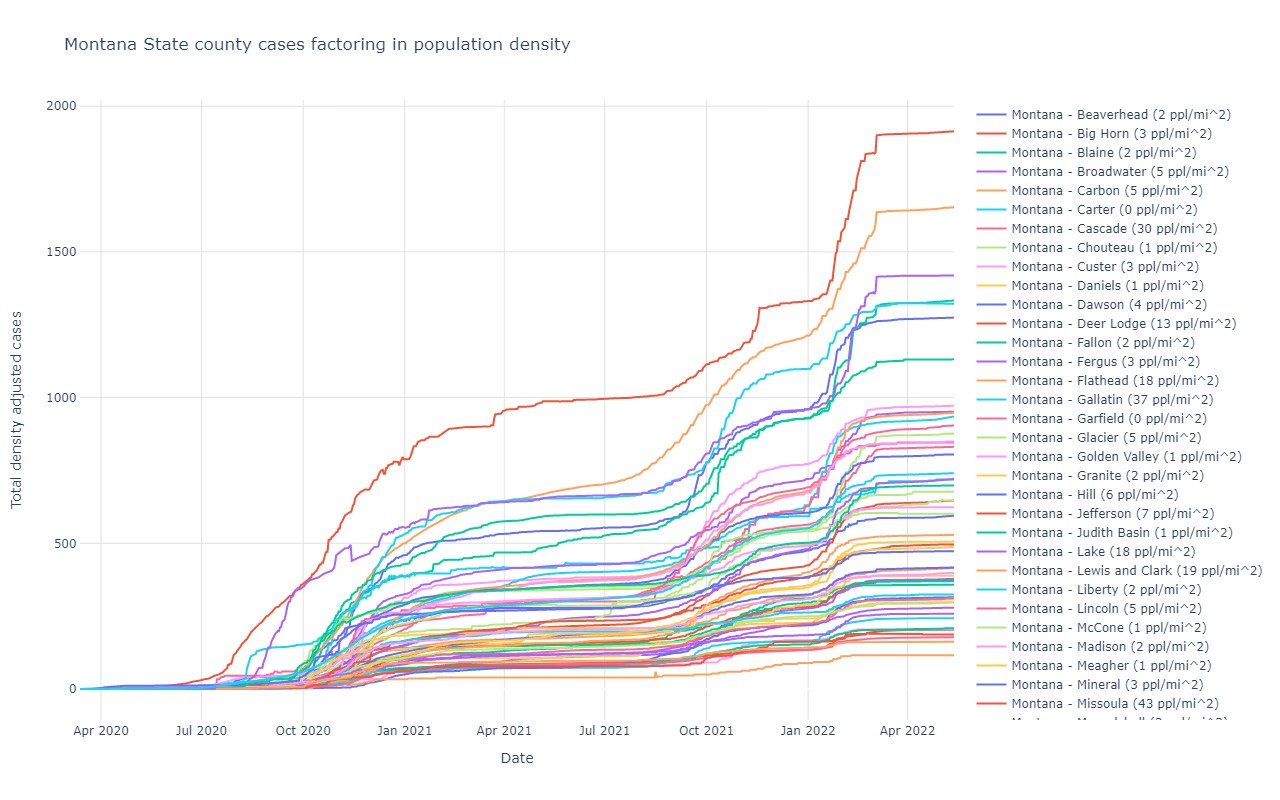
Montana
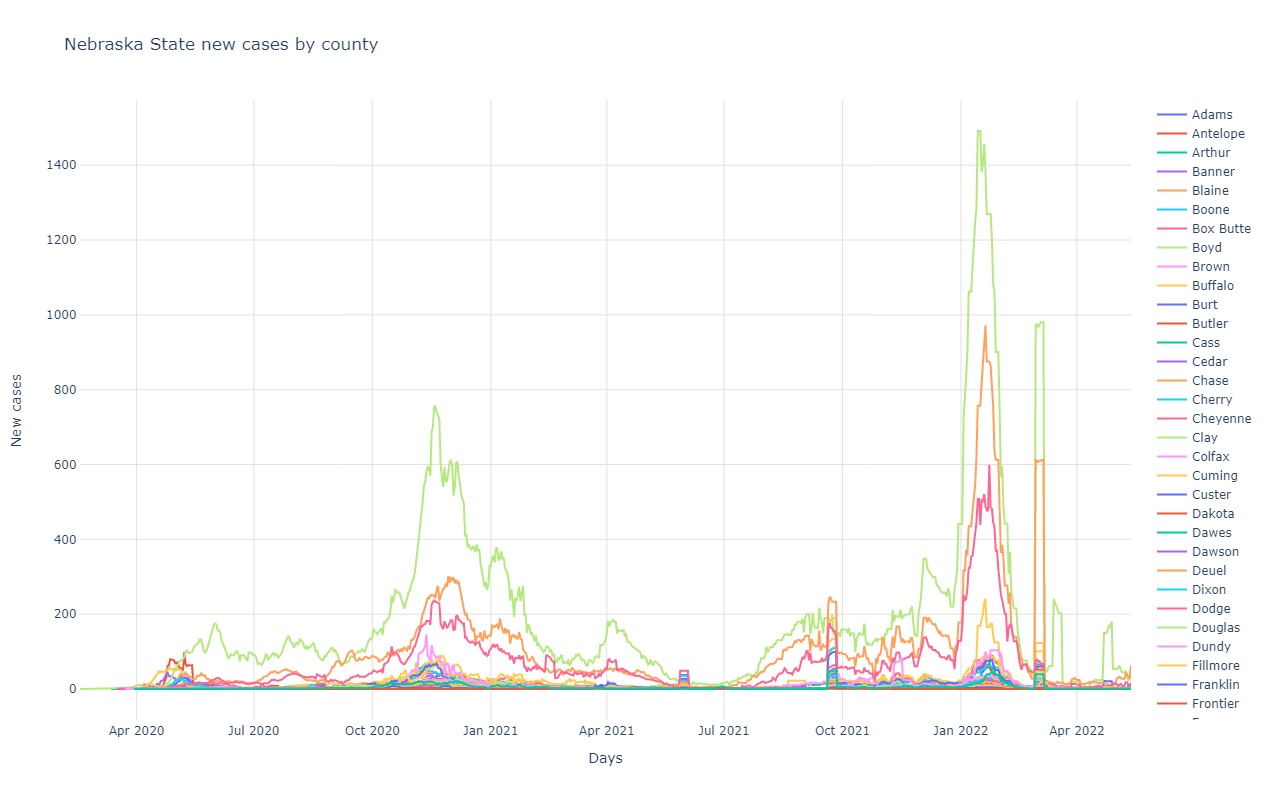
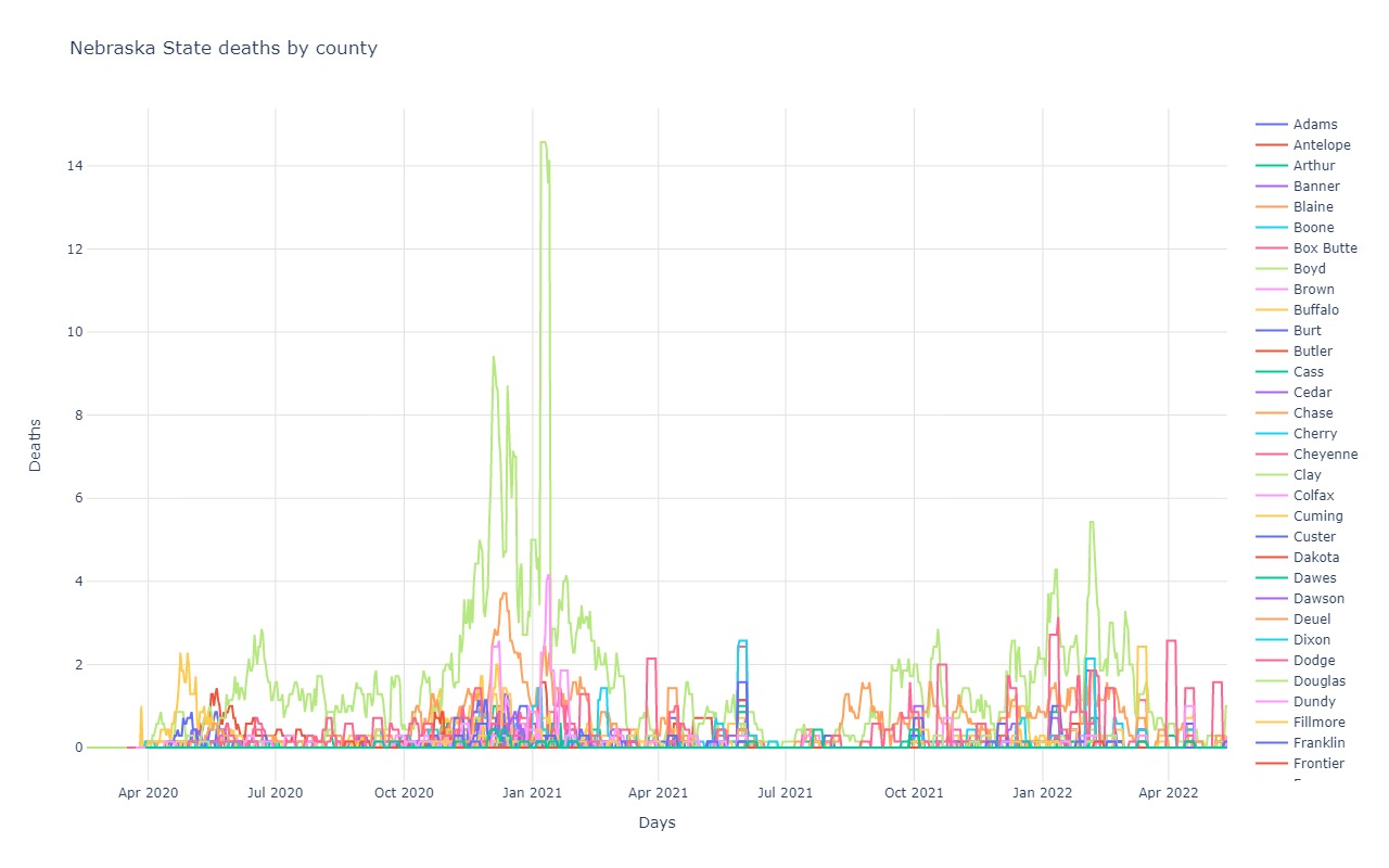
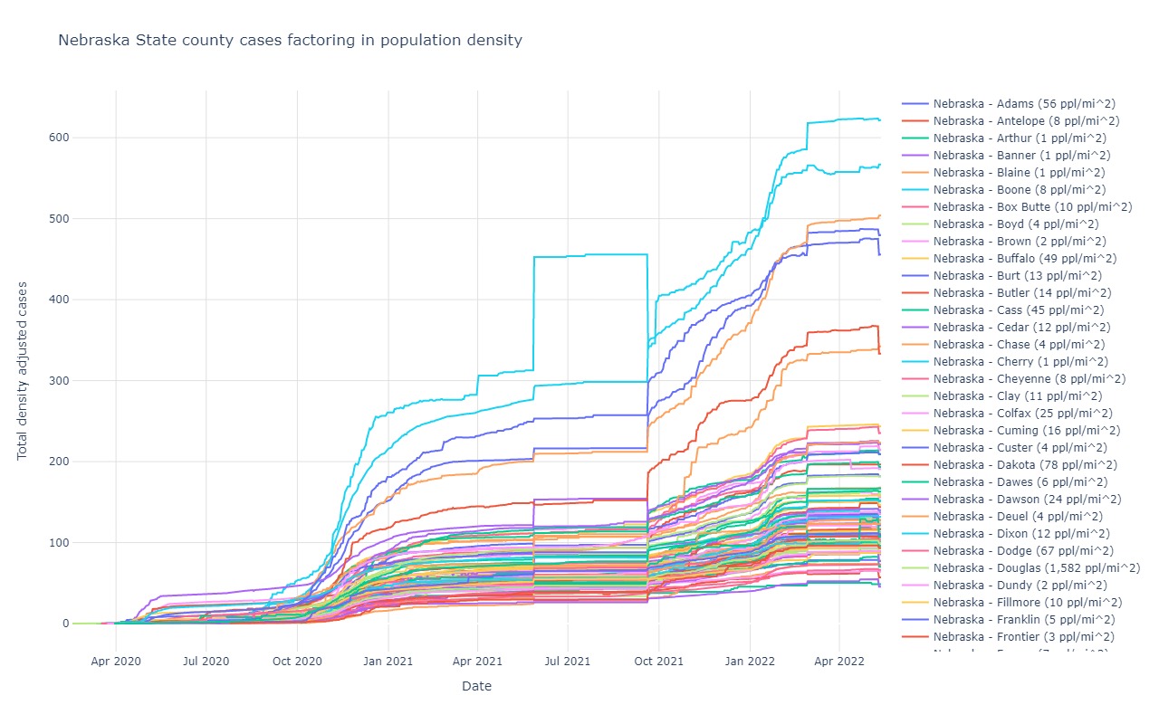
Nebraska
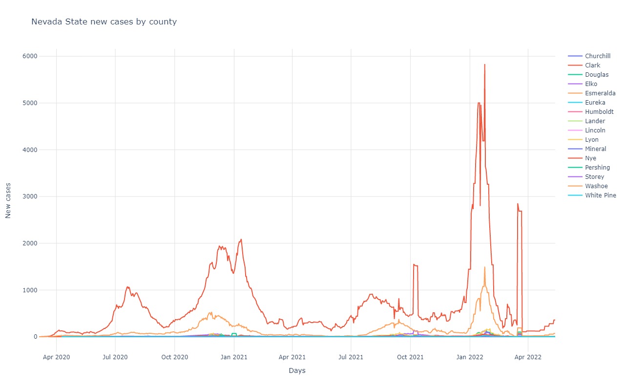
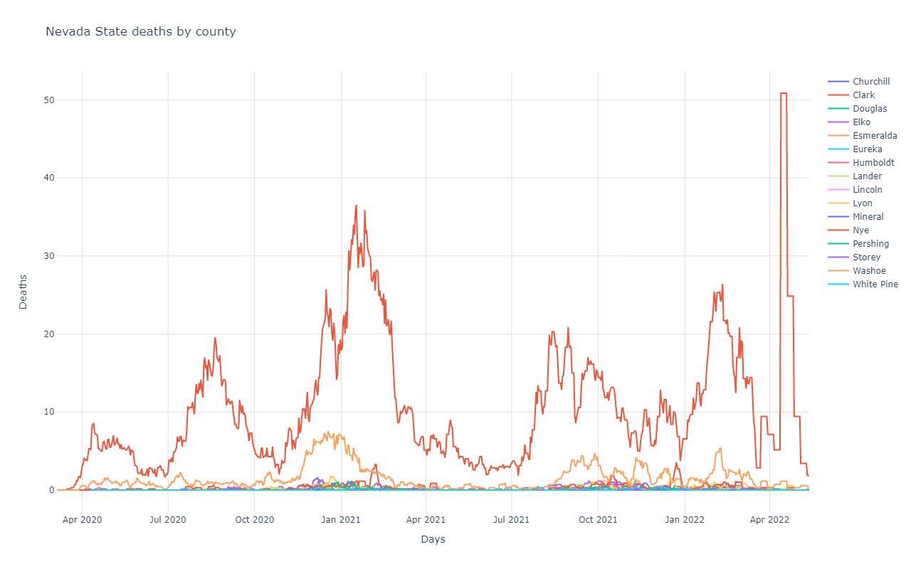
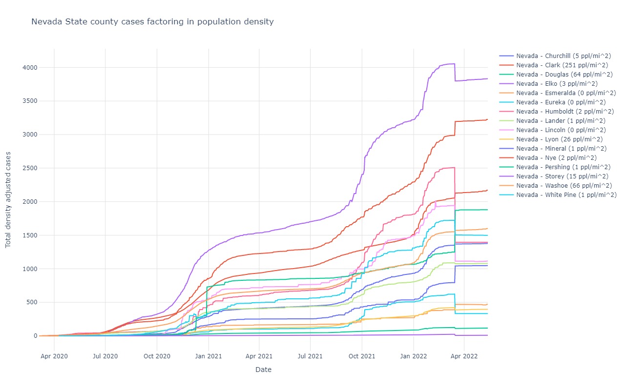
Nevada
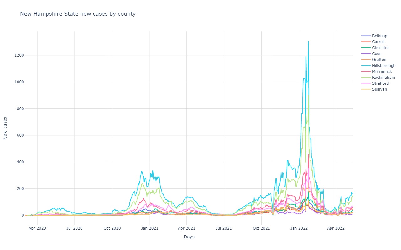
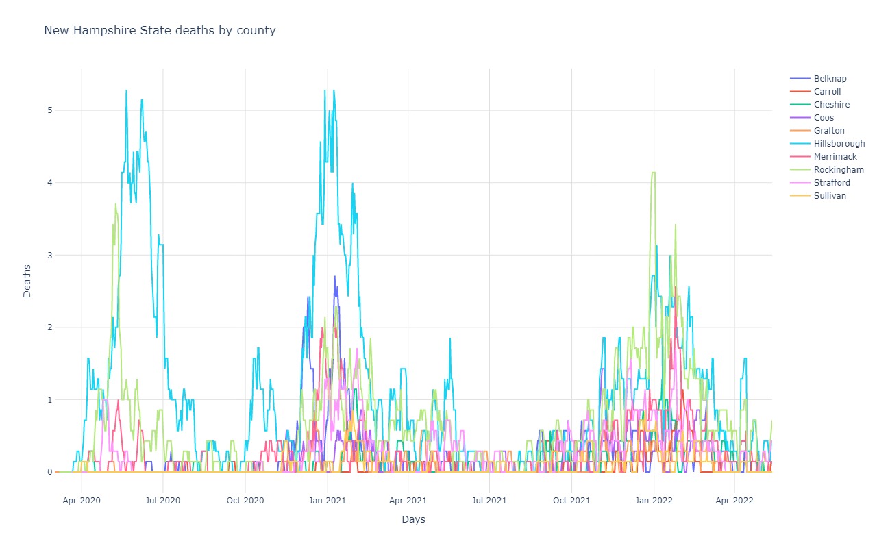
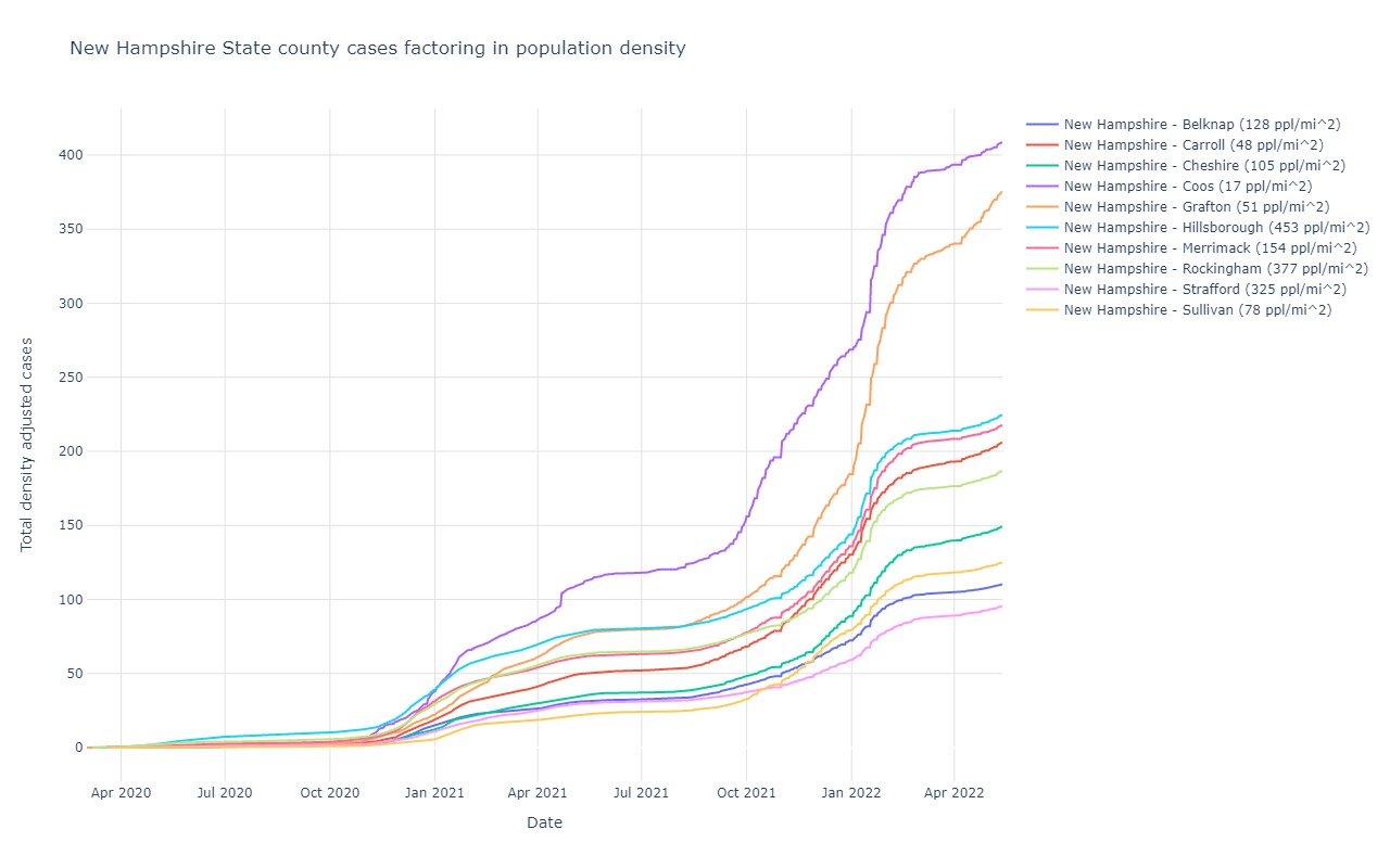
New Hampshire
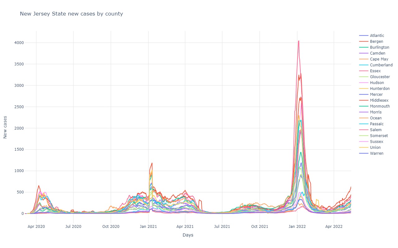
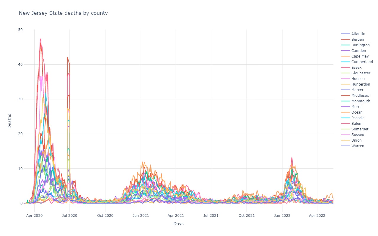
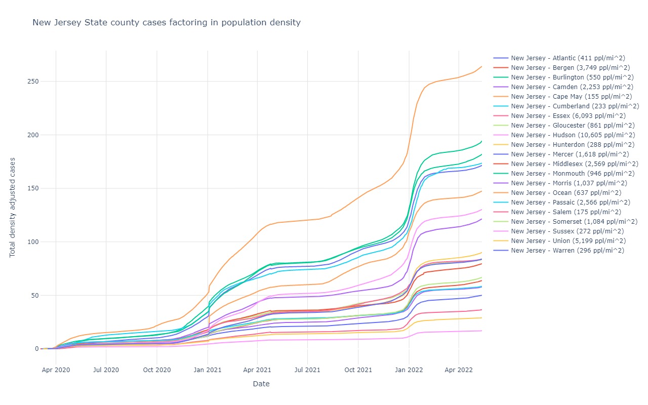
New Jersey
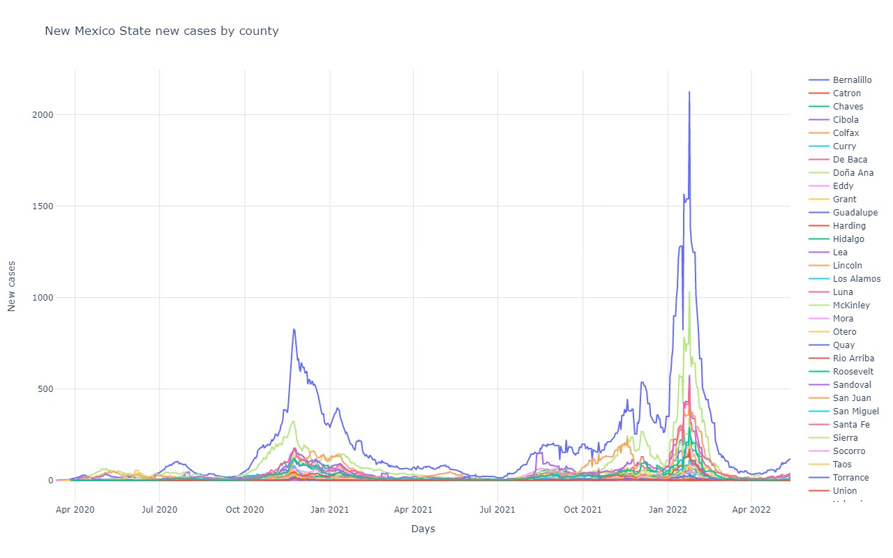
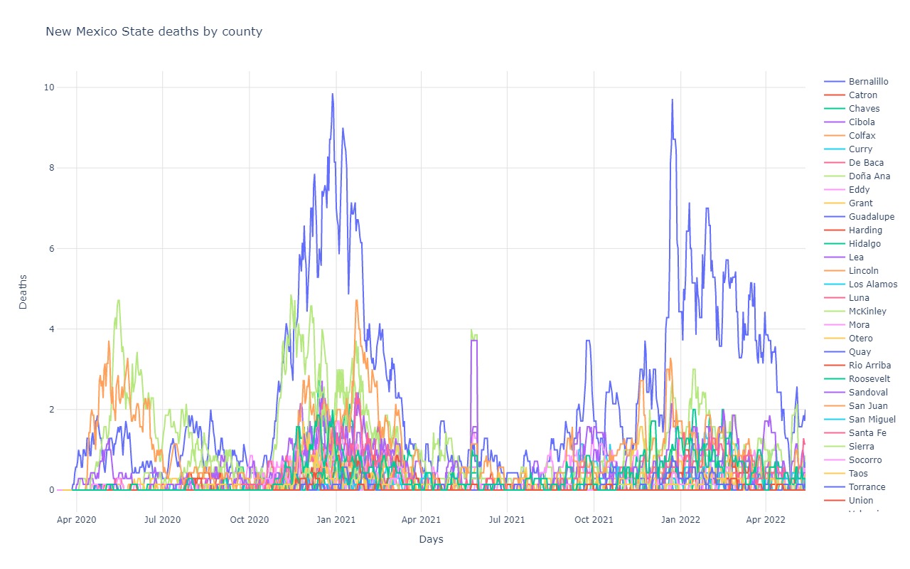
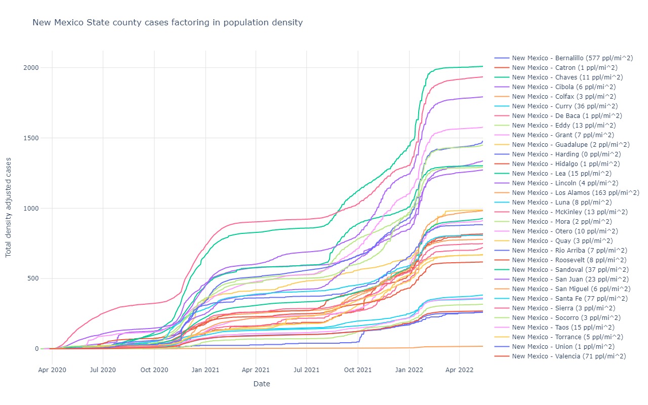
New Mexico
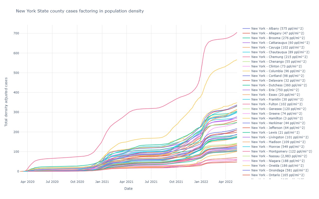
New York
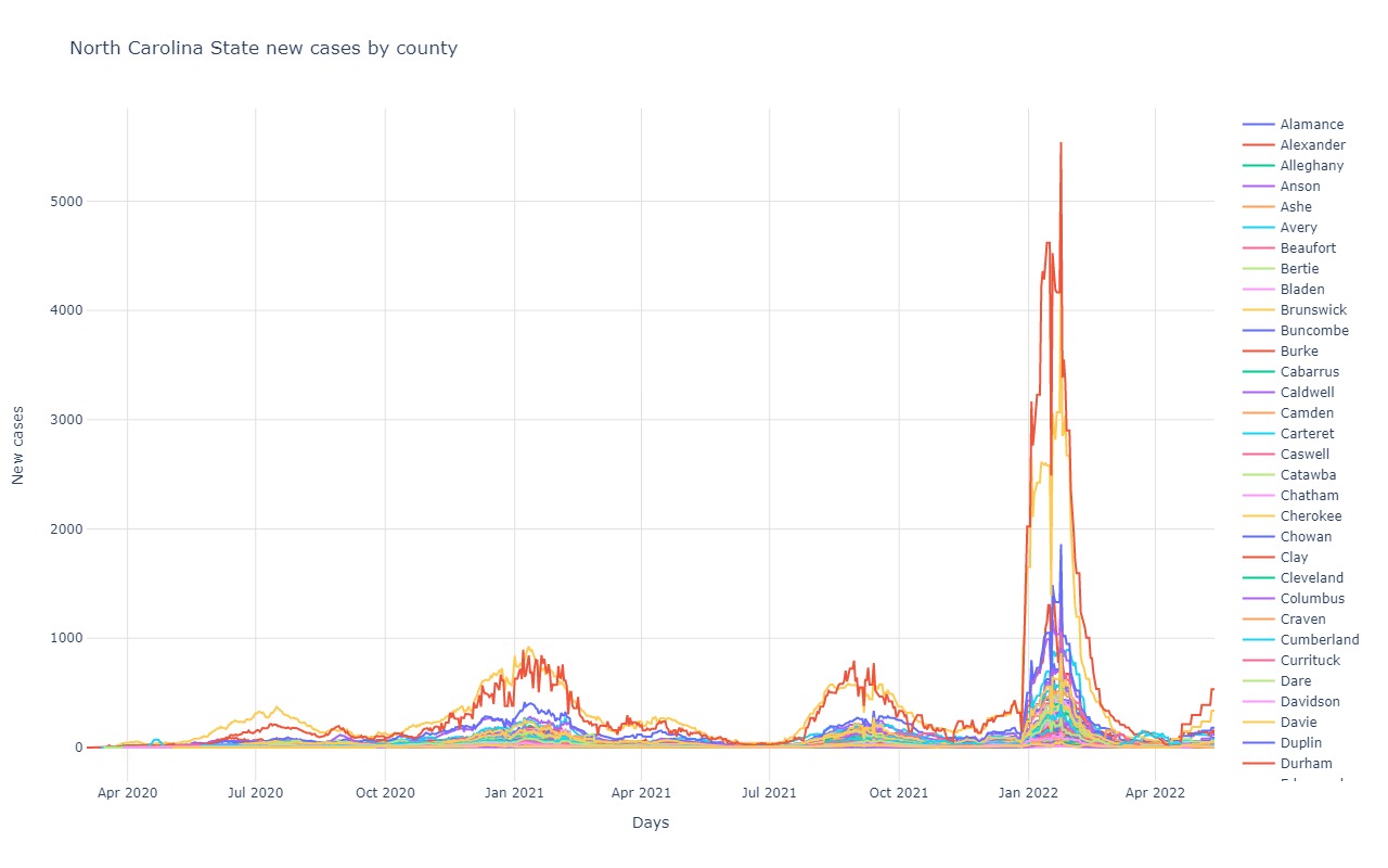
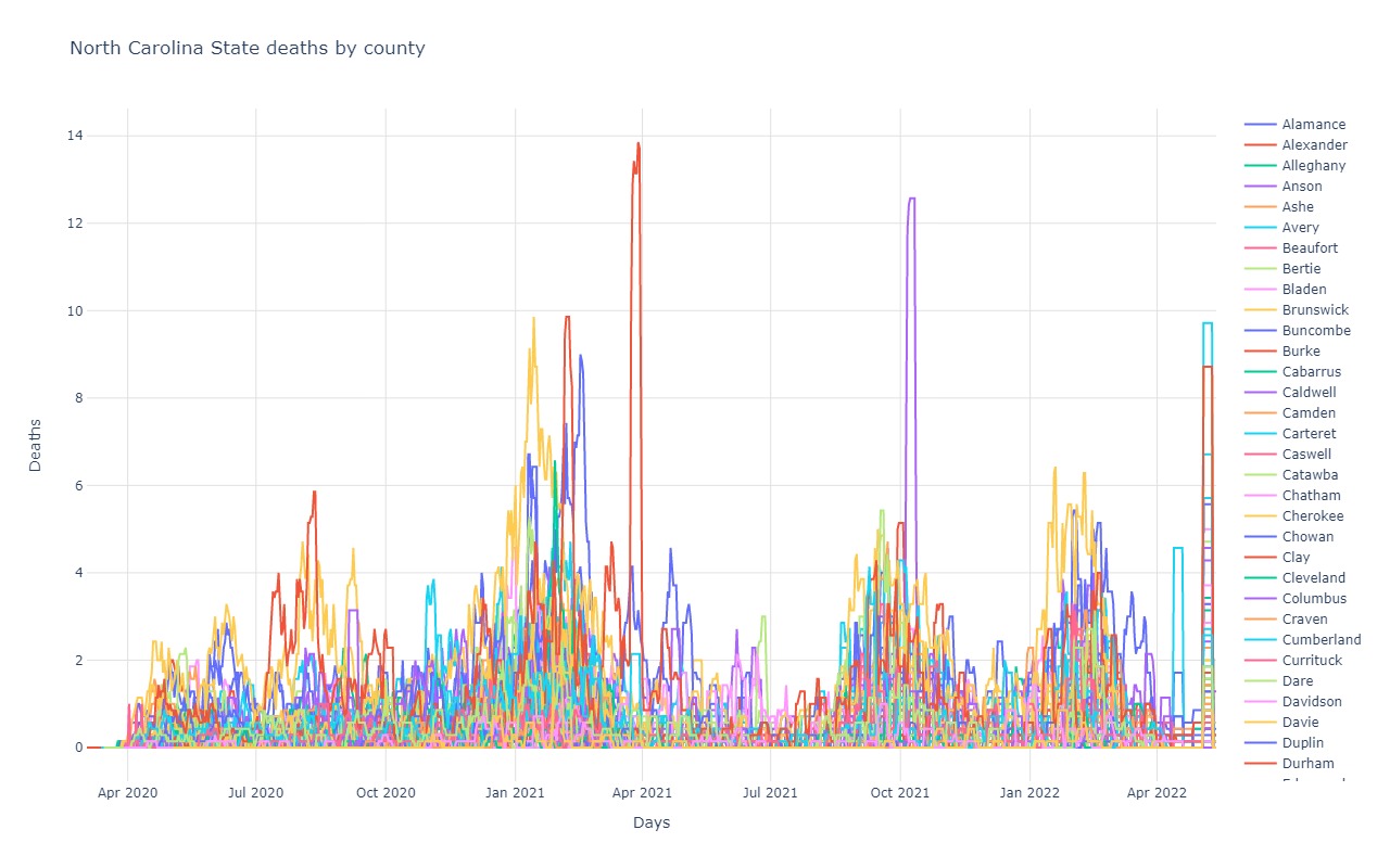
North Carolina
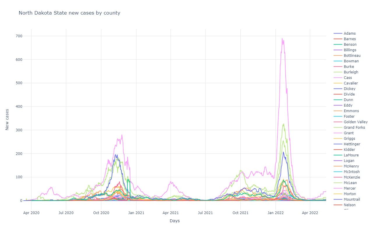
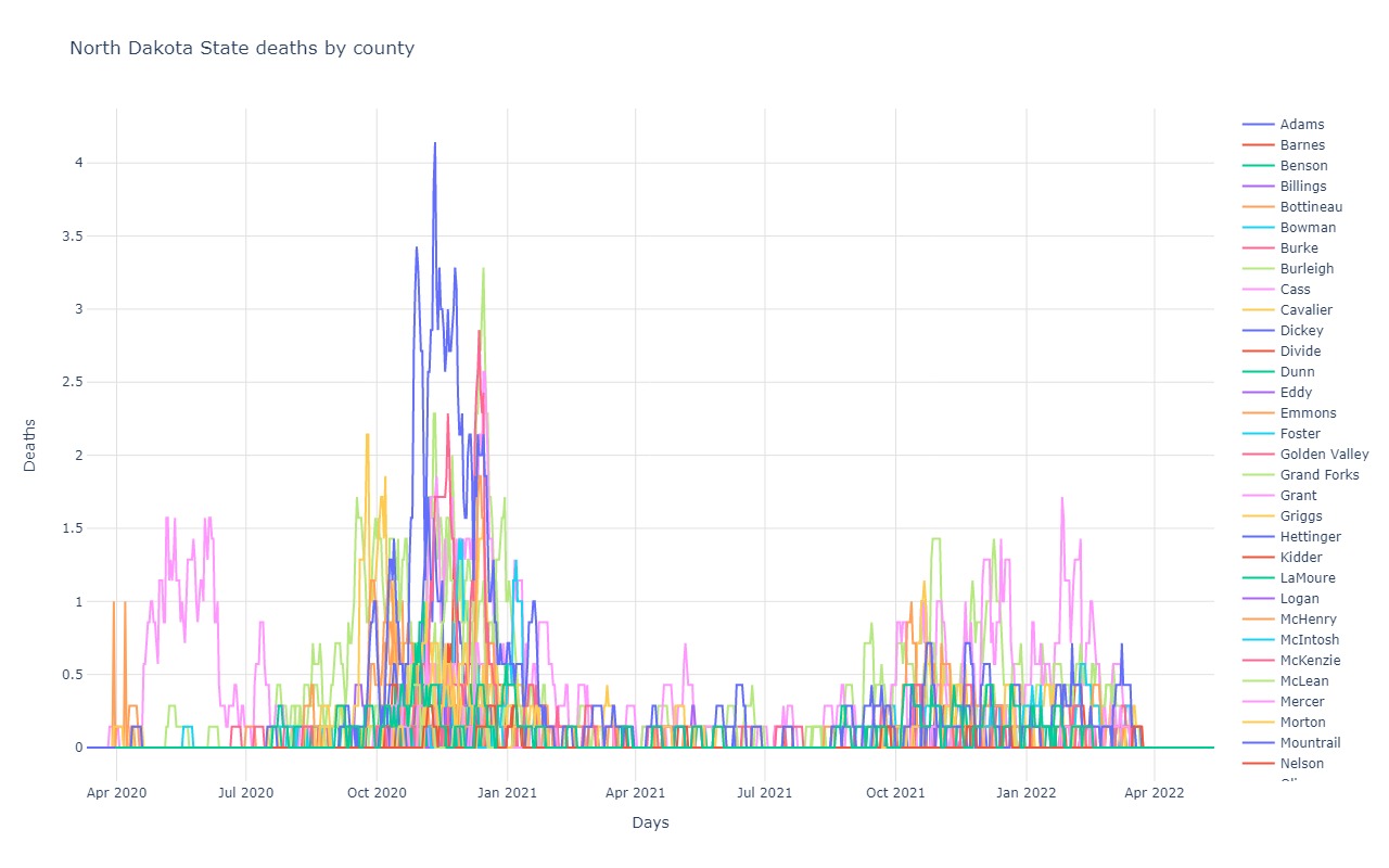
North Dakota
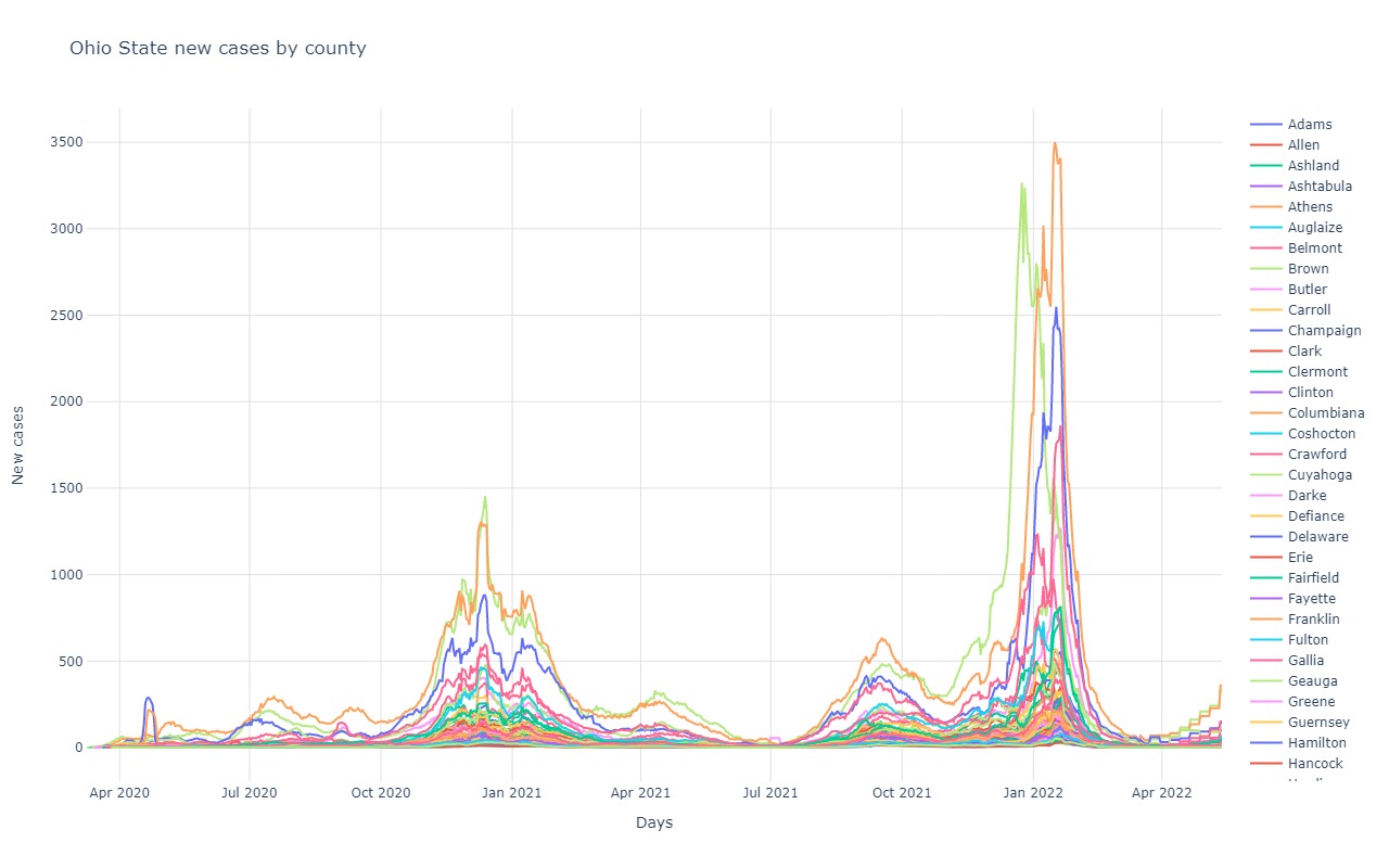
Ohio
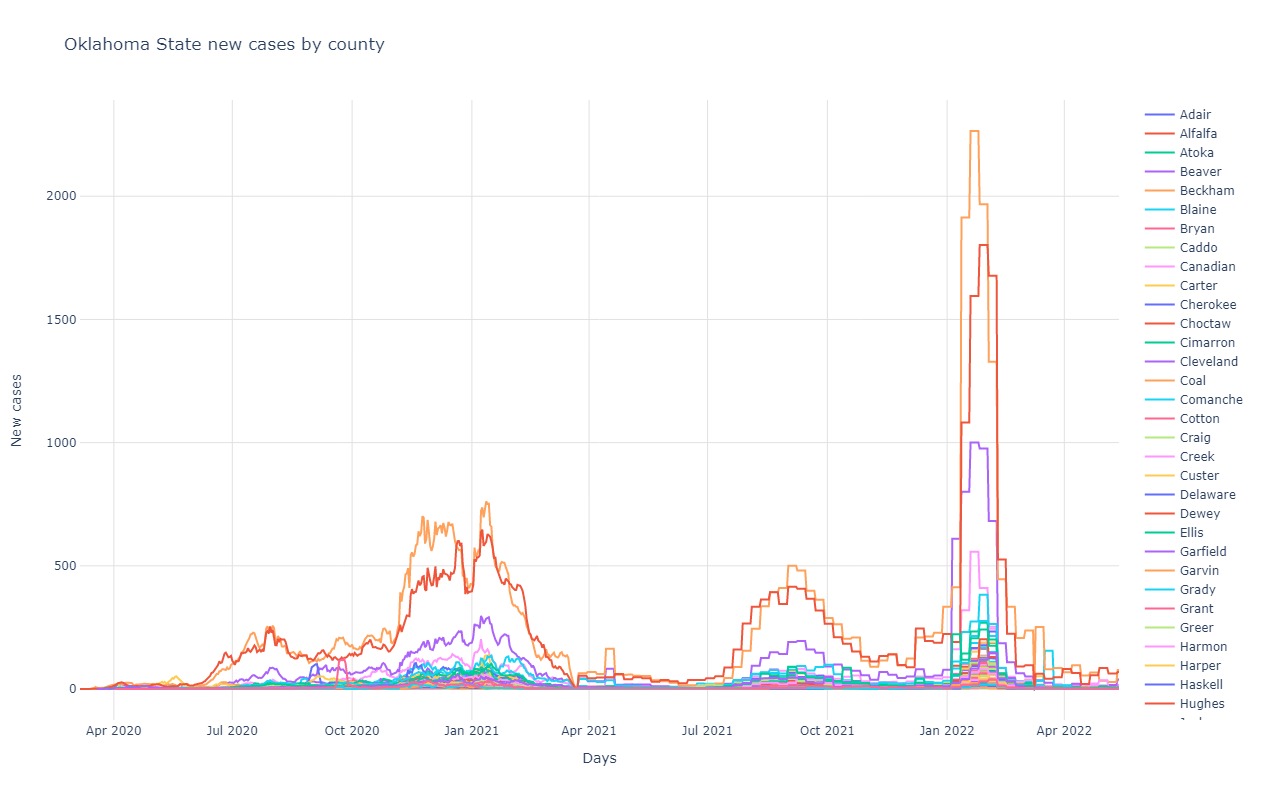
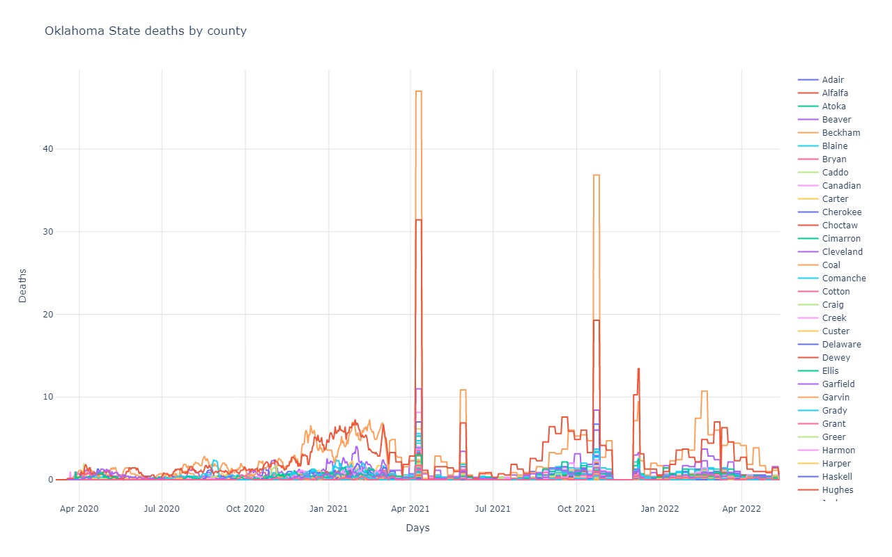
Oklahoma
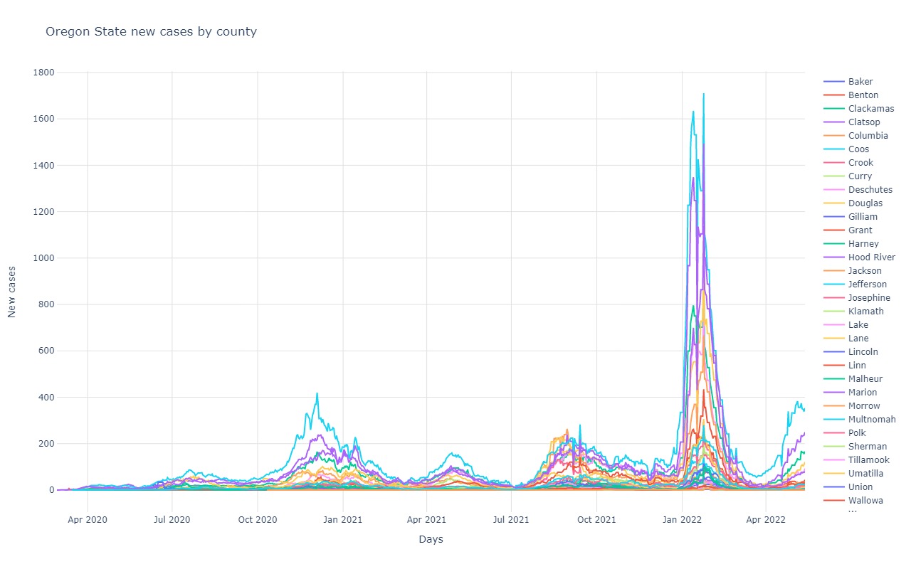
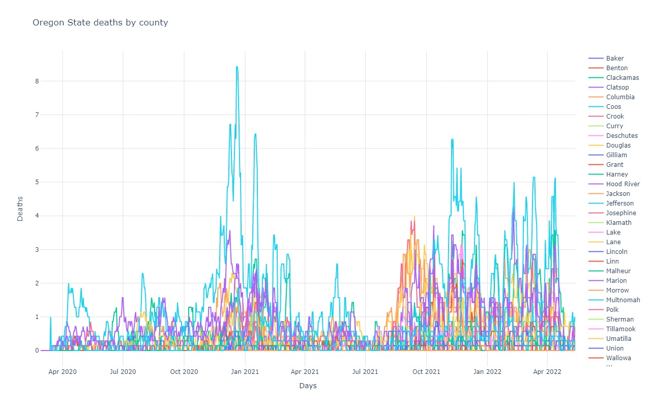
Oregon
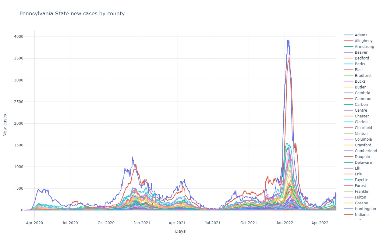
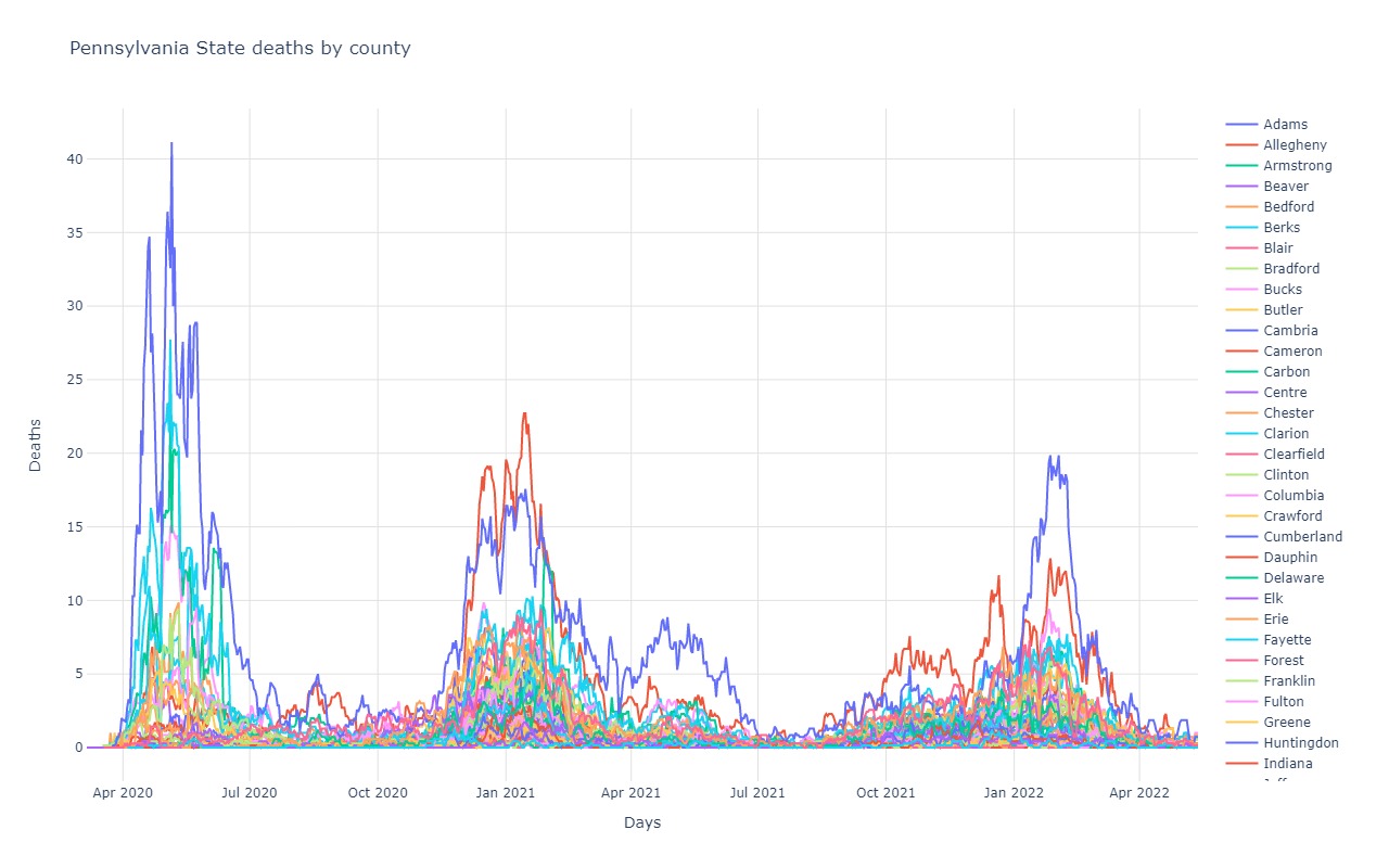
Pennsylvania
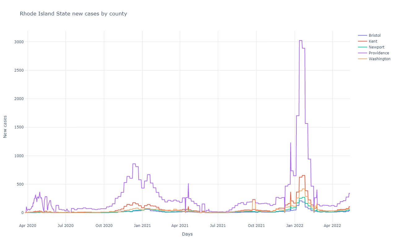
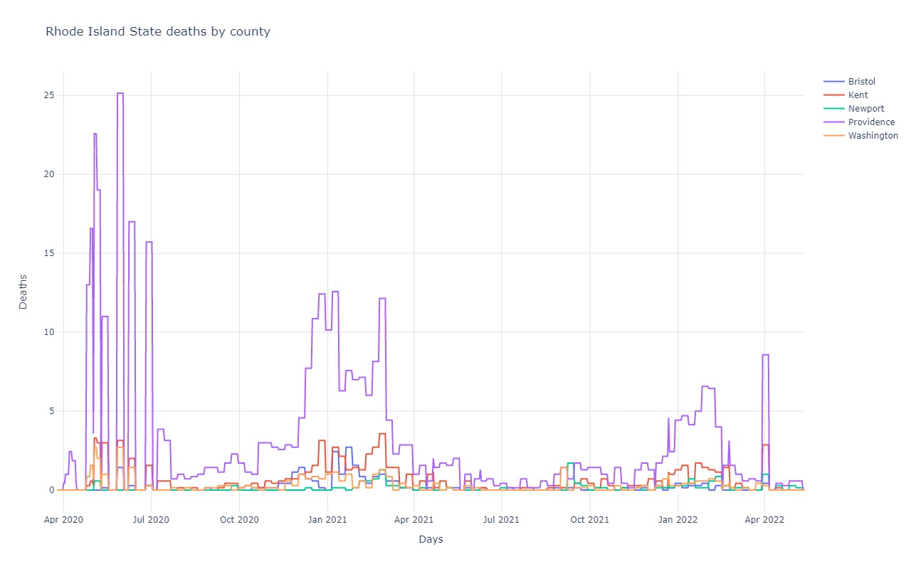
Rhode Island
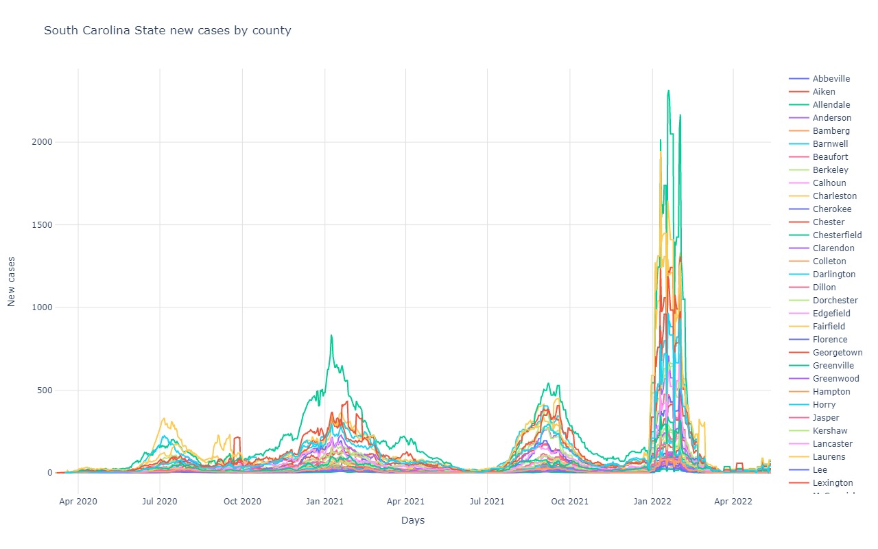
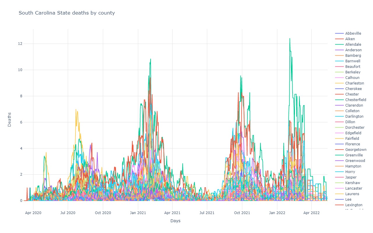
South Carolina
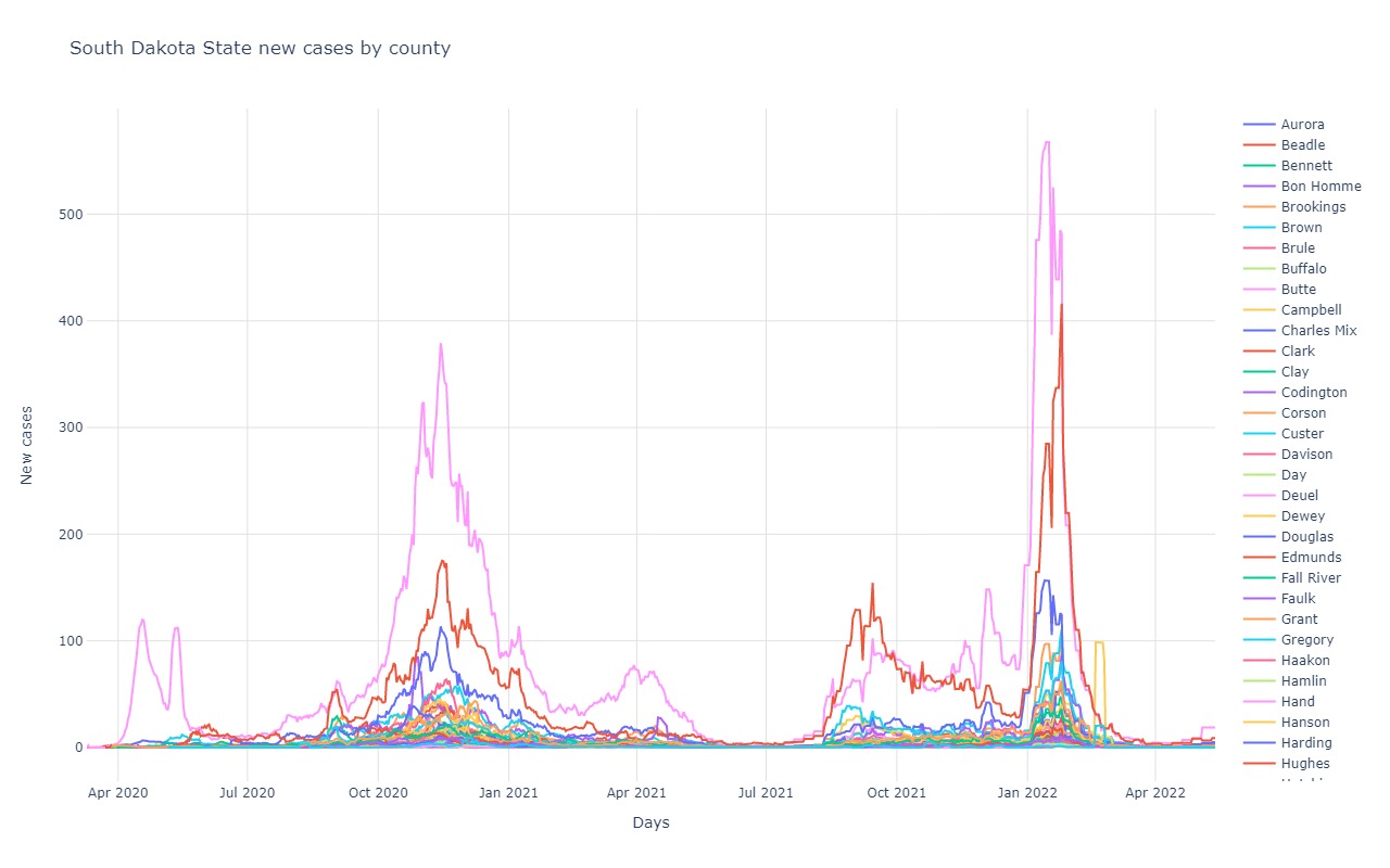
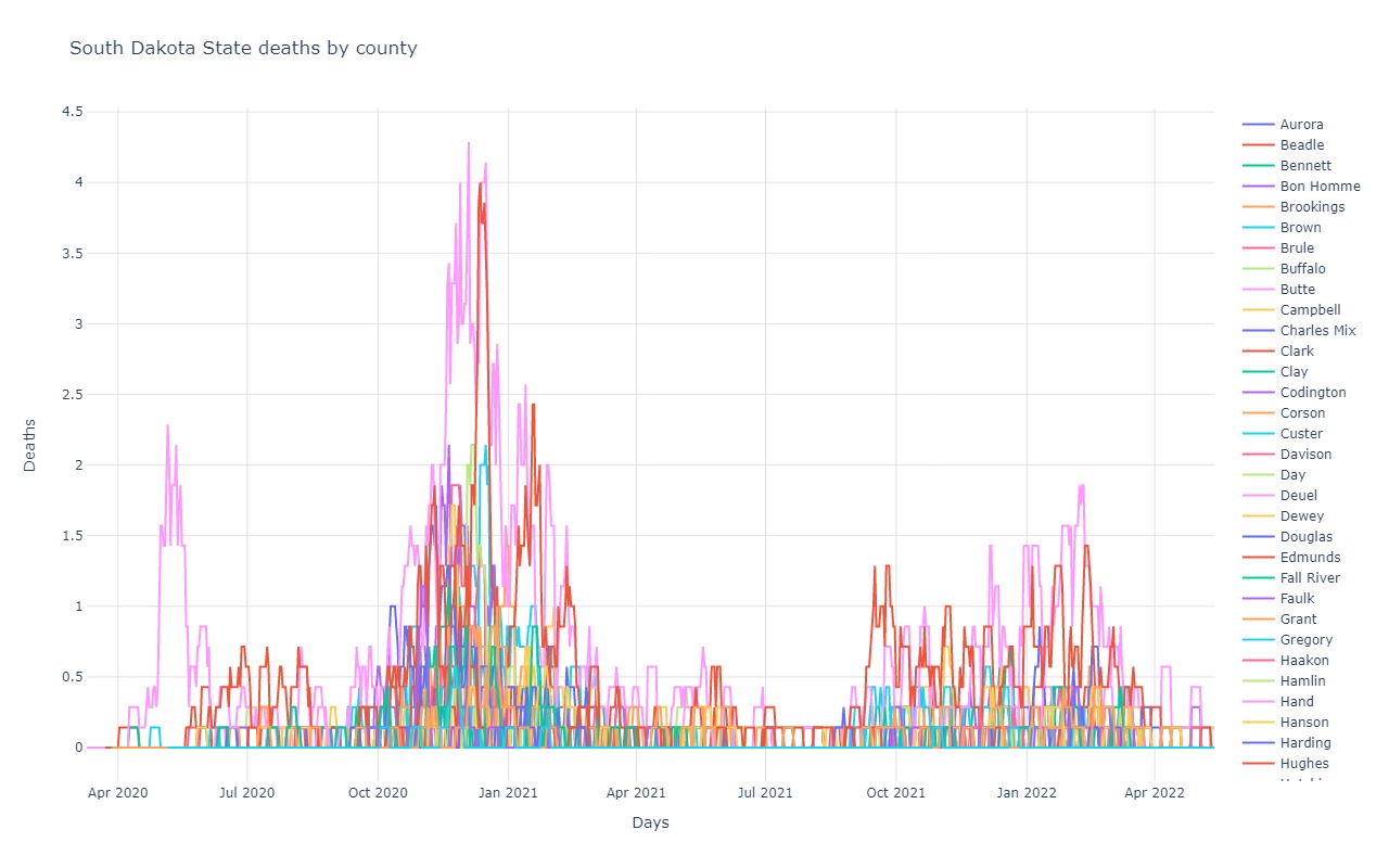
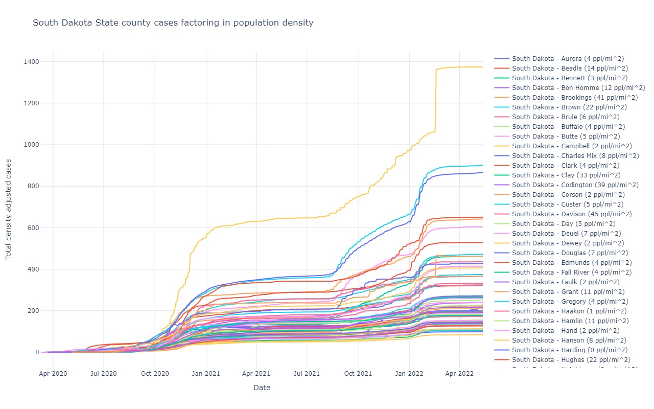
South Dakota
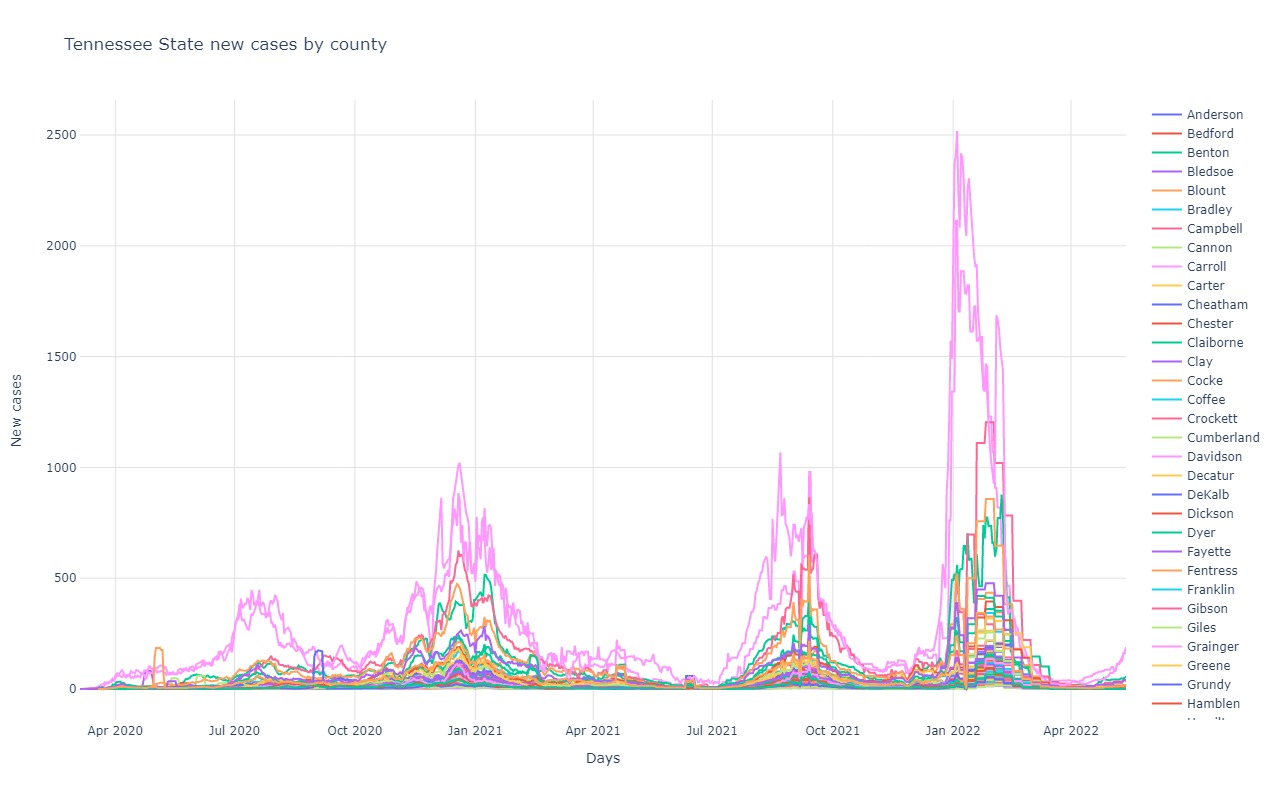
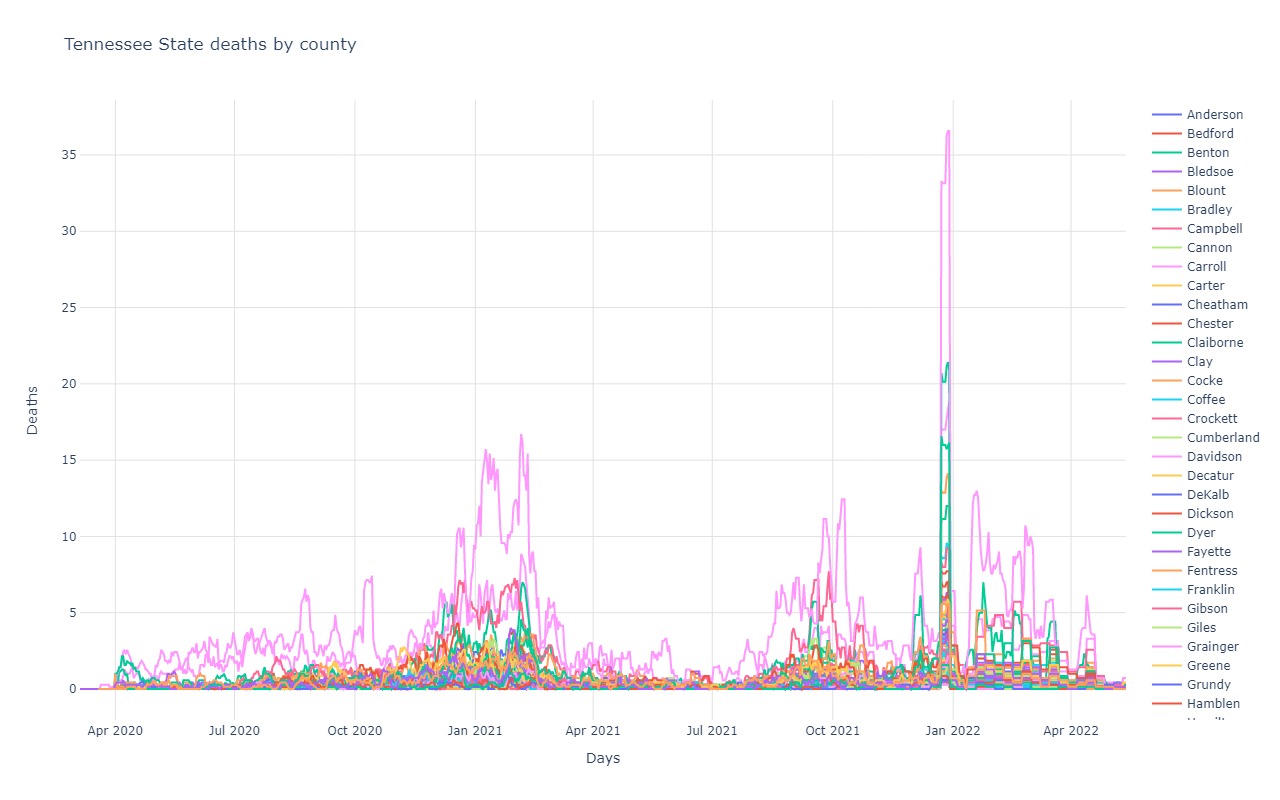
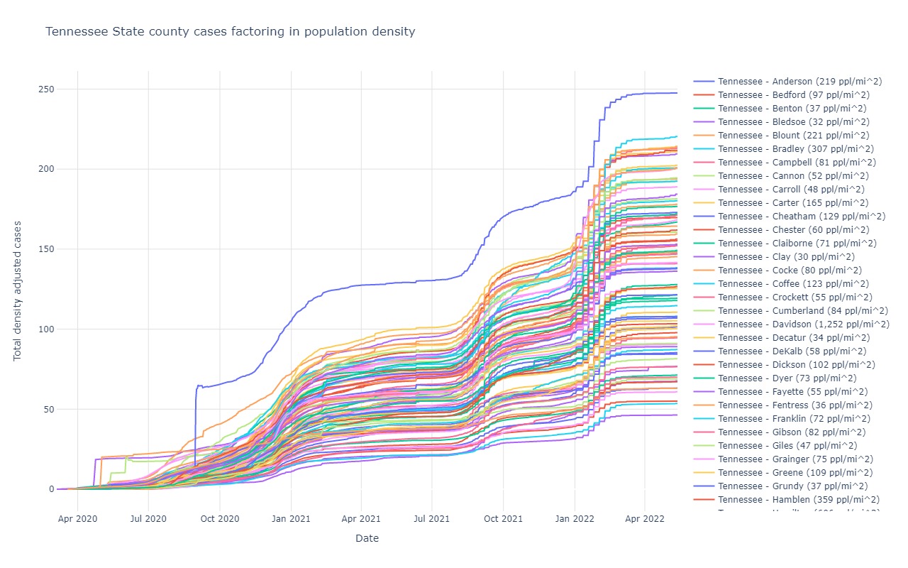
Tennessee
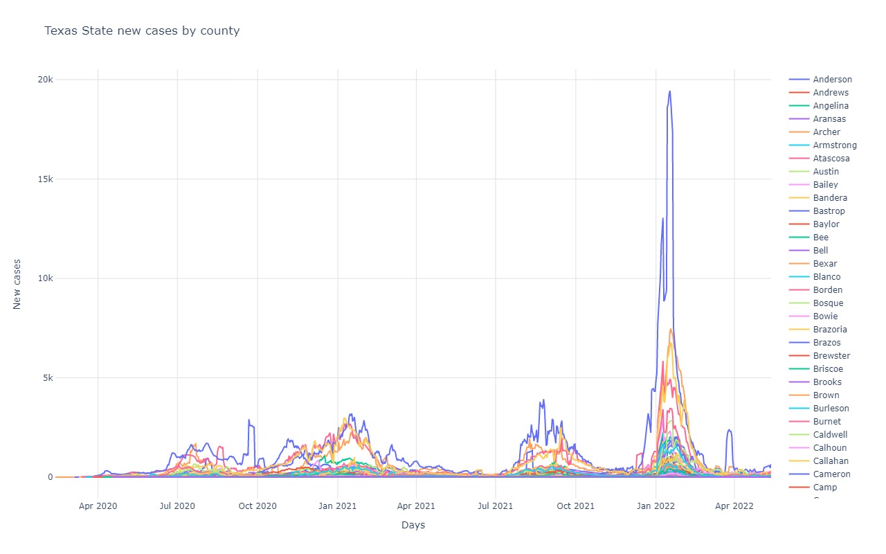
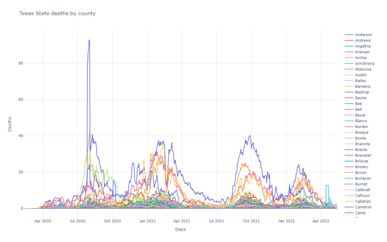
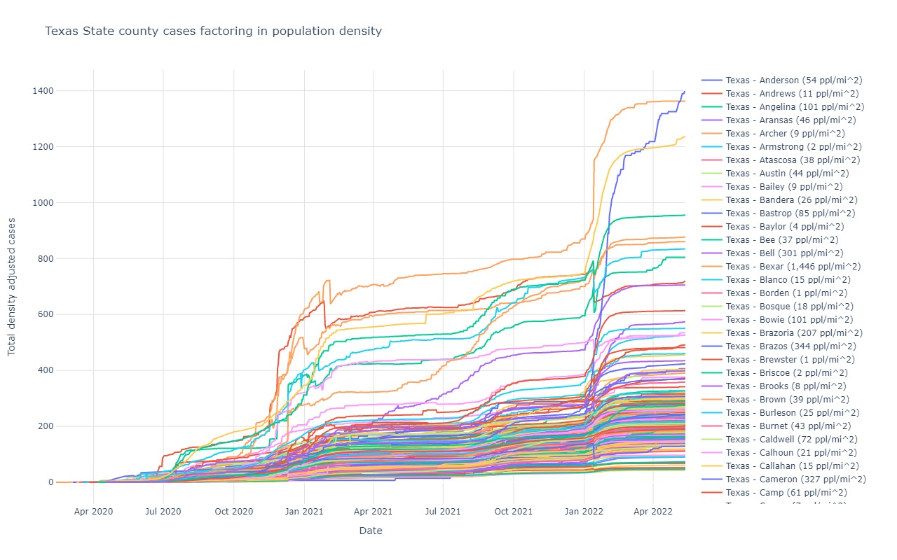
Texas
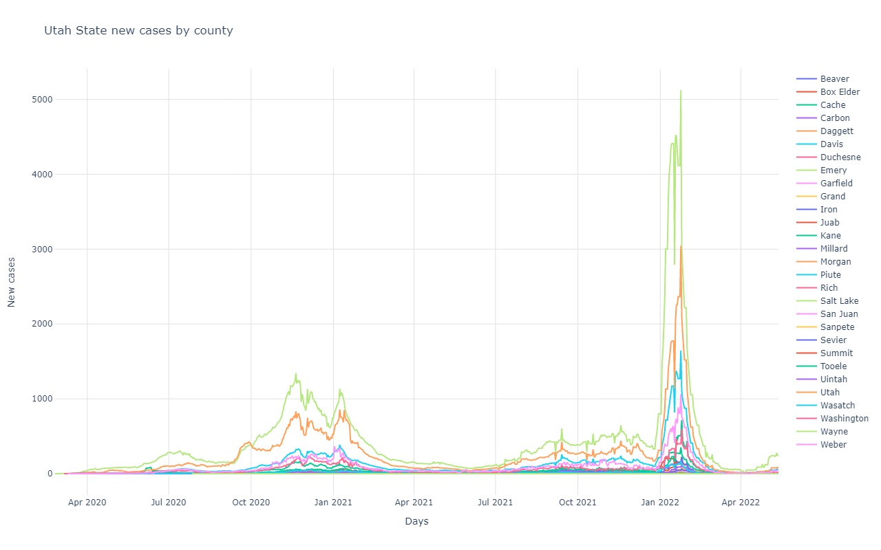
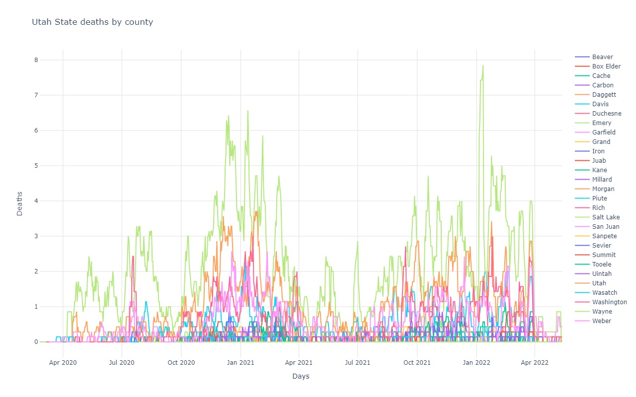
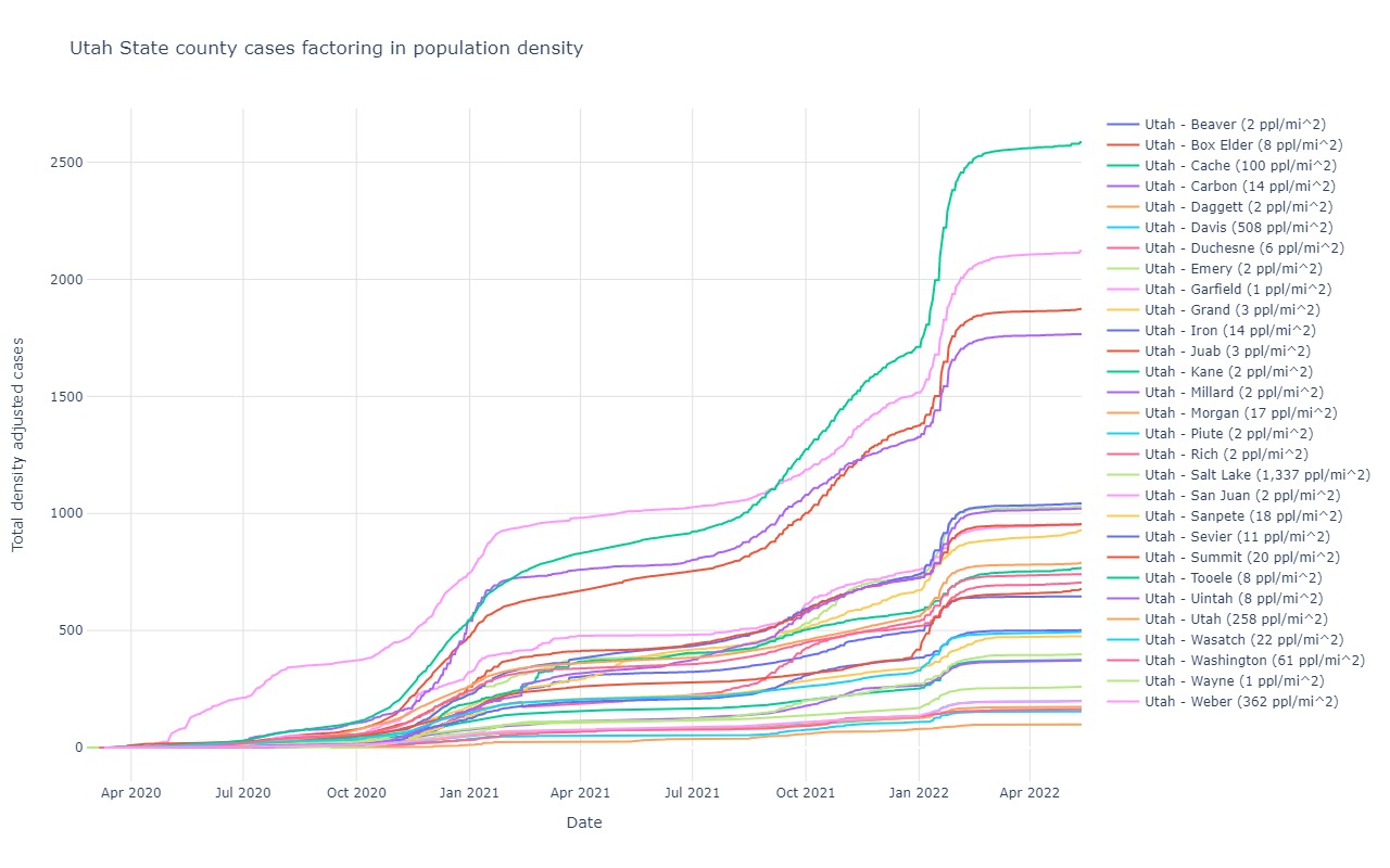
Utah
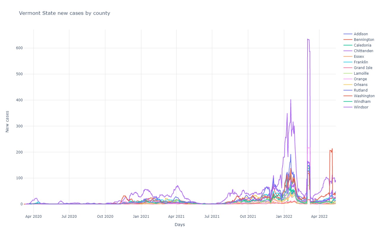
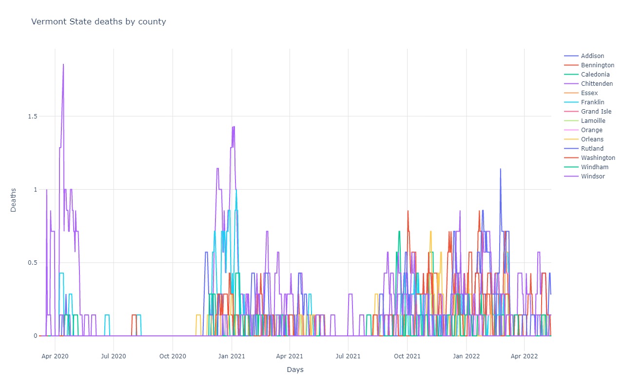
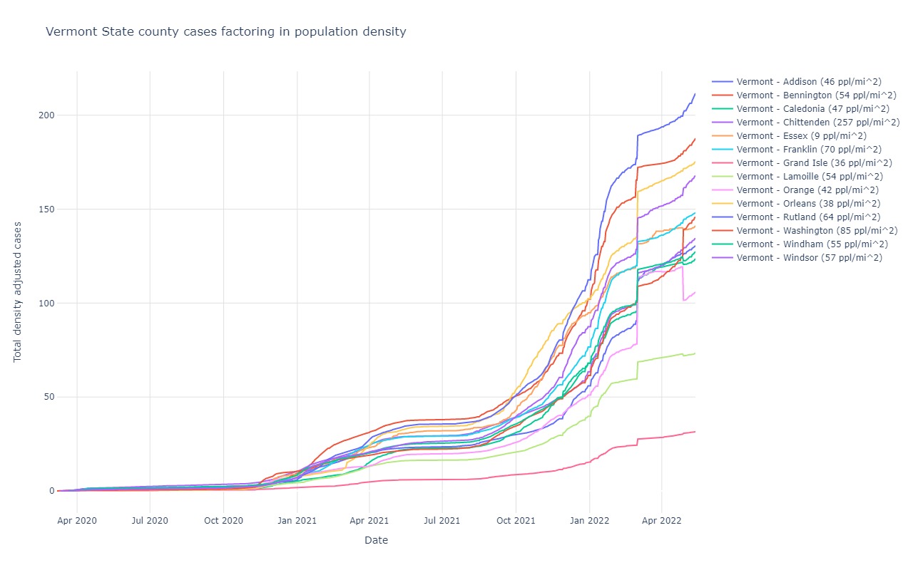
Vermont
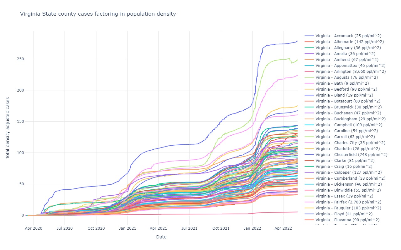
Virginia
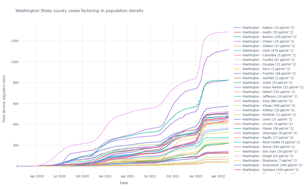
Washington
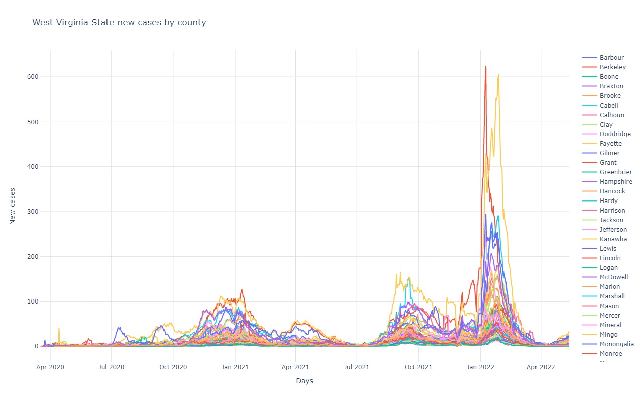
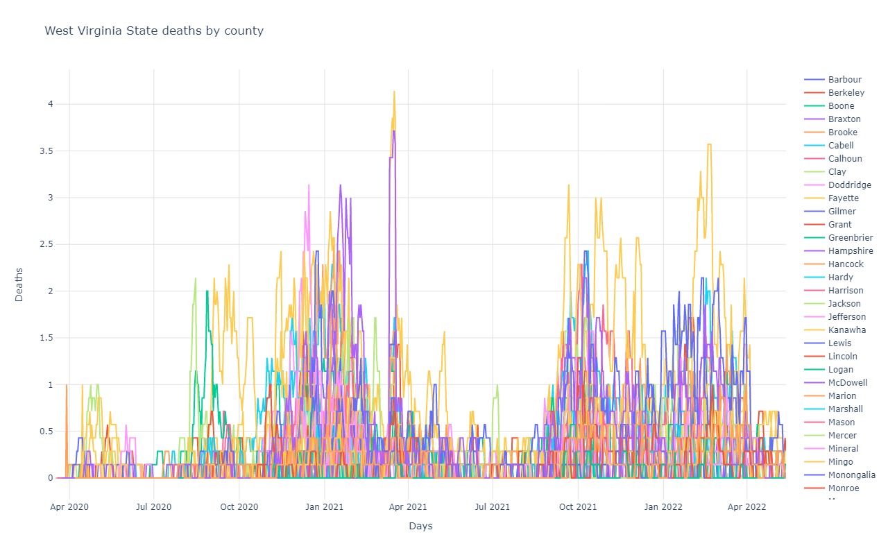
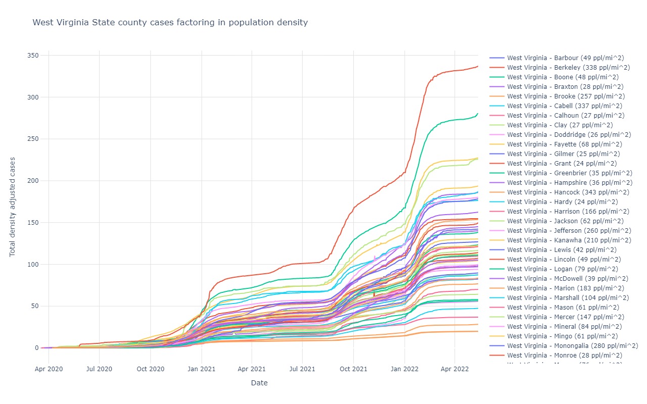
West Virginia
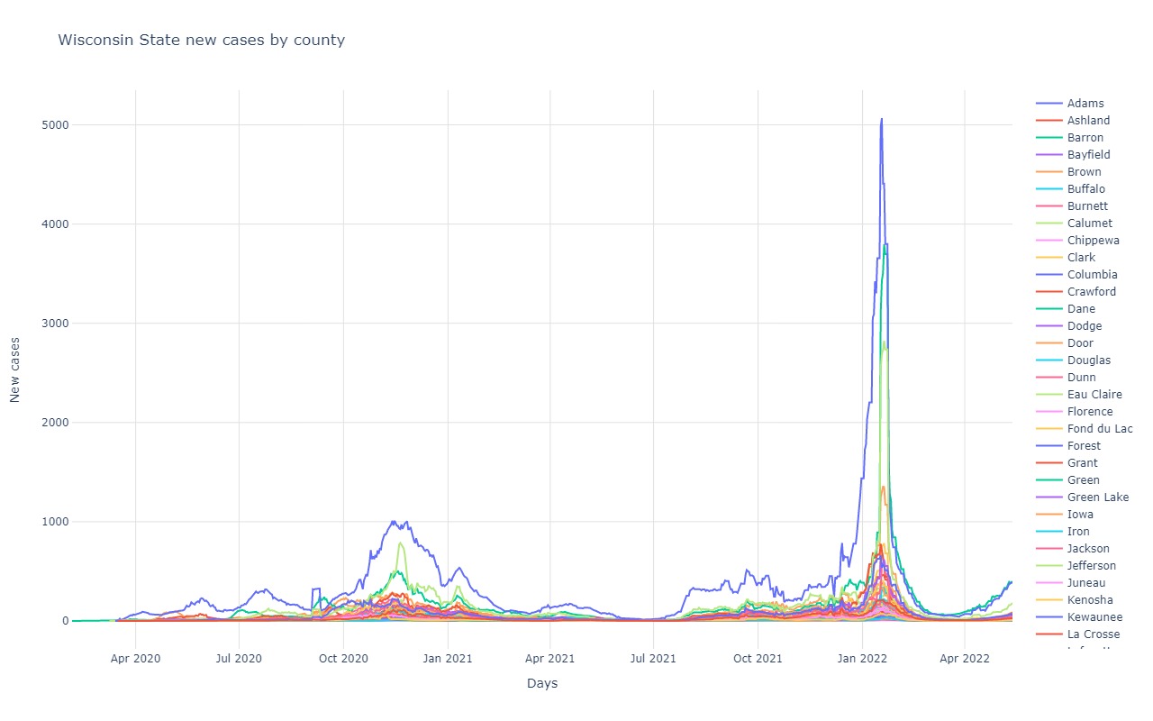
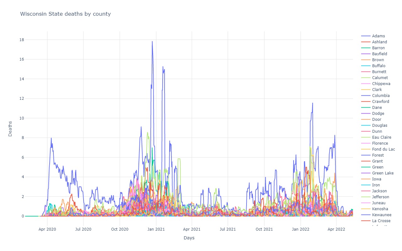
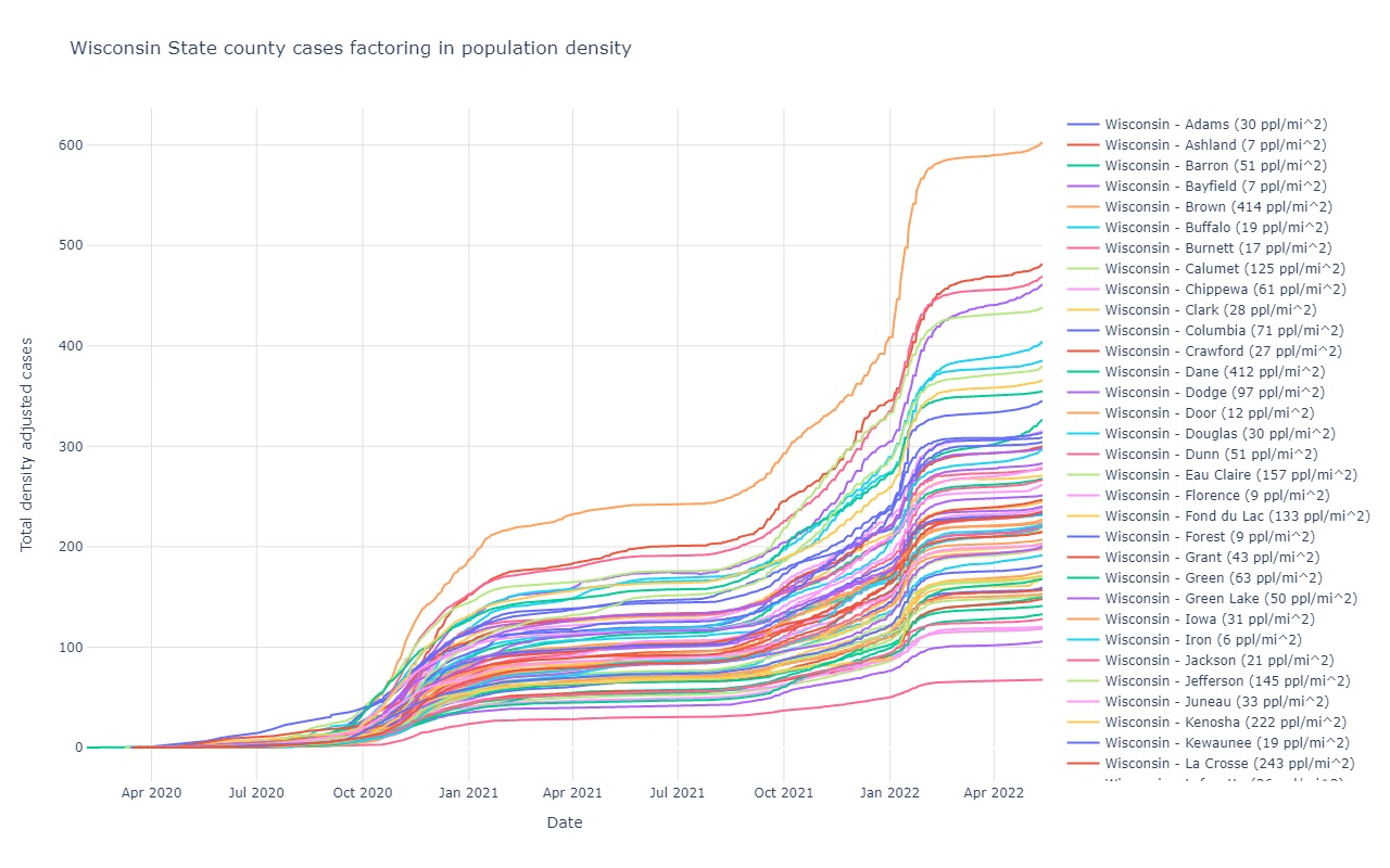
Wisconsin
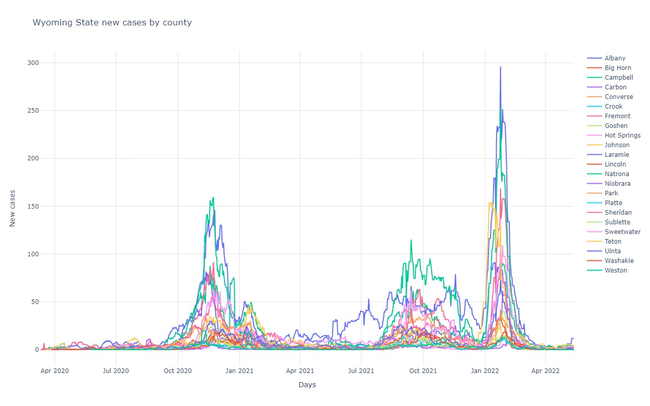
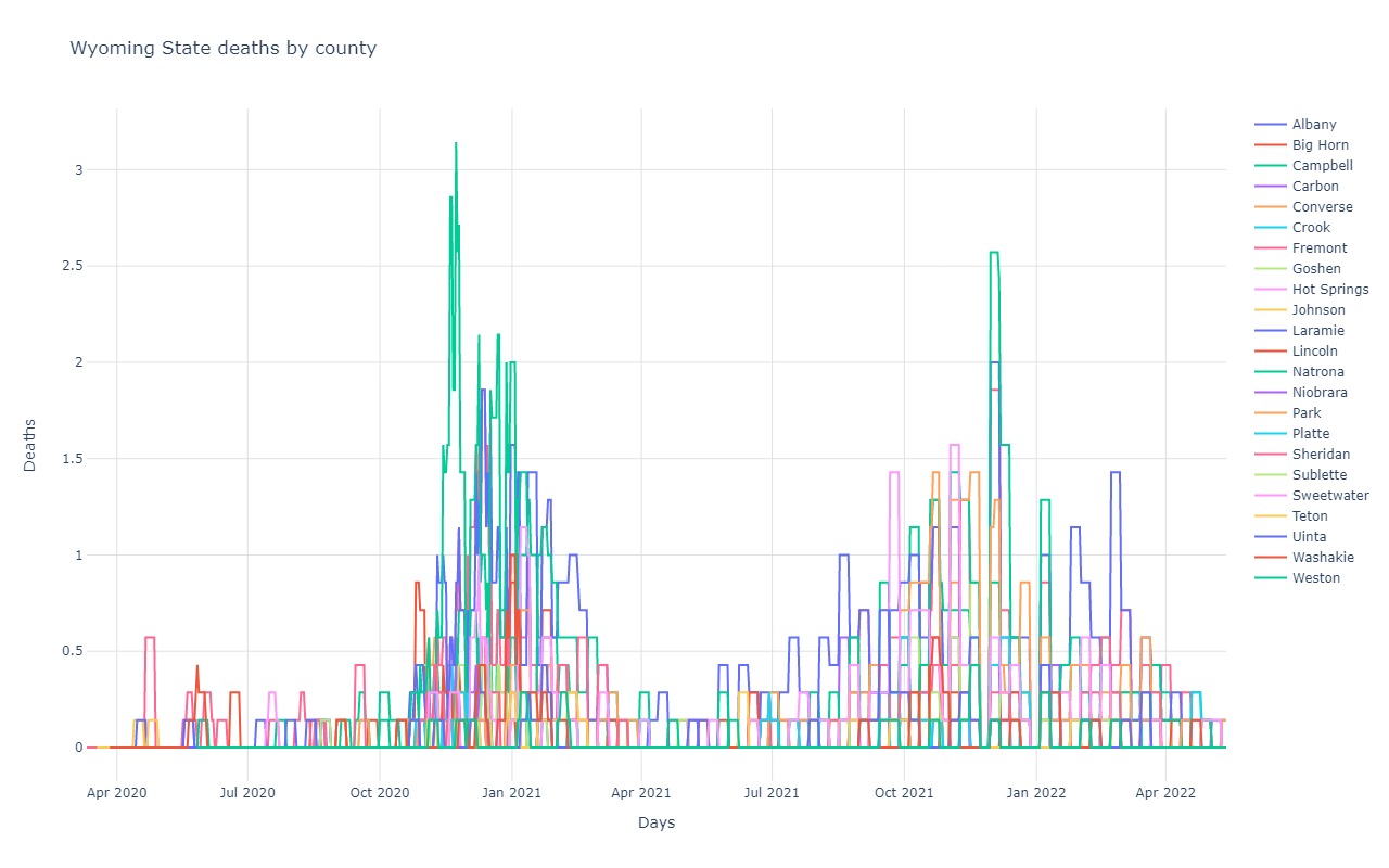
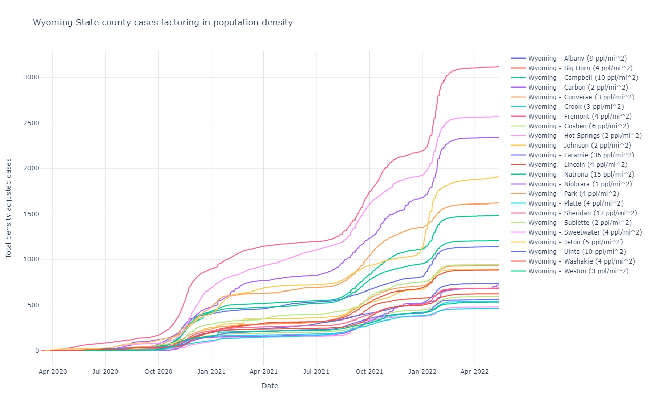
Wyoming
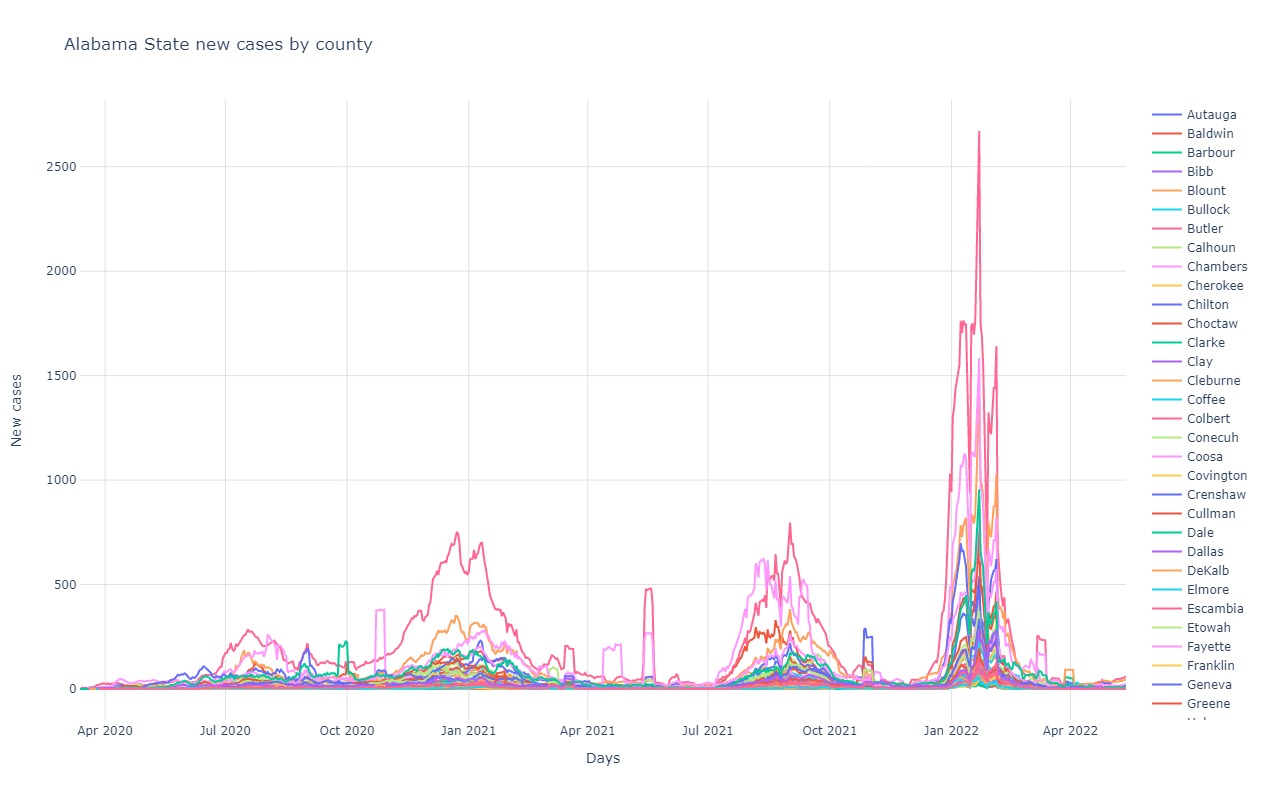
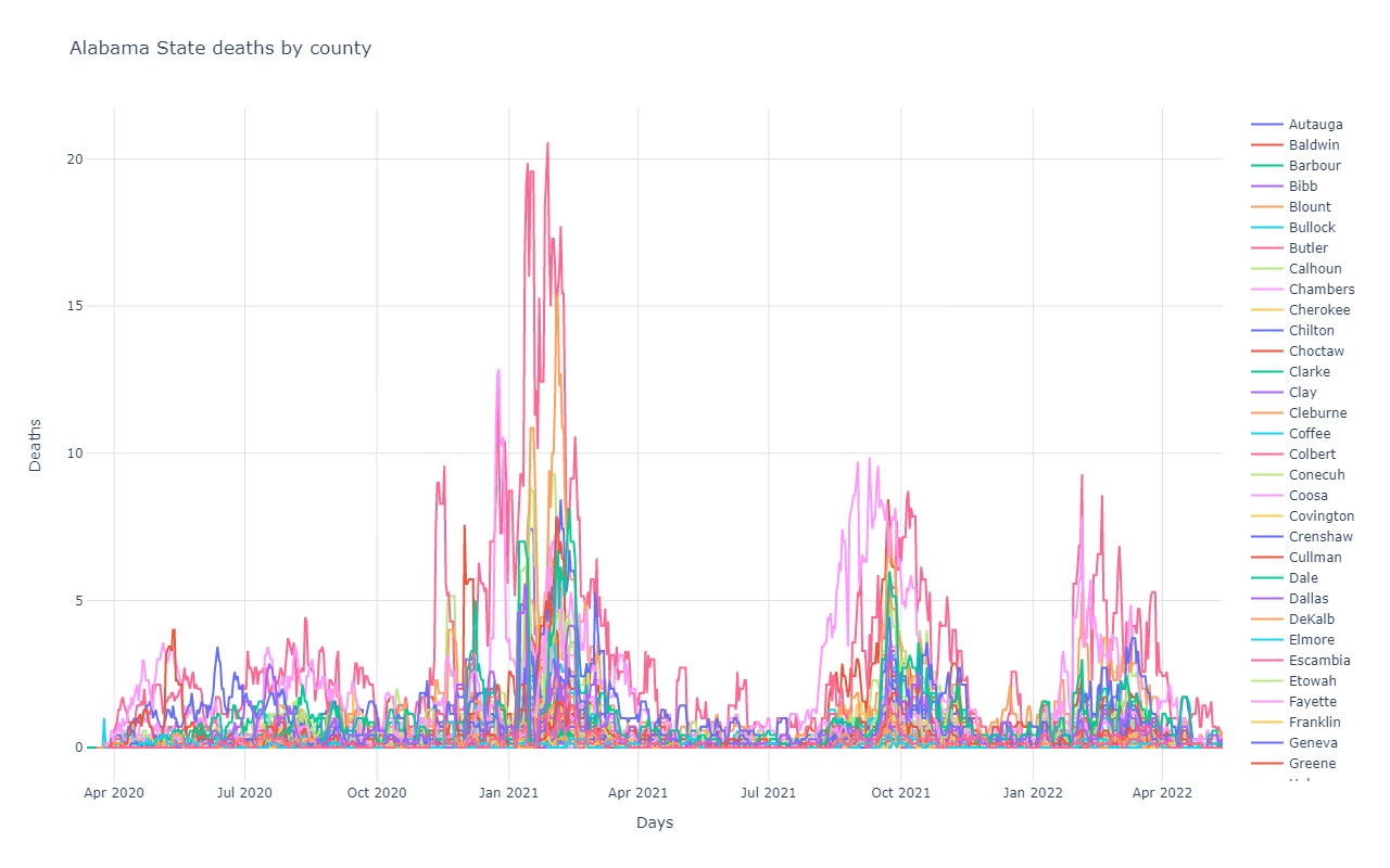
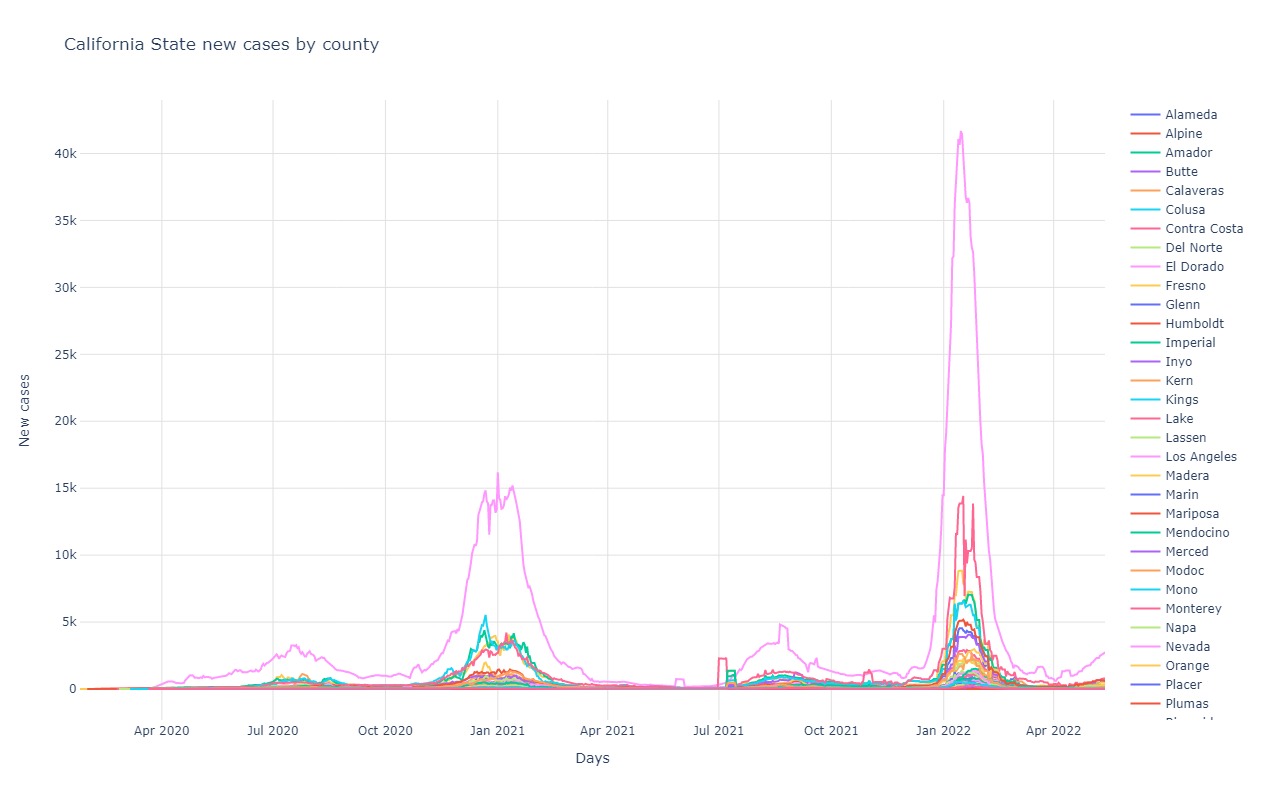
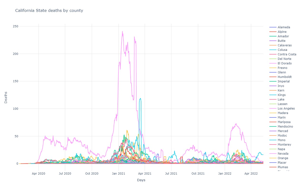
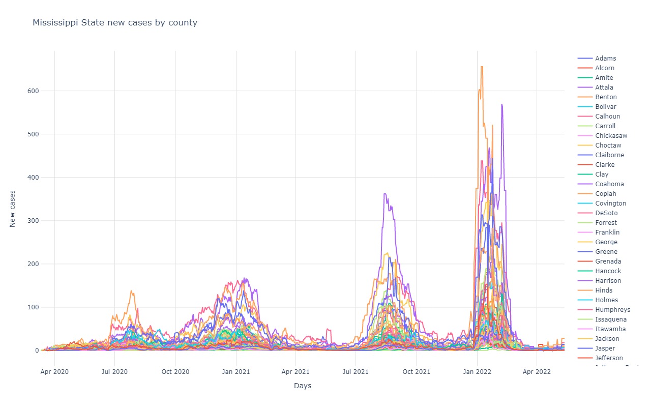
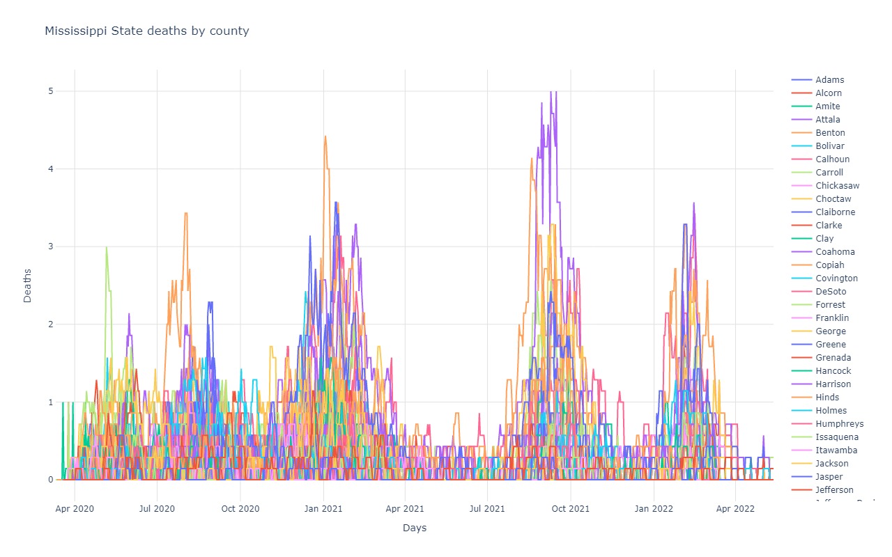
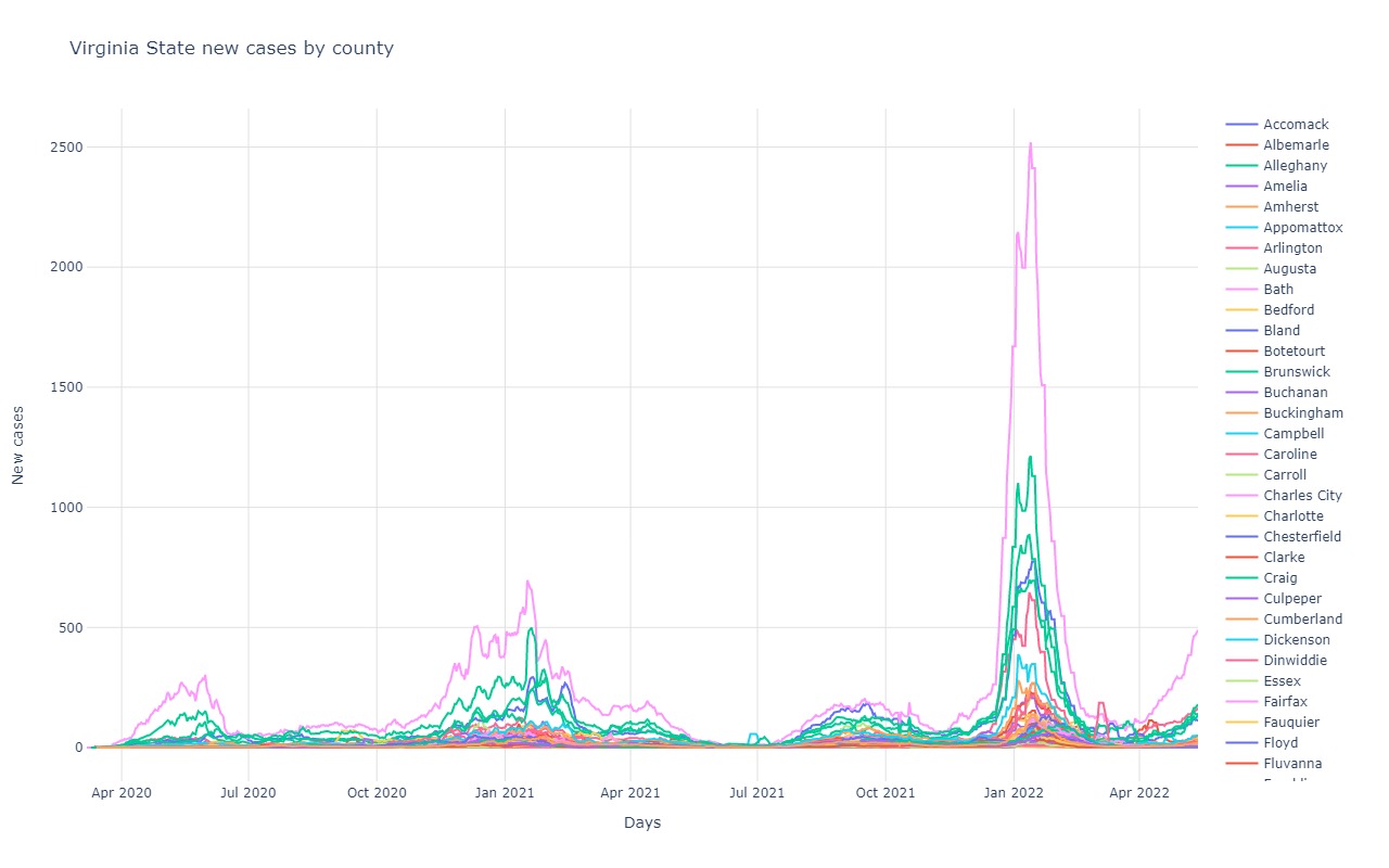
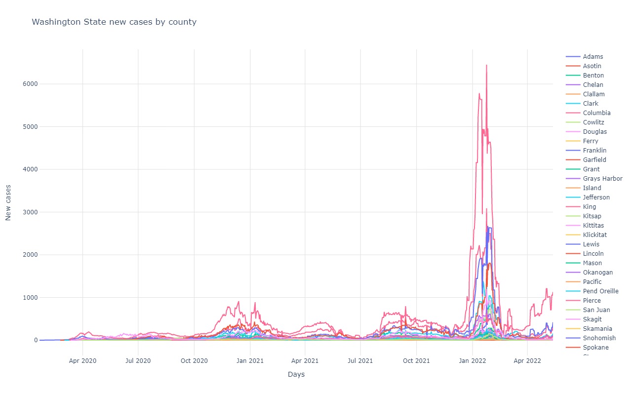
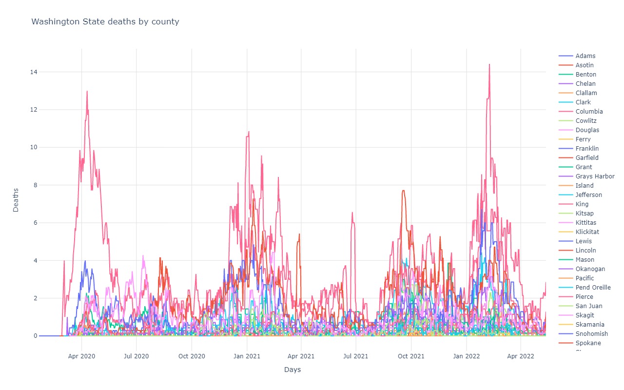
State and County Total cases
The simplest count is just a total number of cases per state and then per interesting county. Nothing more than what each state is reporting
as new cases on a daily basis.
State and County cases adjusted for population
Total cases is one thing, but to better get a sense of how different states and counties may be handling the virus compared to others,
you can adjust the graphs to account for the number of people who live in each state. A state that has 100,000 people vs
one that has 8,000,000 people should obviously have far fewer total cases because they have 80x less people. By factoring
in the population, a state or county with a low population may show a slope as high as other states with far more people.
This would indicate that the lower population state isn't likely effectively quarantining nearly as much as a higher
population state.
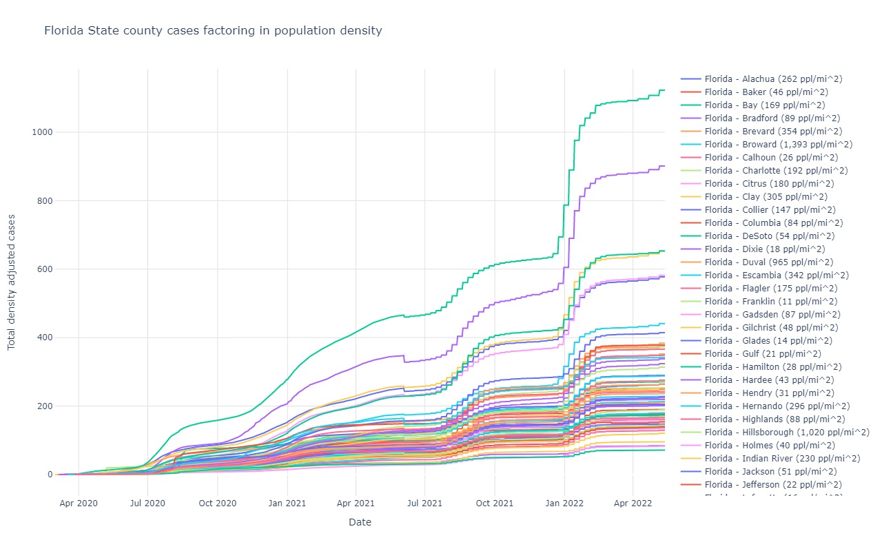
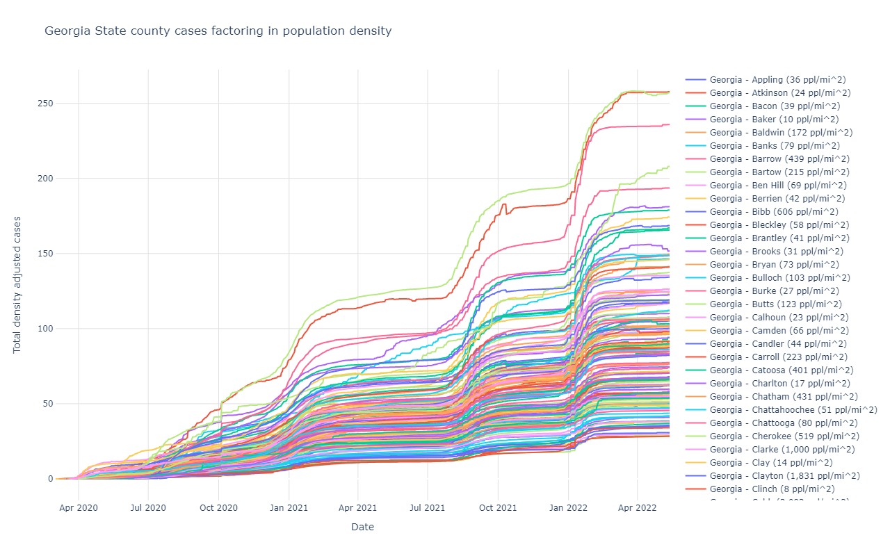
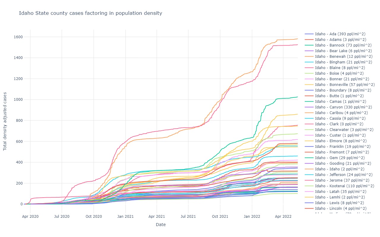
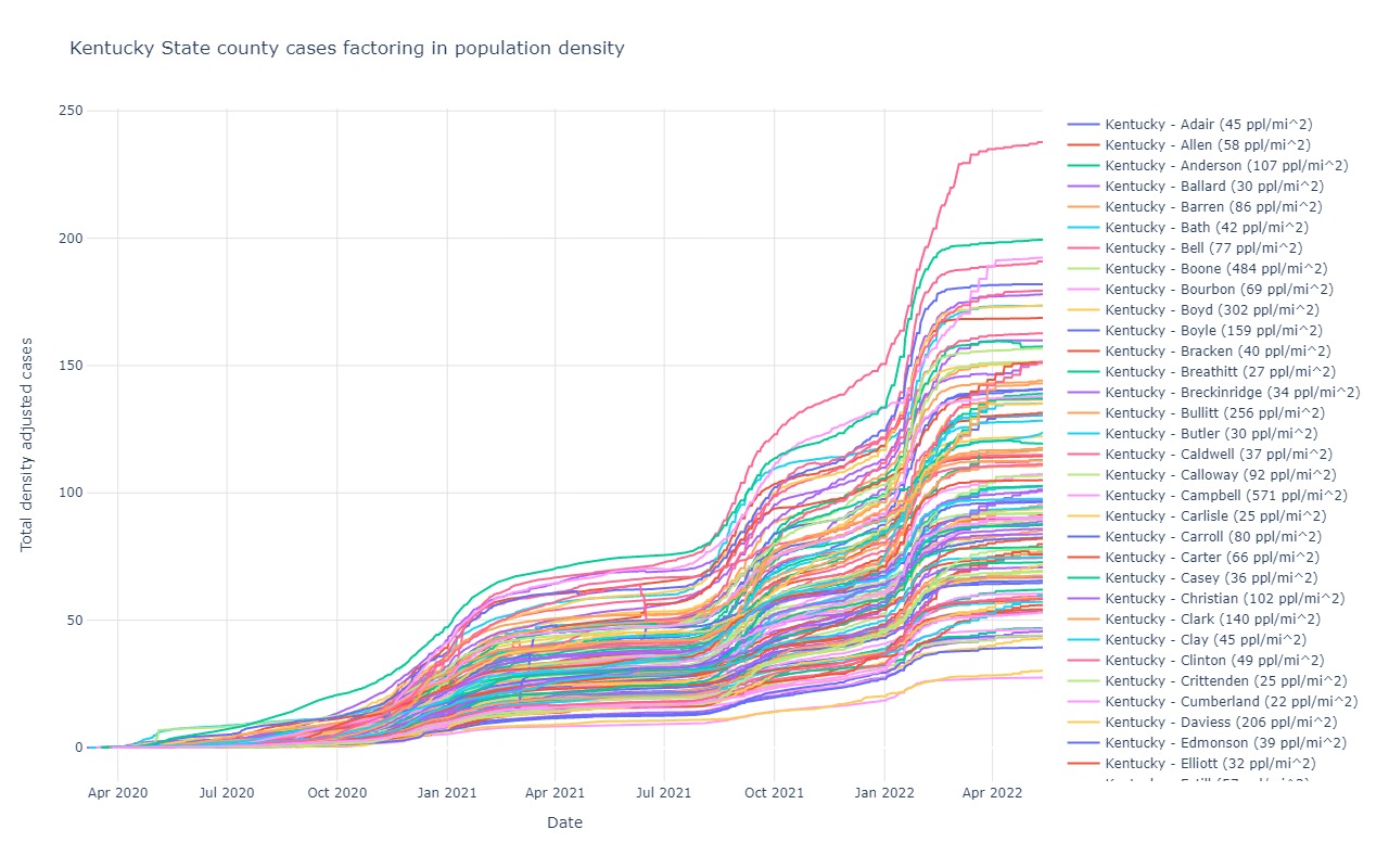
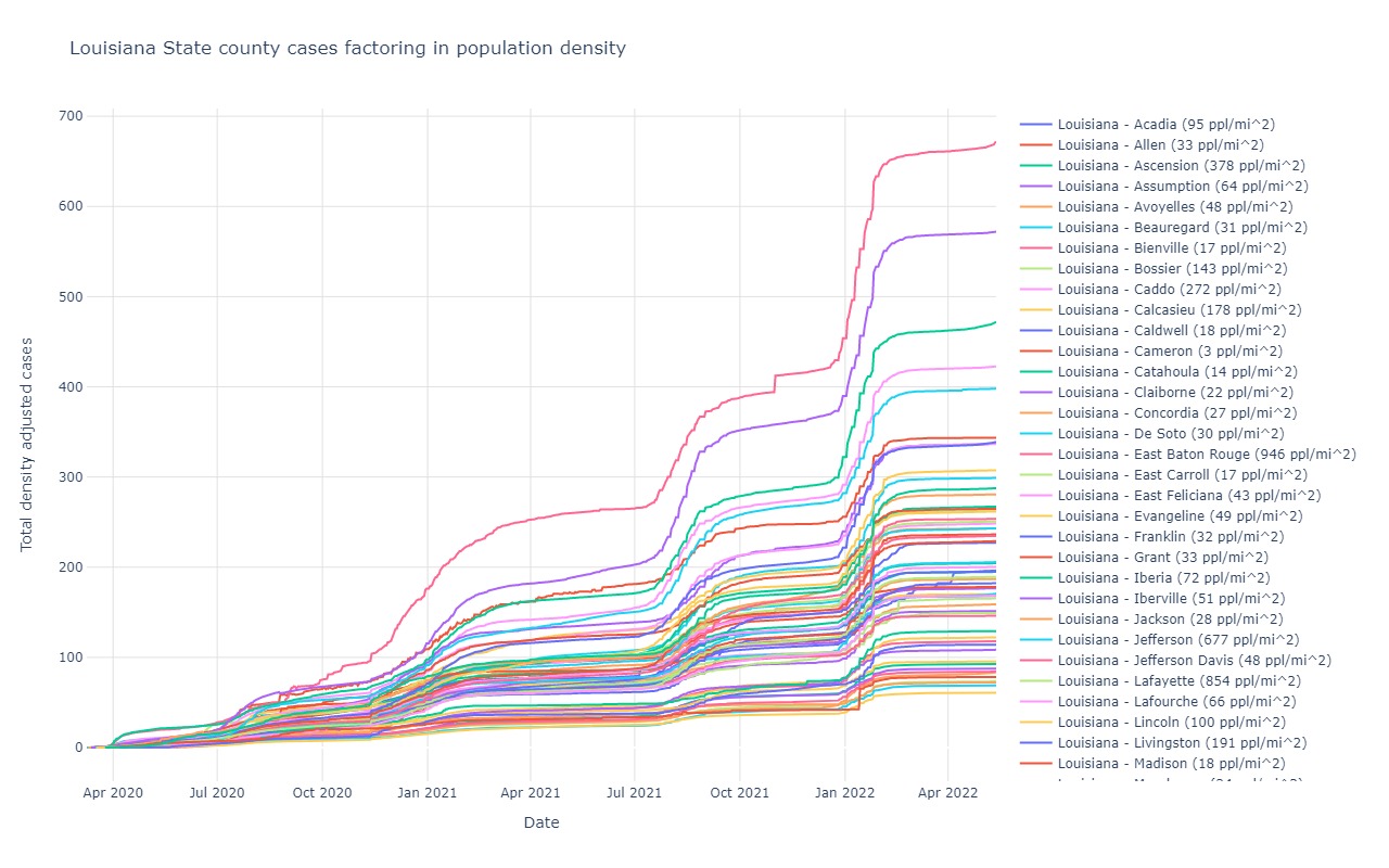
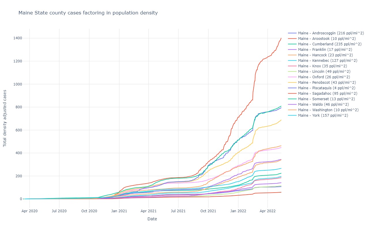
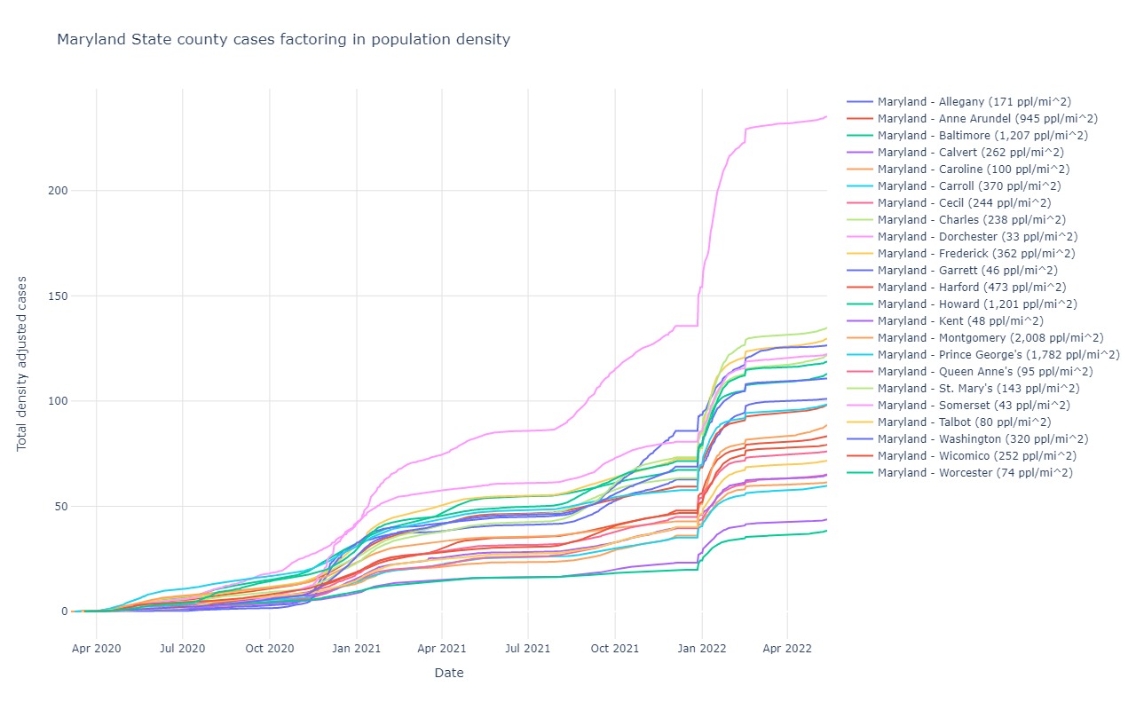
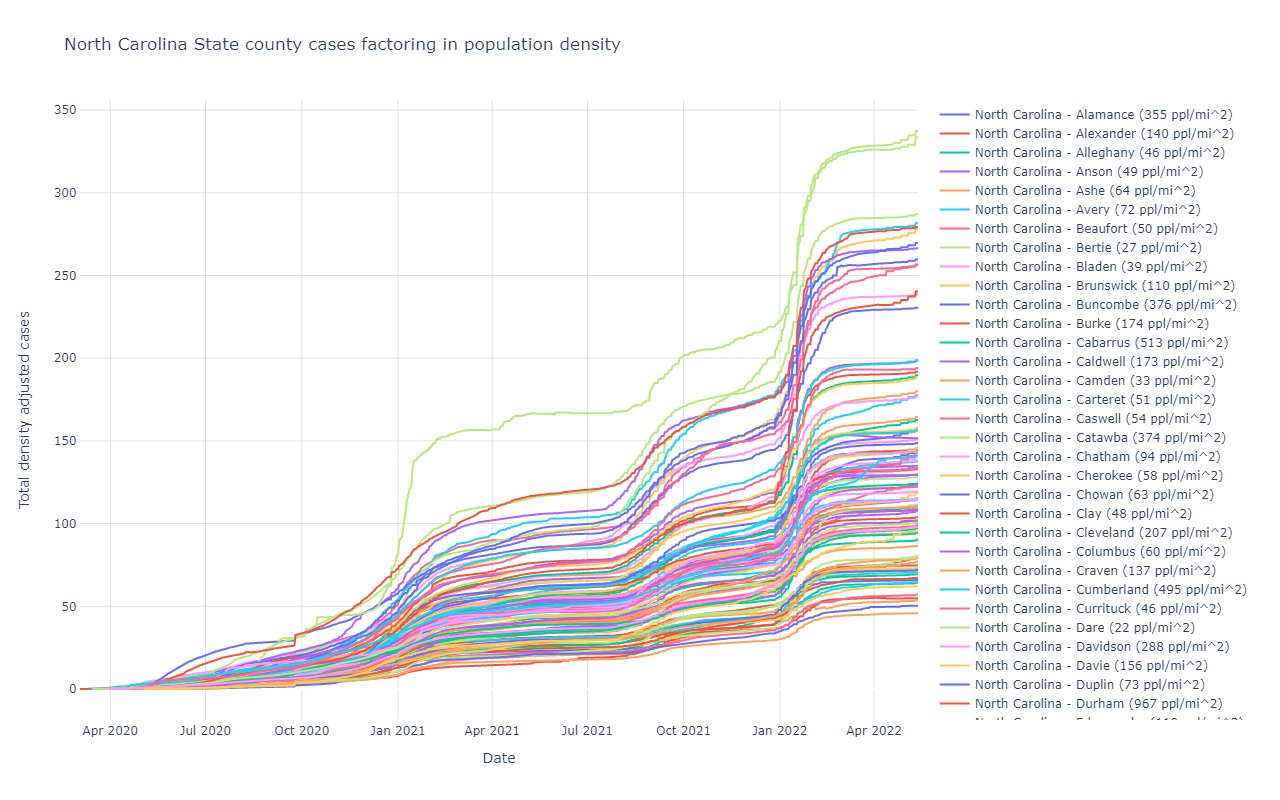
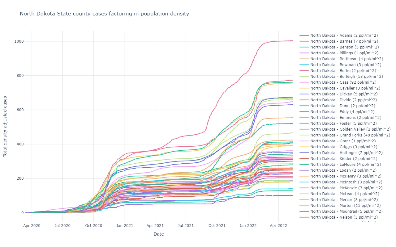
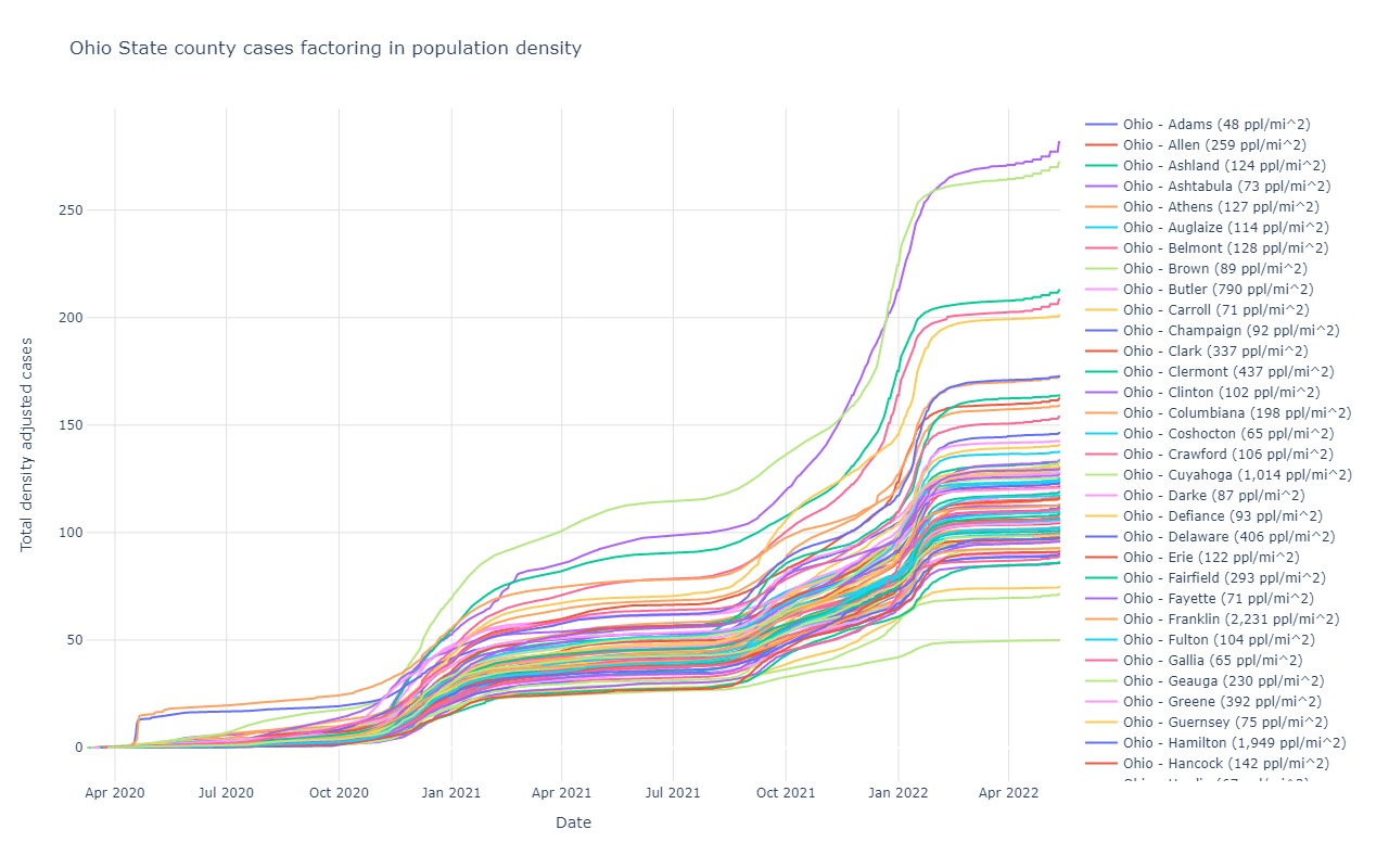
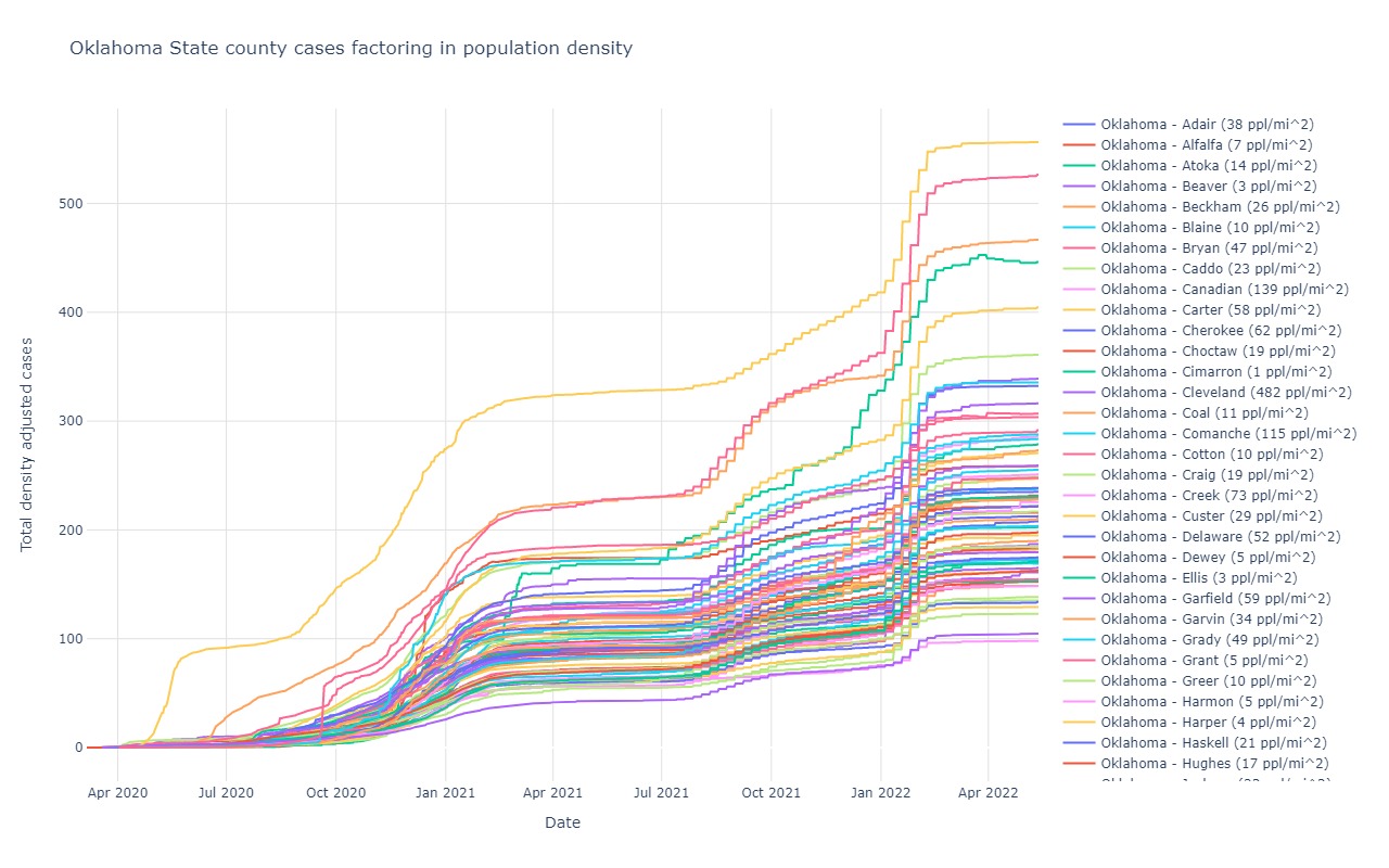
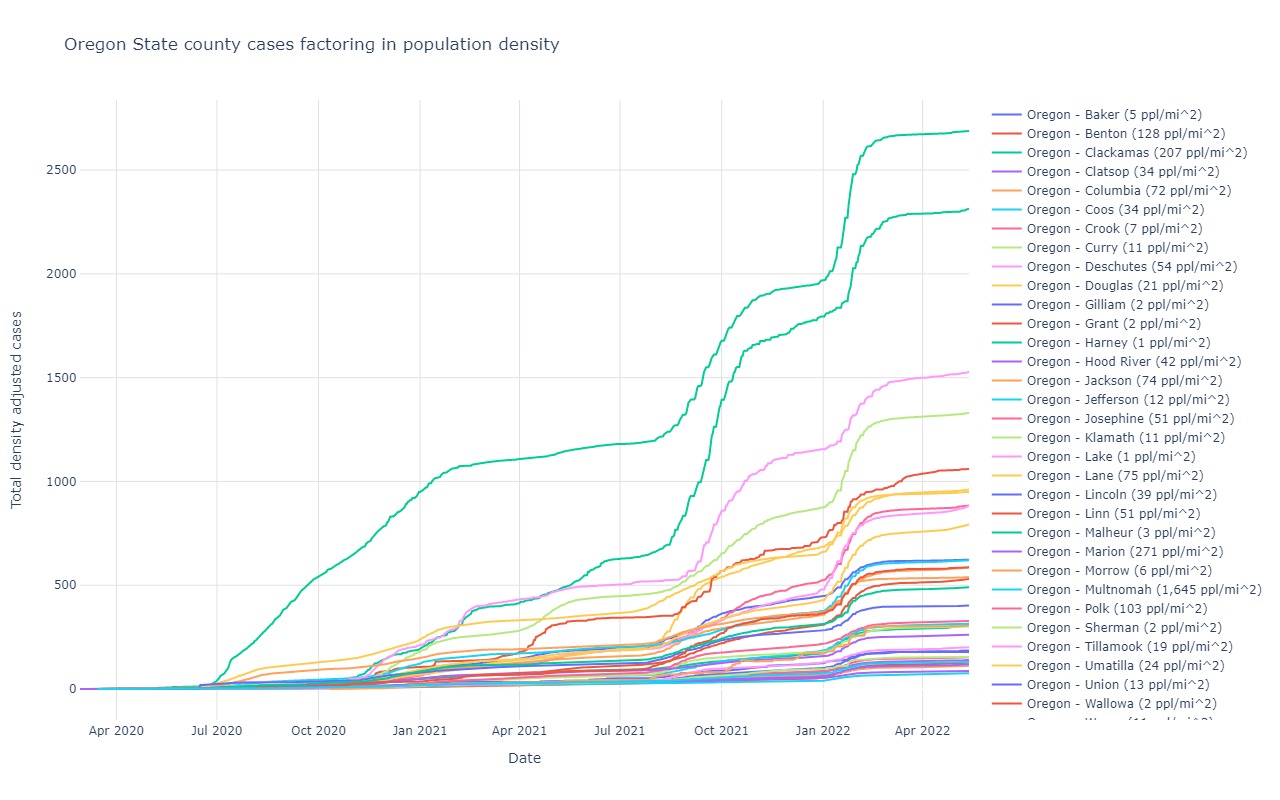
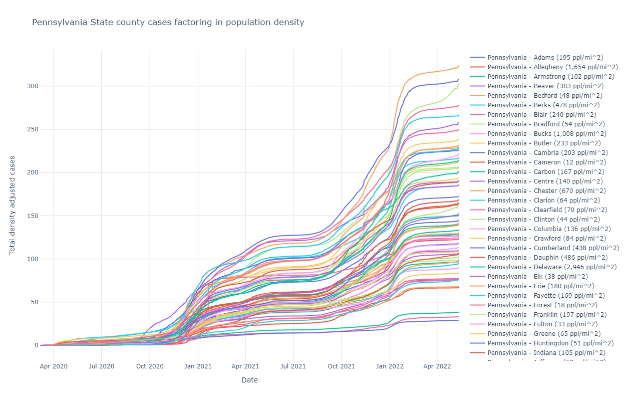
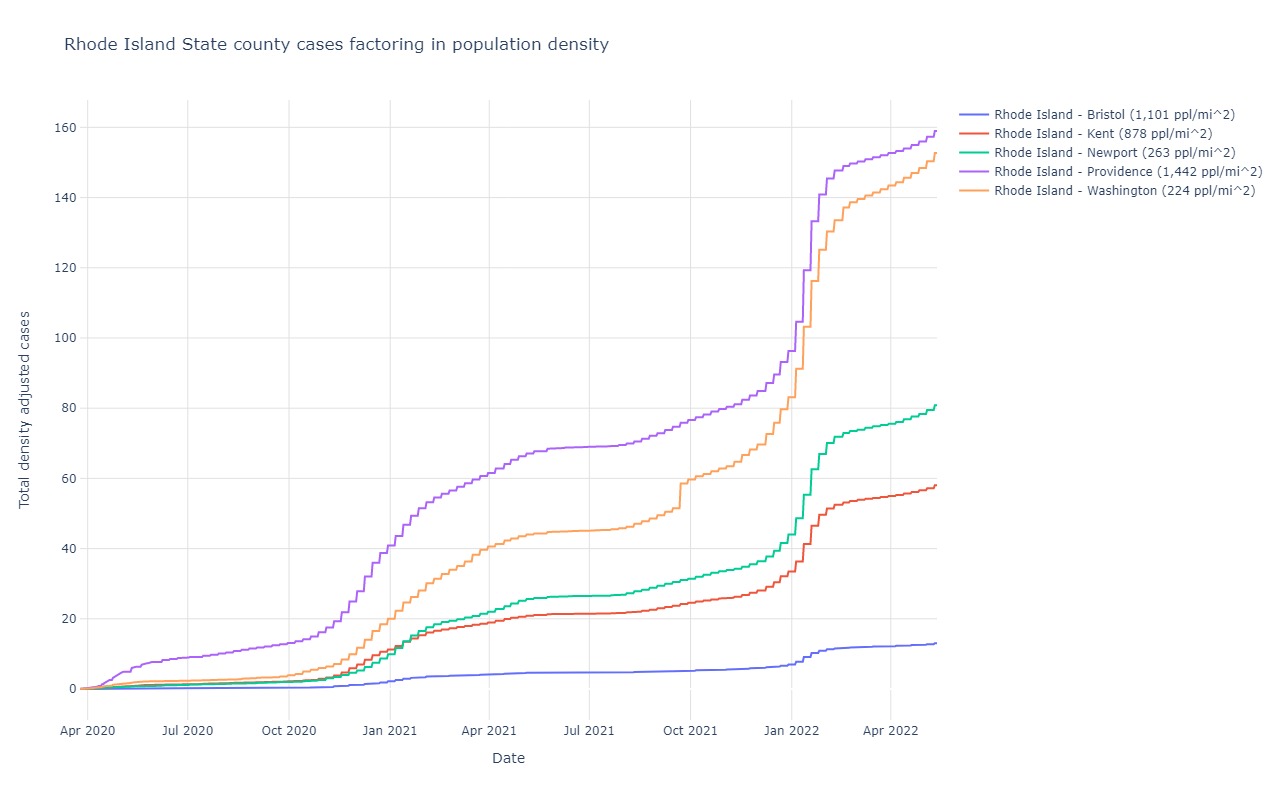
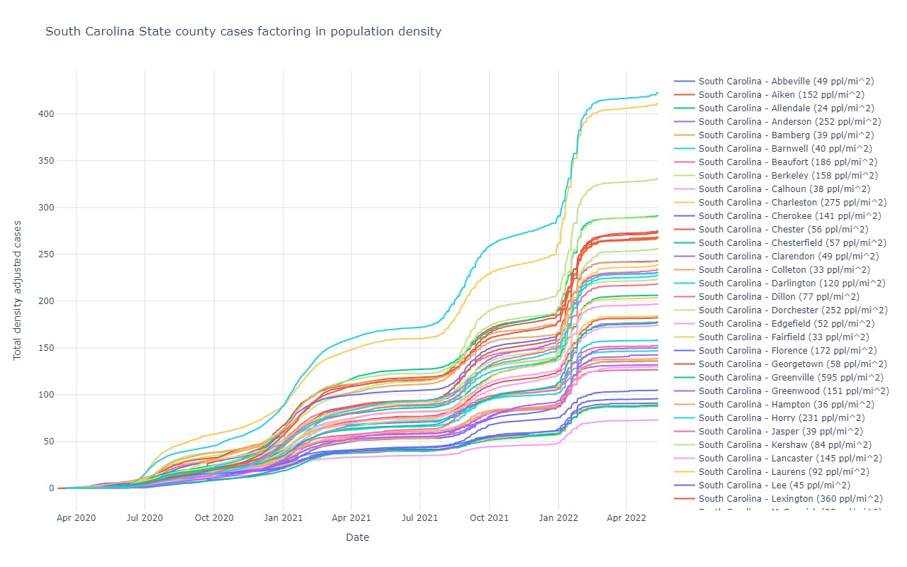
State cases adjusted for population density
Each state and county obviously has a population and an area in which this population lives. *Pretend* for a moment that Texas only has 1,000,000
people total. Also *pretend* that Rhode Island has 1,000,000 people. The land area of Rhode Island is much, much smaler than that of Texas. So, if both states
have a total of 5,000 covid-19 cases over the same number of days since the outbreak began in that state, you can say with high confidence that the people
in Texas are likely not effectively managing to stay as safe as they are in Rhode Island.
This graph factors in this consideration for comparison between states and counties
Alabama
Alaska
Arizona
Arkansas
California
Colorado
Connecticut
Delaware
District of Columbia
Florida
Georgia
Hawaii
Idaho
Illinois
Indiana
Iowa
Kansas
Kentucky
Louisiana
Maine
Maryland
Massachusetts
Michigan
Minnesota
Mississippi
Missouri
Montana
Nebraska
Nevada
New Hampshire
New Jersey
New Mexico
New York
North Carolina
North Dakota
Ohio
Oklahoma
Oregon
Pennsylvania
Rhode Island
South Carolina
South Dakota
Tennessee
Texas
Utah
Vermont
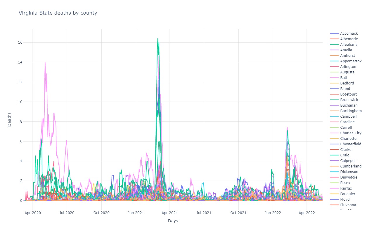
Virginia
Washington
West Virginia
Wisconsin
Wyoming
">
City total cases adjusted for population
You can do the same types of adjustments as we did for state and county at the city level.
A city that has 100,000 people vs 8,000,000 people will obviously look far better with regard to total cases
because they have 80x less people. By factoring in the population of a city, this is difference
is accounted for.
City total cases adjusted for population density
Same trends as described for state cases adjusted for population density, but applied at the city level instead. The intent of
this graph is to discount the consideration that some cities growth rates are so fast because those cities are so densely populated.
This was a common explanation as to why New York was growing so much faster than other cities. Though even when taking density into account,
New York's trend still beats all others, but other cities are much closer!
City deaths adjusted for population density
See description above concerning cases adjusted for population density. This is the same, but is about deaths, not just cases.